Excessive HTTP Requests: Saturated Fat for the Mobile Web

Like Butter, Baby!
Butter makes it better. Anyone who has enjoyed a nice French meal knows what we mean. Nevertheless, if you have a weak ticker and your arteries cannot handle it, fat can be a killer.
HTTP requests are the butter of the Web. They enrich the desktop experience with unperceivable impact; but on the mobile Web, the added latency can bring your site to its knees. The impact is devastating when you're dealing with inherently slower processor speeds and are dependent on a wireless mobile network.
Just as it has taken society years to learn the lessons of a healthy diet, the Web development world needs to take a similarly critical eye when it comes to maintaining a healthy mobile website. Each request made adds to the amount of time needed to download your site, and increases the chances of user abandonment.
There are avoidable ways that websites routinely make excessive HTTP requests, which add latency to their mobile sites. These excessive HTTP requests negatively affect the user experience and yet we commonly see how URL redirects, JavaScript requests, CSS requests and too many object requests in general can quickly result in a website experience few will tolerate.
URL Redirects
There have been many historical uses of URL redirects as they relate to Web page navigation in the desktop browser. The redirection process is handled automatically within the browser and is transparent to the end user waiting for the page to load and become visible.
URL redirects are very useful and common when serving up desktop-based Web content. The redirect process happens very quickly on most desktop Internet connections and for the most part a real person never knows or perceives what is happening.
For mobile Internet content, one might guess that using URL redirect guidelines would be the same as in the desktop world. Because the mobile Web is the regular "Web" just viewed over a mobile device, it seems like using URL redirects to help manage mobile content is just as valid as it is in the desktop world.
Many owners and creators of desktop Web content re-use the same content creation and management techniques that have proven to be reliable over the previous years of desktop Internet usage.
article continues below

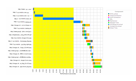
In the image above, the browser makes a URL request to the content server for the mobile homepage of a popular retail site. Instead of returning the base page that would begin to render on the browser LCD screen, the content server instead returns a URL redirect.
If you look closely at the graph, you see a series of four redirects sent back from the server to the mobile browser. Every time the mobile browser receives a URL redirect, it has to process that locally and then send the new URL received in the redirect back to the server. Processing a URL redirect requires that the mobile device send another request over the carrier's RF radio network.
All of the time highlighted in yellow in the graph is time spent by the mobile browser processing URL redirects sent by the server. During this 36-second delay, the URL redirect does not return any displayable content, so from a real user's perspective the site is slow and not loading.
There is probably no way to ever know the exact reasons why the owners of this content created a mobile URL redirect chain that goes four levels deep. When building a mobile site, some of the techniques and methodologies used to build desktop Internet sites have to be re-thought when creating your mobile content. Something done as an afterthought on the desktop Internet can magnify itself into an ugly user experience when accessed over a mobile connection.
It could be that for mobile, you might have to do things in a different way that requires more work, but in the end you can create a better user experience. In this example, if there is a way to cut out even one or two of the redirects, the overall pageload time would dramatically improve.
Too Much Fat
Requesting too many objects is another way to slow mobile Web performance. The New York Times is a good example of a mobile site that has pared back content for a good mobile experience.
How much faster is their mobile site? We examined data from our public index and looked at website performance collected in New York, requested by a Motorola Droid X. For a 24-hour period download times were consistently under 10 seconds. During the same period of time we collected data from an iPhone 4 in the same New York location and relatively few downloads happened under 30 seconds.
What explains the performance gap? The New York Times server does not redirect iPhone 4 users to the mobile site. Consequently, the iPhone users are downloading a tremendous amount of content. Setting aside the questions of usability of a full site on a relatively small screen, the impact on performance is quite noticeable.
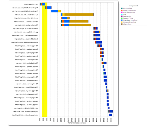
Chances are that many users won't stick around for the 60-second homepage download. Not only is this a potential lost sale for an online retailer, users are not very likely to return.
There are several images downloaded, but that may be needed to generate an impulse sale. But before that first image is downloaded there are other areas to improve this site. The retailer should consider a single redirect and combining style sheets. Moving JavaScript to the bottom and combining them is another W3C best practice not being followed. The JavaScript download is blocking the site from taking advantage of parallelization capabilities available on many of today's popular smartphone browsers.
Your mobile website is much more than a website on a smaller screen. It's used differently, the wireless networks are inherently slower and processor speed simply can't replicate the desktop experience. Yet, your customers will have similar expectations for speed and reliability.
Build a site with the expectations of the mobile user in mind and they'll be much more likely to come back.
About the Author: Tim Murphy, Senior Manager for Mobile Monitoring & Testing at Keynote Systems, is an evangelist for improving the end user experience on mobile websites, applications and networks.


Subscribe to Our Newsletter!
Latest in Mobile Marketing


