What Users Want More Of From Your Site

Putting yourself in the shoes of your site visitors ensures your site gives your target audience exactly what they want. While it's a simple task to figure out basics about your typical site visitor, it isn't always as easy to figure out what individual consumers want from your site. Fortunately, there are some key elements you can study to help you figure it out.
1. Excellent Navigation
Online shoppers are a fickle bunch who will move on to a competitor's site without thinking twice. About 21 percent of those who shop online say they will abandon a cart on a website due to bad site design or navigation. Although there are some things that make them leave a site quicker, such as having to pay for shipping or a poor return policy, 21 percent abandonment isn't a small amount and can put a real dent in your overall profits. 
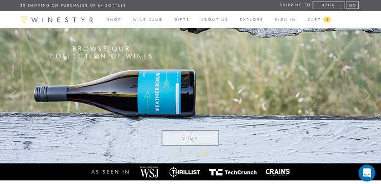
When it comes to website design, Winestyr takes a fairly traditional approach, but the navigation is very intuitive and natural for the site visitor-even one accessing the site via mobile. The shopping cart is extremely simple. What is in your cart is listed, and the place to insert a gift card or discount code is simple to find and in a box that highlights its location. The checkout button is large and easy to locate, and the navigation is the same across the top of every page on the site.
2. Roadmap to the Fun
Have you ever landed on a website and been unsure what to do next? Either the site was too busy or there wasn't appropriate navigation or information. This impacts the overall user experience and impacts how consumers see the brand. More than likely, you bounced away from such a website and other consumers will too. Make sure you have a clear structure to your site so users know what to do from the minute they land on your page until they check out of your shopping cart.
3. Clear Benefits
What is the benefit of consumers buying your product over the competition's? Show your site visitors why they should buy from you. Your product or service might not be unique, but your company is different from every other one out there. It's your job to explain to your customers why you're unique and how those characteristics benefit the consumer. 
Cliffside Industries offers a page that helps consumers better understand the uniqueness of its high-quality cabinet hardware by giving tips on how to care for the bronze, zinc or solid brass items. The company also explains the warranty on its products and what you should and shouldn't do with the materials they're made of.
4. Faster Loading Time
The human attention span is short and getting shorter in this busy, instant satisfaction world. In 2008, the average attention span was 12 seconds and it is now a mere eight seconds. If your site takes too long to load, you can be almost certain your site visitor will find something else to do rather than shop on your site. There are many ways to make sure your site loads as quickly as possible, including optimizing images, keeping the design simple and investing in better servers.
5. Complete Contact Information
People want to know who is behind a website. It adds a level of trust that isn't there if the people who own the company remain anonymous. About 51 percent of people state that thorough contact information is one of the most important factors on a website. Be transparent enough to list the names of the leaders in your company and offer multiple ways to contact customer service. 
House of Fraser is a U.K.-based clothing retailer. It not only explains who it is and what it's about, but it also offers a contact page that provides multiple ways to get in touch, including a street address, telephone number, email or live chat option. Knowing they can get in touch with the company at any time allows customers to feel confident in making a purchase through its website.
6. Working Logo
Consumers expect a logo to also function as a link back to the home page of a website. Visitors may land on your site while searching for any number of topics. Most know you can simply click the logo and use it as a home button. In fact, about 36 percent of visitors who come onto a site via a referral site click on the company's logo to go back to the homepage. If your logo isn't a hotspot, then you risk losing those site visitors. This also reduces the number of clicks and enhances user experience.
7. Secure Site
With so many data breaches in recent years, people really do care about what you're doing with their information. In fact, the European Union passed a law called GDPR that means your site must let visitors know what you're doing with their info and why you're collecting it if you do business with anyone in an EU country - even if you are located in the United States.

Nestle is a global company. Note how it not only clearly lists its privacy policy to show what it uses collected information for, but it also has a popup at the bottom of the screen indicating the site uses cookies and asks for consent. This is a new feature you'll see on many sites due to GDPR. If you don't already have a privacy policy and notifications in place, you do need those.
8. Useful Content
The main reason people come to a website is still to gather information and for the content there. Although the way we serve content is changing, with more videos and visual graphics, people still want to learn. Even if you sell a product, in-depth reviews and descriptions are what users want from your site. Figure out how to serve up unique and helpful content and you'll stand out from the competition.
What Users Want
Figuring out what users want isn't always easy, but it is worth the effort. Keep in mind that what they want today may not be what they want tomorrow. Ask your current customers what you're missing and continue to improve and add to your website over time. If you always seek to put the customer first, they will turn to you over your competitors.
About the Author: Lexie Lu is a web designer and writer. Her work is featured on CreativeBloq, Envato, Marketo and JUSTCreative. She manages her own design blog, Design Roast, and loves connecting with people on Twitter @lexieludesigner.

Subscribe to Our Newsletter!
Latest in Marketing


