What the F#nt! Why Typography Matters for Mobile Marketing

By Trish Sammer Johnston, MobileTechCreate
Typography in mobile email seems like a pretty straight-forward matter. Doesn't it all just boil down to this question: How big should the letters be? Like most things that seem simple on the surface, there are many underlying issues to consider once you dive in further. Our mobile email experts had lots to say on the topic - and very little of it had to do with font size.
How Much Does Typography Matter?
What's really at stake here? Not to put too fine a point on it, but potentially more than half of your audience.
"For the first time the majority of all opens - 51 percent - happen on mobile," said Meghan Anderson, product marketing director at Hubspot, referring to a 2013 study by Litmus. "We know that email is leading, so to give you a sense of the contrast, it's somewhere around one-third of all search traffic is mobile-driven, but 51 percent of email opens are mobile driven. Email is an activity we do on mobile habitually."
Cliff Seal, a UX designer at Pardot, agrees.
"If I get an email that I know is a bad format but I know is always good content, yeah, I'll deal with it and I'll wish that it was easier to read," said Seal. "But if it's something from someone else, I'm not going to bother."
Super Important Facts About Fonts
The most important thing you need to do is to test your typography across an array of devices. Not only will many devices resize your text, but some may also change your font entirely.
 "Stick to Web fonts any time you're making an email, because if you don't, people are probably not going to see the font that you intended them to see," says Julie Jarrett, junior Web designer at AWeber. "If you Google 'Web fonts' - I think there are eight fonts that are universally going to show up on anything you have."
(Editor's Note: We totally Googled it. Believe it or not, it's hard to find a definitive, be-all, end-all list on this topic.)
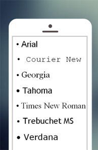
Most lists include the following fonts: Arial, Courier New, Georgia, Tahoma, Times New Roman, Trebuchet MS and Verdana.
Your Type Has Super Powers
Psst ... don't forget this: You can use your typography for most than just forming words.
"I would recommend using typography to make the sections very clear," said Amanda Gagnon, marketing content manager at Proscape Technologies. "Breaking your email into sections lets someone get to the parts they want, and not feel like they have to slog through the whole thing on their phone."
"You just want it to be very easy to read so you can start engaging with content, because if you're wrapping your content well, you're making a value proposition for consuming that email very quickly," continued Seal of Pardot. "So with larger type, or large-enough type, you've got another chance to engage people. Whereas if you don't do that well and don't test it, then you're sort of asking people to give you the benefit of the doubt."
Anderson of Hubspot adds that it's important to look at the message in its entirety. "You want to make sure that your emails aren't so long that you're going to lose people who are reading it on the bus on the way to work and trying to scan.
"At the end of the day, you have to design for people who are hopping from device to device," said Anderson. "That's actually why we like responsive design at Hubspot instead of a mobile version of a site or a mobile version of an email - because people will move very quickly between one or the other."
The upshot for marketers:
- Your audience is unlikely to be forgiving about teeny, tiny text unless they already have an established relationship with you and they know that your content is worth their time.
- Can you hook new customers with hard-to-read type? Unlikely. That's why responsive design is uber-important.
- Key thing to remember: Test that type before you hit "send."
Trish Sammer Johnston is a contributor to MobileTechCreate, which explores the intersection ofcreativity, technology and business acumen. MobileTechCreate delivers actionable advice, resources and education to help marketers engage their customers in a mobile world. Follow at @mobtechcreate.

Subscribe to Our Newsletter!
Latest in Marketing


