:: By John Cole, Ezoic ::
As mentioned last month on this site, there are five heavyweight items in the SEO Battle. Unsurprisingly, the number one item on the list, was user experience. Google's Head of Search Spam, Matt Cutts said "If you want to stay competitive, you need to take a 'fresh' look at your site and keep upgrading, tweaking, improving the site and the user experience."

If you look after your users and give them a good experience, you're aligning yourself with what Google wants from sites it lists in its search returns. Makes sense, right? After all - Google.com or Bing.com - will record if a user bounces back to their search engine after a few seconds of being on your site. Those bounces - whether mobile or desktop - will tell a story about your site's appeal and about the appropriateness of your site being ranked in a certain position for that keyword.
So - how DO you lower bounce rate, improve time on site and increase your page views per visitor? The answer is not a simple one, because every site is a unique mix of keywords, but there is a way that works every time; running tests.
Just like 'location, location, location' is the key to real estate, then 'testing, testing, testing' is the key to boosting user experience metrics on a website. You must work to find out what your visitors like and don't like about your layout. That doesn't mean conducting a survey (which are unreliable indicators of actual 'experience'), you need actual user response data. That means measuring visitor responses to changes on the site using Google Analytics or similar. Even reducing your bounce rate by 1 percent can have a marked effect on site health.
Here are five things you can try to boost your UX metrics and help get your site moving up the search rankings:
1. Page Layout.
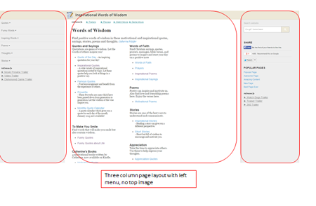
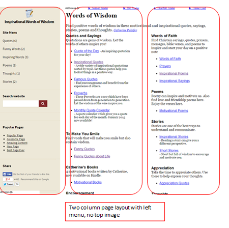
Knowing how easy your site is to navigate isn't something you can just 'know,' because everyone has bias toward what they personally prefer or what they find easy. That said, try two-column desktop and three-column layouts on desktop, test responsive designs on mobile vs. dedicated mobile. Test background colors.

2. Page loading.
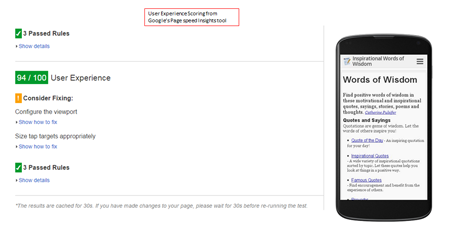
A fast site is essential to get the best results, but it's more important to load the important things first; like the content, especially on mobile (useful methods we use are 'lazy loading'). Google scores for UX as well as page load speed here: https://developers.google.com/speed/pagespeed/insights/
3. Menu Position.
Finding better ways of showing a main menu may double your page views per visit. Left menu vs. top menu on desktop is a great test to conduct on desktop. Mobile menus with sub/dropdown items are also a must. Sidebars on your tablet versions are expected too.

(Click on image to increase size)
(Click on image to increase size)
4. Ad Location & Ad Size, by Device.
No one wants to see a site with too many ads pushing the content down or making the site difficult to navigate. Balancing monetization with user experience metric measurement is vital - how big an ad is, in a particular location might negatively affect user experience and get the users bouncing out. Monitor and test all your ad locations, especially on mobile.

5. Additional Navigational Elements.
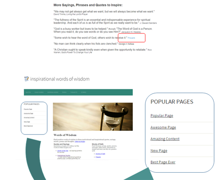
Everyone likes things easier and your users will view more pages if you make it easier for them to do so. Consider linking your content between pages in the same way that Wikipedia does; so if you have a page on Proverbs and mention Proverbs elsewhere in your content, you should link the word 'Proverbs' in the text, linking it to your Proverbs page. The same goes for 'related content' recommendations, which you do yourself by offering Popular Pages by pulling the data from Google Analytics of the most popular pages and offering them as links. This is something we've found (from testing) can add an extra 30 percent to your time on site.
(Click on image to increase size)
When it comes to trying to improve user experience on your site - try to be aware of your own subjective preferences with regards to looks (which can constrain your thinking). Instead, use A/B and multivariate testing to try new things; letting your users be your guide. After all, if time on site is going up, page views per visit are increasing and your bounce rate is going down that means that the majority of users are liking what you're doing. Testing UX elements methodically boosts UX every time - and that will keep your site healthy, your users happy and win you more traffic. Now that's what 2015 should be all about.
John Cole is the CCO of Ezoic, Inc. Formerly an officer in the British Royal Navy, John founded and sold several online businesses in the UK, prior to joining Ezoic as CCO. Ezoic is a venture-backed tech start up based in San Diego, CA and Newcastle UK. Ezoic technology automates multivariate layout testing for content websites; improving usability and ad revenue.


