The Web's Cruft Problem

By TJ VanToll, Developer Advocate at Telerik
Open Web evangelist Kyle Simpson recently opined on Twitter about whether there was a term for hating the Web more and more as a user but liking it more as a developer.
There isn't an exact term for what Simpson means, but the sentiment is agreed upon by many in the Web development community.
Between modals, app-install prompts, mobile Web fails, ads, mobile redirects and European Union (EU) cookie prompts, Web developers (just like average users) increasingly hate using the Web.
The term that this article will use to describe the phenomena is "cruft": the poorly designed, unnecessarily complicated or unwanted code and page elements that the average website includes, which des not contribute to what the user is trying to accomplish (e.g. read an article, buy a product).
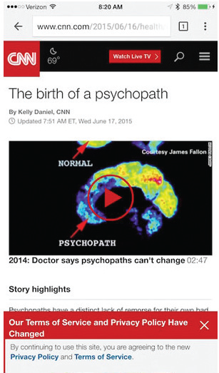
To put this into context let's look at an example. Visitors to the CNN article - in Image A - wanted to learn about psychopaths, but before reading they were required to view and experience social buttons, the temperature and a terms-of-service modal. That's cruft.

User engagement can be impacted negatively when cruft distracts users from their goals.
Loading the article took 200-plus HTTP requests and used approximately 2MB of data, taking about three seconds to load using Wi-Fi. A test of this Web page actually indicated that it would take about 13 seconds to load on an average mobile network. This example wasn't selected to single out CNN, but because it is now representative of the "average" Web experience. So, what is causing the cruft in the CNN example?
A deep dive into code reveals some 200-plus HTTP requests (ad related and serving tracking/analytics functions); 25 of which are to different domains. Since minimizing HTTP requests is a well-known best practice for mobile Web performance, why do many mobile websites violate this rule? Money. Why des CNN show ads? To make money. Why des CNN include tracking services? To learn more about the reader, to show targeted ads, to make money. Why des CNN use social media buttons? To encourage sharing the article, to get more page views, to get more ad views, to make money.
Again, this isn't intended to call out CNN as the "bad example," but rather to show a specific model that has become pervasive for content on the Web.
Developer Brian Rinaldi argued that the content model of the Web is broken because Web users thoroughly devalue content and writers. He contends that because users refuse to pay for content, publishers must resort to drastic tactics to make money from their writing.
Many people are attacking the cruft problem, but interestingly the innovation is mostly coming from outside the browser world. Flipboard was perhaps the first successful attempt at fixing cruft. Flipboard takes content from around the Web and provides excerpts and links to the full content. This provides a pleasant browsing experience without all the cruft.
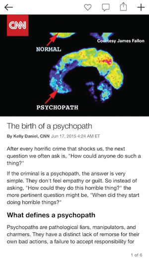
Flipboard has gone beyond this content preview role and now partners with certain content providers to display full articles directly within the Flipboard app - foregoing the browser entirely. Image B shows the same CNN article in the Flipboard iOS app. The same content is visible, yet unlike the browser version, the Flipboard article is cruft free and loads nearly instantaneously.

The same article displayed in Flipboard is now "cruft free."
Flipboard's success hasn't gone unnoticed. Its business model has been more or less copied by others, including Facebook's Instant Articles and Apple's Apple News. The way Web users experience and consume content is changing, so how is the technology and development community reacting to the cruft problem and what is being done?
HTTP/2: The HTTP/2 specification offers to substantially decrease latency on the Web by serving compressed HTTP headers and loading resources in parallel over a single TCP connection. Once implemented in browsers, HTTP/2 should substantially lower the load times of sites relying on a large number of HTTP requests.
Mobile-friendly: Last year, Google announced that it will penalize sites that aren't mobile-friendly in their search results, and display a "mobile-friendly" label next to search results that meet their guidelines. This is a small tweak, but one that early research shows is having a noticeable impact on how digital experiences are built.
Proxy browsers: Opera Mini has long been acting as a proxy browser, caching resources on its servers to reduce the amount of data that needs to be sent to each individual device. Chrome for Android and iOS now includes a similar option to help users increase speed on the Web.
Ad blockers: Ad blockers are the primary tool for attacking the Web's cruft on desktop devices, but they have yet to make their way into users' mobile workflow, largely because mobile operating system vendors have actively prevented them. Google has a fair reason for actively discouraging ad blockers, as it derives 80-90 percent of revenue from online advertising. Apple has also prevented ad blockers, but now allows ad-filtering extensions in iOS 9.
A Cruft-Free Future?
Despite these existing cruft-reducing features, this is still an area ripe for innovation. Why is it that for publishers the only real monetization option is to inject bulky ads that produce a worse experience for everyone? There's no clear answer here, though many have spent years searching. While this is by no means the end of the open Web, it's time to clean up the mess.

Subscribe to Our Newsletter!
Latest in Marketing


