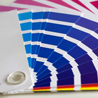
The Right Color Choices for Your Website

When you're designing your first website, you'll probably consider things like the page layout, the copy, and how your customers are able to buy products or convert. Only as a secondary consideration will you think about the colors on your site and how they represent your brand or influence customer buying behaviors.
The truth is, colors are probably more important than you realize. Not only do they have a powerful impact on how people view and receive your brand, they can also make your visitors behave in specific ways. So how, exactly, does color influence these effects, and how can you use this to your advantage?
Dominant Colors
First, you'll need to select the "dominant" colors of your website. Most brand color palette guidelines have one dominant color that takes precedence, giving users a familiar feeling when they see it, and breeding brand loyalty in the process. For example, think about the dark blue associated with Facebook or the bright red associated with Coca-Cola. You'd be able to recognize these colors, and notice if they were off even by a shade; that's because these are the dominant colors in each respective brand.
Similarly, you'll need to decide on one dominant color (and potentially one or two smaller, complementary colors) to be on prominent display throughout your site. If you already have a logo, you can use it as a basis for your development. Otherwise, you'll have to start from scratch.
Industry and Audience
Some industries have specific color palettes that represent them; for example, you'll often see green colors in businesses related to the financial industry (supposed to instill trust), and reds and yellows in fast food restaurants (the color combination is supposed to make people hungry).
In some cases, adhering to audience expectations and the norms of your industry is a good thing; you'll immediately give customers the right vibe, and you'll set an expectation for the interactions they can expect.
Competitive Differentiation
On the other hand, you might want to break away from industry expectations and the standards that have been set before you. The problem with singular colors that come to dominate an industry is that most brands using those colors end up looking the same. If you want to continue winning business and attracting new people, you'll need to differentiate yourself-and that means selecting colors that are unconventional for your industry. You'll need to be careful here, because playing too far off type can be alarming more than novel.
Too Many Colors?
You'll have some wiggle room in selecting other colors to include throughout your site, whether you're coloring the main navigation bar or adding effects to certain interactions. However, it doesn't take much to have too many colors in play at the same time. Having colors that clash with one another, or colors that compete for users' attention can be disorienting and aesthetically unpleasant. They can also make text difficult to read and interactive elements tougher to see, sharply reducing the usability of your site.
Color and Conversion Rates
There have been many studies attempting to discover the relationship between onsite colors and conversion rates, but the results have been mixed. Some studies find that certain colors perform better than others; for example, coloring a button red might increase your conversion rate a few percentage points over a similar green button. Overall, however, there's no clear trend.
Instead, colors seem to influence conversion rates based on how visible they are. Bright, bold colors that stand out from the surroundings but still fit the brand and make the text readable are ideal. Beyond that, changes in coloration appear either insignificant, or associated with unique variables such as audience and placement. That being said, the colors closest to your calls-to-action should be treated as somewhat experimental, subject to tweaks and improvements until you get the highest possible conversion rate.
Summary
As you design or tweak your website, don't neglect the powerful effects that the right colors can offer. If you're new to the process, consider working with a professional designer, or at least experimenting with different colors to examine their effects. Even small changes in brightness and shade can influence a change, so make your decisions thoughtfully.

Subscribe to Our Newsletter!
Latest in Marketing


