The Hardest-Working Staff Pages on the Web

Every digital enterprise has a team - from one-man shows with makeshift offices to globally staffed companies with luxury digs. Regardless of size or setup, transparency is key to building trust, and almost no page works harder for a company in this regard than its staff page.
Companies can use this valuable real estate to not only highlight their biggest resource, the people behind the brand, but also to showcase (if not brag about) the deep level of expertise their company has in a given industry.
For some inspiration, let's take a look at the hardest-working staff pages on the Web.
Caxiam Group
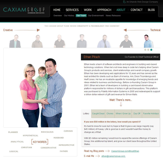
This team of passionate, talented and dedicated professionals loves to collaborate together and with its clients to build Web solutions of all shapes and sizes. And perhaps because Caxiam Group works so closely with clients, its "Our Team" details each person's favorite holidays, favorite thing to do on their day off and the list goes on. The staff bios also detail the person's job at Caxiam and their qualifications. It should also be noted that Ethan's profile has pictures of him - sans the family - in business casual attire, but who doesn't love a cute baby? Also, did you notice the keywords that describe Ethan?

LATERAL, INC.
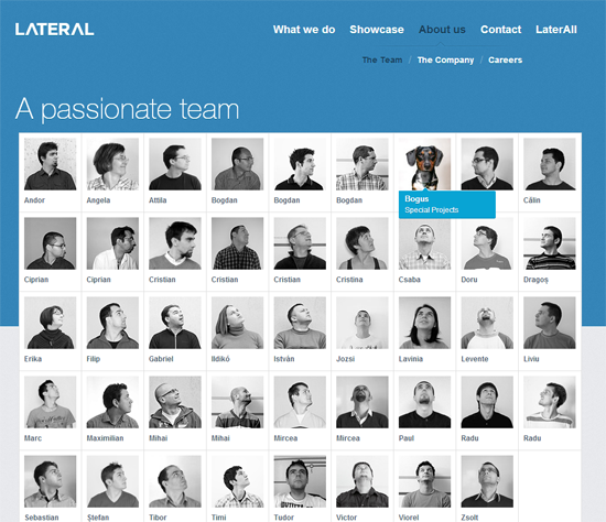
LATERAL delivers design and technology with passion for tangible business results. It has a passionate and, judging from its "The Team" page, wildly creative staff. While there are no actual bios of employees, the site makes up for this in originality, and when hiring a design staff, that's typically more important anyway. For example, when a user scrolls over any team member's image, the rest of the employee photos look in the direction of that person. See how Bogus the dog's image is highlighted and everyone is looking at him? By the way, he's in charge of special projects.

Blue Sky Resumes
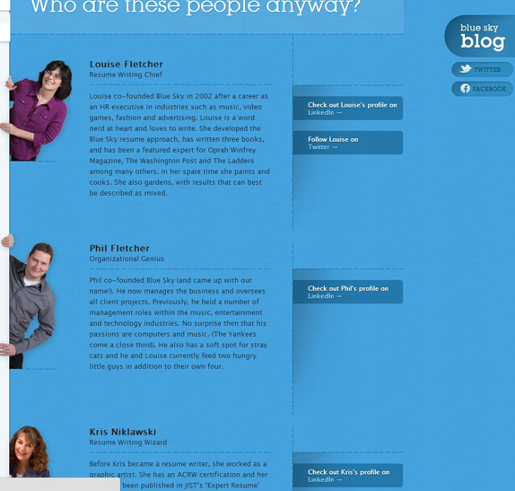
This small team of professional writers and job search experts pride themselves on amazing work and fabulous customer service. Working with them will even give you something to sing about, which is why the company selected design elements that revolve around blue skies and a blue bird. Its "About Us" page answers the question, "Who are these people anyway?" The design and copy choices reinforce the company's quirky and passionate approach and reinforces the staff's qualifications.

Arc90
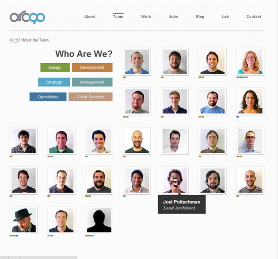
Arc90 is based in New York, but lives at the intersection of design, strategy and technology. So it only makes sense that its staff pages connects cool design with trust-building content. There are several elements at play here. On the "Team" page, a key indicates which area of the company that team member is responsible for (e.g. design, development, strategy, etc.). Additionally, when a user hover overs any employee's image, an alternative and more eccentric photo of them is shown (see Joel, below). Visitors can also click on any person's picture to read a comprehensive bio.

Space & Time Media Limited
Space and Time Media is a media planning and buying agency specializing in integrated media solutions both on and offline. Its website is committed to an action-hero theme, which carries over to its "Who are we?" page. While this design choice certainly wouldn't be right for every business, it's appealing for this one. There are cartoon images for each employee, and once clicked on, a user is brought to a new page with a full, professional bio.

-------------------------
Meet the Website Magazine Editorial Team

Subscribe to Our Newsletter!
Latest in Marketing


