Sound Web Photography

To succeed, your website must either tell a story or have a narrative subtext that guides your visitors through the steps you want them to take. Photographs and graphic illustrations drive the giant leaps in online commerce and the richness of the Internet. Whether you're selling shoes, systems, or a ski house, all those eyeballs and unique visitors expect to see pictures. And the better the pictures, the better your site will be.
Taking OK pictures is easy. Today, posting photos on the Web is also easy. But getting really good photography for your site - that's not so easy.
With the emergence of auto-everything cameras way, way back in the age of film (say the mid-1980s), we noticed that automatic cameras make it easy to take mediocre pictures - automatically. Sure, something in the picture will be in focus, and chances are the exposure will be OK, but do your pictures turn out the way you'd like? Too often they don't. I'm going to give you some simple tips to make your pictures look better and work harder for you on the Web.
 |
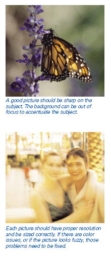
But first, let's step back a bit and consider why most pictures don't hit the mark. As already mentioned, automatic cameras solve basic exposure and focus problems. This makes it easier to take pictures without much thought. That's a problem right there - a lack of thought weakens many pictures. A good picture should be sharp on the subject. The background can be out of focus and often that's best. Similarly, each picture should have proper resolution and be sized correctly. If there are color issues, or if the picture looks fuzzy, or as our art department might say, "wonky," fix those problems. If you don't know how, get technical help. Now, we can get to the heart of the matter. If you have a good picture to start with, it will look good on the Web. So what makes a good picture? At the New York Institute of Photography, we stress our Three Guidelines for Great Photographs: - A Great Photograph must show its subject clearly. - A Great Photograph should emphasize the subject. - A Great Photograph has nothing that distracts the viewer from the subject. |
In sum, every picture is supposed to tell a story. The failure to meet NYI's Three Guidelines causes most pictures to fail. Let me give an example. A few years ago, I was on assignment in London and found myself down by the Thames River near the Tower Bridge. An American family was just coming out the front door of their hotel. It was a glorious autumn day, tourists were wending their way to the Tower Bridge museum and the sights and sounds of London were all around us. The doorman greeted the family with a pleasant cockney accent. Dad was exuberant: "Hey, let me take of picture of you with the bridge in the background," he said to his family.
And take a picture he did. Very quickly. His wife and three kids posed in the middle of the parking lot. I would estimate that they filled perhaps 20 percent of the picture, the Tower Bridge far, far in the background, at most 3 percent. The rest of the photo (over three-quarters of the image) was composed of empty parking lot, cars, and some sky.
It would have taken 30 seconds to move the family to the edge of the walkway along the Thames and set up a photo where the family would have been 50 percent of the image and the bridge 20 percent.
Why didn't he do that? Because he thought he knew what the subject was. He could see his family, see the bridge, even hear the sounds of London. He didn't stop to think that a day or a month later, when that picture lands in front of a relative, whether as a 4x6" print or as an email on a screen, the two-dimensional representation of that moment loses all those associations. For the people who hadn't been there, hadn't heard the sounds or smelled the smells, the picture won't work.
It's the same for the product you're selling on your site or posting on eBay. It's the same for the site promoting your motel, your band, or your small business. For each picture you show, you need to think carefully about the subject of the photo, and how you can emphasize that subject and keep distracting elements out of the picture.
A final thought: people who produce for television have a saying: "Video is a close-up medium." By that, they mean that sweeping landscapes and panoramas that may appear very dramatic in a movie theater or a 30x 40" photograph, don't read well on a small television screen. Assume your viewer is looking at your website on either a monitor or LCD panel of normal size. When in doubt, favor the close-up.
About the Author:
Chuck DeLaney, Dean at New York Institute of Photography, and editorial director of www.nyip.com.

Subscribe to Our Newsletter!
Latest in Marketing


