Optimizing Fears for Higher Website Conversions

By Martin Greif, SiteTuners
On a salad, you need to balance the amount of dressing you use. Too little, and the salad tastes bland. Too much, and all you can taste is dressing. Replace salad with websites and dressing with fears, and you've got pretty much the same balancing act at work.
On a website, if marketers want people to convert they need to play around with the optimal amount of fear - ensuring that fear works in their favor and nudges visitors to act. Marketers also need to make sure that there's more to see on their websites than fear-based triggers, and that users don't experience the wrong kinds of fears.
To optimize the use of fear on a brand's website, marketers need to understand the way users experience different types of fears.
Useful Fear One: This offer is only valid until today
There are good types of fears that move users toward a goal, and bad types of fears that keep websites from converting.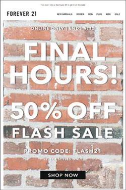 Offer validity falls squarely on the former; used correctly, it can help nudge people who are on the fence to act before leaving the website. The principle behind this is rooted heavily in BJ Fogg's behavior model, which essentially says brands need to put hot triggers in front of motivated people. Marketers need to work on both motivations and triggers, and offer validity helps quite a bit with triggers.
When people are uncertain about something, fear of loss (in this case, loss of the product or service that's available for a short time) is a better motivator than potential gains (more savings from another, potentially less expensive site). The hot trigger - the buy button, tied to a timer - can help brands close at a much, much higher rate. This is especially useful as a counter to the industry trend of high cart abandonment rates. By adding a deadline to the mix, marketers are giving themselves a better shot at getting the sale.
Useful Fear Two: +1 non-smoking room left
A cousin of offer validity, the configuration play is also a useful type of fear. The idea is that visitors will convert sooner based on two things:
- There's a specific configuration available that they want
- The configuration is in demand, and limited
Now, this is especially useful in particular industries. Airlines have a pretty convincing play, for example, with "12 aisle seats left." Hotels obviously have a ton of things they can test as well around the sizes of rooms available in smoking and non-smoking. Car rentals have pretty good leverage here, too.
Even with actual physical products, though, the configuration play can still be tested and used - colors available for a certain period, and various other configurations and specifications can get people to act sooner when used correctly.
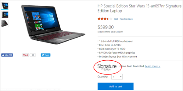
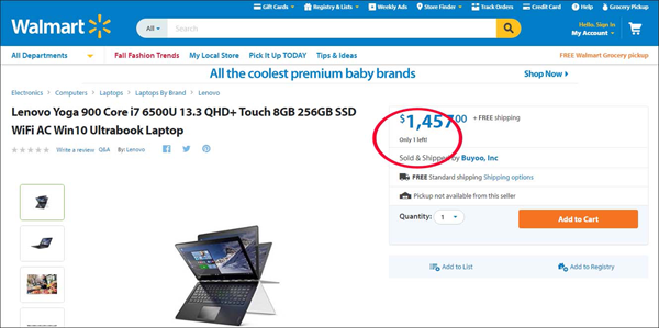
Useful Fear Three: +4 items in stock
Robert Cialdini, author of what is pretty much seen in the industry as the gold standard in persuasion ("Influence: The Psychology of Persuasion"), notes there are six core persuasion principles: liking, social proof, commitment, authority, reciprocity and scarcity. They are all useful, but the one marketers can apply to balance user fears is scarcity.
Now, brands can't generate scarcity; or at least they can't do that solely by changing their site. There are a host of factors at play, including how a company stores items, how it manages its supply chain and inventory, how it controls price points and so forth. What marketers can do is experiment with the different ways they emphasize scarcity.
Brands can highlight that there are only a certain number of stock left. They can experiment with the positioning of how they display that information, and making that the second or third most important element of the page, next to the product image and the call-to-action. If brands experiment until they get the balance right, scarcity can be one of their most useful tactics.
Useful Fear 4: Deliver this in time for Christmas
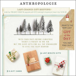 Thus far, the fears described in this article have been internal. The offer of the website expires today. The company has 4 items in stock. There are only 19 aisle seats available from the airline. To the user, there are a host of external fears at play.
Some people want to have flowers delivered on Valentine's Day. Others will want to have presents ready for Christmas. People fear missing those dates. The fear is already there - what marketers need to do is convince them that by using their site, they will get the item when they need it. To maximize this, brands need to test how they display delivery times, especially for holidays.
Bad Fear 1: Transaction Worries
+Not all fears move visitors to conversion.
One fear visitors have is about the transaction itself. If marketers can't get users to trust the site enough to transact, they'll leave even if there's something they want. Brands need to display trust symbols above the fold and ensure their professional design alleviates those fears.
Other Side of Fear
Learn how humor can work to increase conversions at wsm.co/crohumor.
Bad Fear 2: Hidden Costs
+Another bad form of fear is around hidden costs.
Pricing and shipping costs need to be displayed immediately. People fear being suckered into a purchase that's more expensive than they initially bargained for, and some will leave even if they're fairly deep into the funnel if this fear isn't addressed.
Putting It All Together
Fear is something that is tough to balance on a website, but those who do manage to put in the right amount of scares tend to win long term.
Martin Greif brings 25-plus years of sales and marketing experience to SiteTuners where he is responsible for driving revenue growth, establishing and nurturing partner relationships and creating value for its broad customer base.

Subscribe to Our Newsletter!
Latest in Marketing

