Long List of Website Elements Preventing Purchases

There are many reasons why a website visitor may not convert - from unclear copy and poor navigation to low-quality product images and a lack of details.
Since the list of reasons is long, it is important for website owners to continuously run tests on their digital properties. Doing so can help uncover elements that are causing friction, enabling site owners to take action to better optimize the path to conversion and overall customer experience.
While analytics data is undoubtedly the best place to start when looking for testing opportunities, there are some general site elements that tend to cause friction across verticals and industries. Find out if your site isn't living up to its potential by taking a look at Website Magazine's long list of website elements preventing purchases below:
Bad Visuals
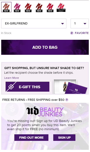
Since online shoppers can't touch or feel the products and services they are looking to purchase, it is important that brands provide strong visuals that accurately represent the product being sold. This includes offering multiple images on product page, the ability to zoom in and out of images, as well as informative product videos. What's more, brands should provide visuals for all product variations when possible. For example, if an apparel retailer offers the same shirt in three different colors, shoppers should be able to see the item in each color (see image).
 Lack of Details
Online shoppers are a savvy bunch, and often times they want self-service options rather than leverage live chat or a call center. This is why it is very important that brands provide as much detail as possible about the products they are selling. This means having very informative product descriptions, offering sizing guidance if necessary and giving details like ingredient lists, washing instructions, weight and height measurements and more. Slowness
Brands cannot afford to have slow sites interrupt the user experience, as recent data from Imperva reveals that 62 percent of online shoppers will wait five seconds or less for a page to load before they leave. Fortunately, Google offers a free page speed tool that brands can leverage to analyze their site's performance. Poor Navigation
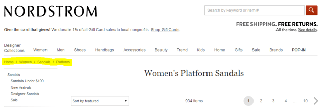
It's not difficult to see why poor navigation could have an impact on conversions, as its easy for online shoppers to move on to the next site if they can't find what they are looking for. This is why it is important for brands to monitor their on-site search data, test their menu options as well as offer breadcrumbs (see image) to help consumers better navigate their online shopping experiences.
 Vague Pricing
Although visible pricing is usually not an issue on traditional ecommerce sites, it is sometimes unclear in the service industry. To prevent unclear pricing from becoming a problem, all brands - regardless of industry - should test the display of their pricing to identify which variation garners the best results. Unclear CTAs
Sometimes the wording of calls-to-action (CTAs) makes all the difference, which is why this is an important website element to test for every brand. For example, "add to cart" may work better for some merchants while "buy now" may work better for others. Conversely, brands in the service industry may want to consider offering multiple options for hesitant consumers, such as "get started" and "learn more." Color, shape and size of CTAs are also testable moments. Minimal Social Proof
Social proof, including ratings and reviews, can give consumers confidence in their purchasing decisions. It is important that these elements add to the shopping experience, however, not distract from it. Apparel retailer Free People, for example, subtly includes social proof on its product pages by displaying a heart that represents the number of people who have "liked" the item next to the product title (see image).
 Lack of Trust
Cybercrime is on the rise, which can make some customers hesitant to make purchases online. Brands can ease these fears, however, by not only offering a secure website but also including security seals on their sites - especially on product pages. Difficult Checkout
There is nothing worse than losing a conversion in the checkout, which is why brands should focus on offering a friction-free experience that includes guest checkout as an option. After all, some consumers don't want to create an account before buying, and guest checkout allows them to move quicker through the conversion process. Shortage of Payment Options
Brands must go beyond the traditional payment methods nowadays to make it as easy as possible for consumers to complete their purchase. This means offering payment options like PayPal, Visa Checkout or Apple Pay in addition to options like credit and debit cards. No Shipping Details
Some customers don't want to wait until the checkout to learn about shipping options, which is why it's a good idea for retailers to offer some information on shipping directly on product pages. This doesn't mean that brands need to put every shipping option on every product page, but instead offer some type of information, such as "free shipping on purchases over $50" on product pages, or provide a link that allows consumers to learn more about shipping options prior to the checkout.
 Return Policy Nowhere in Sight
Similar to how brands should offer shipping details on product pages, they should also offer information about their return policy. After all, consumers that are unsure about the purchase they are making will want to know if they can return it hassle-free. FAQs MIA
As previously mentioned, online shoppers like to self-serve, and frequently asked question (FAQ) sections help them do just that. If this section of a site is difficult to find, however, shoppers will likely move on to see if they can find the information they are looking for on a competitor's website. Difficult to Find Customer Service Options
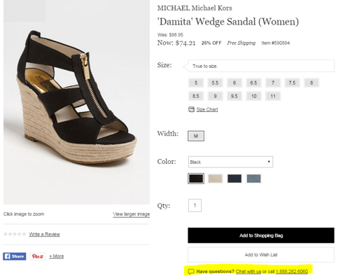
It is important that brands offer contact information and customer service options to online shoppers who want to take advantage of these resources. These service options should be easy to find, with live chat options being visible on every product page (see image). Doing so gives brands a better opportunity to help their customers through the purchasing process.
 Start Here
The list of reasons why consumers don't buy on an ecommerce website is, of course, long. While not all reasons can be accounted for (e.g., some are personal, financial, technical), the above list serves as the foundation as to why your visitors aren't buying.

Subscribe to Our Newsletter!
Latest in Marketing


