Here's How jQuery is Creating the Interest in Pinterest

Startup social networking site Pinterest has been gaining a lot of attention recently - most of it good, but some of the most recent news hasn't been so great.
But good or bad, the online visual pinboard is one of the hot topics of the day and traffic to the site is skyrocketing. As this relates to the design and development world, one of the positive results of all this interest in Pinterest is the increased attention that's being given to its engaging website design.
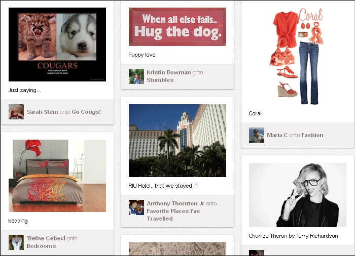
It appears to be using a very popular jQuery plugin called Masonry, created three years ago by David DeSandro. In DeSandro's own words:
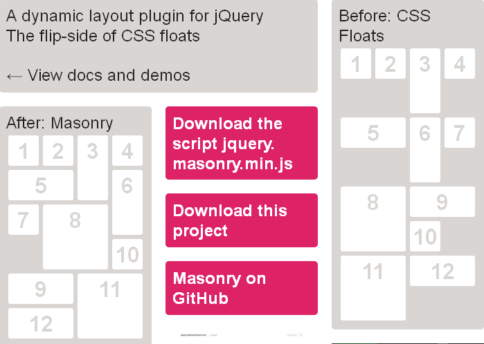
"Masonry is a dynamic grid layout plugin for jQuery. Think of it as the flip-side of CSS floats. Whereas floating arranges elements horizontally then vertically, Masonry arranges elements vertically, positioning each element in the next open spot in the grid. This minimizes vertical gaps between elements of varying height, like a mason fitting stones in a wall."
And below is the designer's visual explanation of Masonry:

The design community has been enthusiastic about jQuery Masonry since DeSandro's initial release, but until Pinterest came along there hasn't been a Masonry site that's received so much attention in so little time. Perhaps this will send Masonry right into the mainstream of everyday Web design, or perhaps Pinterest is doomed to fail and Masonry will fall back into the shadows outside the view of the general Web populace.
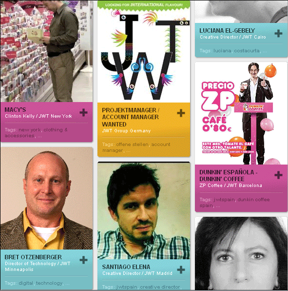
I certainly hope that's not the case because it is a very useful tool that inspires great designs. To help inspire your own designs using jQuery Masonry, below are five examples.


Subscribe to Our Newsletter!
Latest in Marketing


