Name, address and phone number (NAP) data is the most important information to include on a website catering to consumers with local intent.
Words like "near me," "closest" and "nearby" are increasingly common across the billions of searches conducted on Google each month. Thanks to local directories and structured markup, users often find the location information they need without ever leaving the search results. When they do, however, they expect to access this data as quickly as possible regardless of device.
Use a Hyperlinked Image (With Caution)
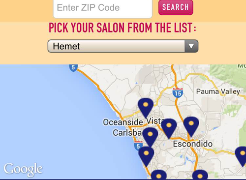
With its 30 Southern California locations, iTan figured out a way to match mobile users with the location closest to them without overwhelming its mobile homepage. iTan opted for a large, clickable image promoting its dozens of location options (Step 1 in the images below), which then directs visitors to an interactive location finder and a list of locations (Step 2 in the images below). Once the correct location is found, a separate location page opens with localized services, information and promotions.
Step 1:

Step 2:

While this is more steps than most businesses would want to give users (for fear of them abandoning the page especially when they are so close to converting, as most local searchers are), this option is a quick fix for local businesses with multiple locations not knowing how to present local users with the most relevant information. This is considered a band-aid, however, as this may negatively affect SEO initiatives because Google recommends site owners use text instead of images to display important names, content or links.
Similar to iTan, Chicagos-pizza.com - while not the most visually appealing site out there - links three images to their appropriate location pages. On mobile, Locations is one of the top menu choices.
Include Location Info in Multiple Spots
Frontera Grill is located in Chicago and a visitor to its homepage will know that pretty immediately. Potential restaurant patrons can (1) navigate to the first navigation bar choice, "locations & hours," (2) view the address directly below the homepage slider which looks nicer as the website is readjusted for mobile users via responsive design or (3) get the location, hours and a map below the other two options.
Frontera Grill also includes a picture of the front of their restaurant so those unfamiliar with the area can spot it when walking or driving by.
Keep It Simple
Internet users have been trained to look for location information in a website's footer because that is predominantly where Web designers place that data. Including location information in a footer is a safe bet but some designers have updated this approach. The first image from Greenheart Shop shows a standard horizontal footer, while the second from Girl and the Goat shows how the restaurant's design team showcases information traditionally found at the top (main navigation bar) and at the bottom (footer) of a website in a left-hand vertical format.
While Girl & the Goat's approach won't be right for all business types, the format does highlight important information in a quick, easy-to-consume fashion. Those opting for a more traditional approach, however, should make sure the location information stands out - different color/weight or by including a map next to the address.
With Google reporting last year that 50 percent of mobile users are most likely to visit after conducting a local search, it's important designers display location information on their websites in a prominent fashion regardless of which approach they take.
