Getting Wild with Wireframes

While content management systems and shopping cart platforms (and everything in between) have in many ways changed the roles and responsibilities of Web designers and developers, it's still important to wireframe the digital experience. Without this important step, designers and developers will most definitely miss the big picture requirements set forth by their client or the organization for which they work. While you "could" sketch and wireframe with a pencil and paper, another viable option is to take advantage of the numerous Web-based solutions built exclusively for this purpose. Hold on to your design cheat sheets - we're about to get wild with wireframes.
Wait, What the Heck is a Wireframe?
A wireframe is essentially a visual guide of the framework of a website. Also known as page schematic or site blueprints, wireframes are created by user experience teams and interaction designers. To build a wireframe, it's important to have a handle on a variety of skills - from information architecture and research to marketing and actual user interface development. Wireframes are useful in that they aid in the arrangement of page layouts, navigation elements (and let's not forget business objectives), but what's ultimately most important is that wireframes help us to understand how everything will work together.
It's important to also understand that wireframes can be created in any medium - from paper napkins to digital platforms. What you may not realize is that there are different kinds - those of a low fidelity and high fidelity. Low fidelity wireframes (those you likely sketch out on a napkin or scratch piece of paper) have little in the way of detail and are more abstract in nature. High-fidelity wireframes, however, focus exclusively on the detail that may closely match the design of the finished product. So what should you include in a wireframe? Typically, wireframes focus on the information that will be displayed, the range of functions that will ultimately be built in to the finished products, as well as the priorities (placement), rules and effects in the actual display. If you're interested in wireframing your next digital product (website or app), make sure it accounts for the following:
Information: Since element placement indicates priority for the user, make sure that your information design skills take center stage. Ultimately, the product should reflect the goals of the user and what tasks a user should take.
Navigation: The hallmark of a well-designed product is the degree of interaction that results in the user experience. If you want users to move through the site or app, focus on how to do that with navigation as you create a wireframe.
Interface: More of a high-fidelity wireframing concern, interface should at least be considered by everyone else - we're looking at you low-fidelity designer. In the least, consider how buttons and boxes, menus and text fields will be presented (where and in what general style).
How about some examples?
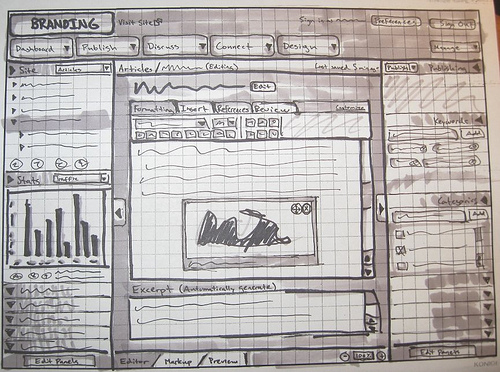
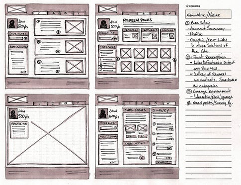
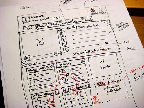
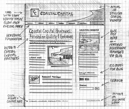
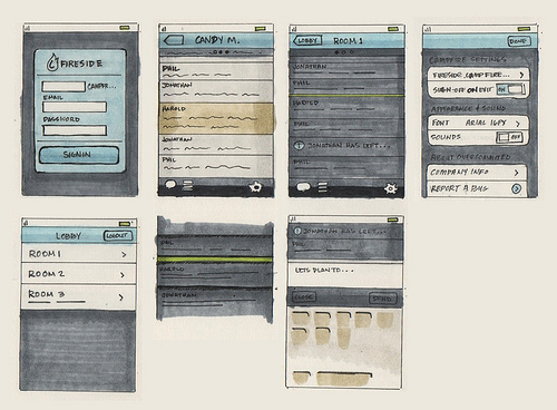
No problem. You'll find numerous wireframing examples at the websites of the wireframe tools listed below and some immensely creative and detailed wireframes circulating the Web. We're also featuring a few wireframes below that definitely deserve your attention and may act as the perfect source of inspiration. Pretty impressive, don't you agree?
The article continues below (and don't miss it, because that's where Website Magazine profiles a few of the top wireframing tools!).
No Paper? No Pencil? No Problem.
If you're not about to bust out the paper and pencil, know that there are numerous, incredibly useful wireframing tools at your disposal as a designer. Below you'll find several of our favorites that are more than capable of handling all that creativity of yours.
Balsamiq: While designed with the low-fidelity wireframe in mind, Balsamiq is a very popular tool in design circles as its simplicity forces users to focus on the design elements (content, functionality) rather than the visuals.
ProtoShare: What fun is wireframing by yourself? ProtoShare offers up a collaborative wireframing tool, ideal for accelerating the entire design process thanks to 2D and 3D animated transitions. Far more of a high-fidelity option, Protoshare is ideal for those focused on UX.
Pencil: Another of our personal favorites is Pencil, a browser-based open source GUI prototyping tool that includes stencils, page linking - ideal for creating quick website mock-ups.
Jumpchart: If your wireframing needs stop at the website, then stop at JumpChart. The collaborative tool offers up revision tracking, content organization and a lot more which should make it a top choice of designers.
So many wireframing tools! There are numerous other wireframing tools that deserve/demand your attention, including JustProto, iPlotz, Pidoco, HotGloo, MockFlow, Mockingbird, Frame Box, Flairbuilder and Creately - to name but a few. To work, you have to use them though, so spend the next few hours or days considering the platform that is the perfect fit for your next design project.

Subscribe to Our Newsletter!
Latest in Marketing


