FYI: The ABC of CRO for B2B

Joe Doveton, GlobalMaxer
"Not the right time"- just one of the objections I have heard from business-to-business (B2B) digital marketers when introducing them to the topic of conversion rate optimization. CRO, it is believed, should be left for the big boys in business-to-consumer (B2C).
For many webmasters, the first hurdle to overcome in CRO is the terminology. As many B2B businesses may not be fulfilling a transaction online, they may not consider themselves to have anything to convert. The B2B sales cycle is likely to be a long one, with several stages of procurement and the final decision made by committee, not a click of a mouse by an individual. However, B2B sites often have a more nuanced set of conversion points than their counterparts in ecommerce. Generating sales leads, qualifying and filtering these leads, supporting research queries, generating a positive reaction to the brand - all of which are vital touch points for potential customers and can be improved using CRO.
Whilst on the subject of semantics, the other factor that is problematic in the CRO topic name is the word "rate." Visibility on the contribution that the Web has made to your company's revenues is often very hard to quantify, and therefore is not often recorded or measured. A culture of analysis and the ability to benchmark is essential for successful CRO - and this means giving more influence and power to your Web analytics team and getting them hooked in with whoever manages the wider range of business metrics.
Below are my top tips for effective use of Conversion Rate Optimization for a B2B site:
- It's not optional (and yes, B2B CRO is still "selling"): Optimizing your website for user interaction is not an optional add-on to your strategy. It IS your digital strategy. Interdependent are the marketing ecosystems of organic search, search engine marketing (SEM), advertising, content, public relations (PR), reputation management and social media that best practice in one discipline begets best practice in other disciplines. Content should reflect the real-world language your customers use to find you. Good advertising and landing page copy creates a positive experience of one's content. Good content begets shares and likes, which begets links which begets rankings. Good content creates engagement which extends to form fills and sales inquiries. As Google's Matt Cutts puts it (post "not provided"): "Succeeding in SEO will be the same as it's always been if you're doing it right - give the users a great experience".
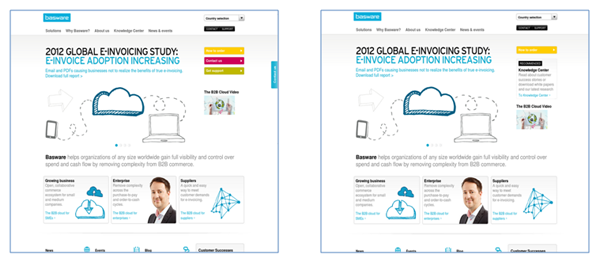
- Action and goals: Just like an ecommerce site, the Web page presented to a user should have a clear hierarchy of your business objectives. If you want to drive users to complete a form, make sure this is given prominence either via a high contrast, attractive button or a clear text link. Other interaction points should be downgraded so as not to compete for eye attention with this call-to-action. Other business to business objectives may be driving phone traffic - so if this is the case, the priority should be to include a prominent phone number and the times of the day that the switchboard is manned. If you have live chat, make this a key feature of the page. It's also perfectly reasonable to have a main action as a giveaway that aims to reinforce a positive opinion of the brand - a white paper or a case study download are good examples of these. Pages with these as the main interaction point should prioritize downloads over form inquiries.
It's generally better to upgrade your principle business call-to-action and downgrade secondary calls-to-action, to encourage users to take up your main primary area of business
- Analyze and measure: The traditional way that your business evaluates leads and revenue may not be conducive to joining up an inquiry that starts via a form completion online and ends with a proposal presentation in a room. Cost per lead, cost per inquiry, average single order value, average contract - these are all metrics to benchmark at each stage you interact with your customers. Your business may have data on offline interaction points, for example, leads generated by meetings at trade fairs, or inquiries from printed directories. However, it's quite likely that your business metrics are under-reporting on the influence your website has played in supplier selection. For this reason, your analytics team should meet regularly with your main Business Intelligence (BI) team and understand how you can assign values to the work done by the Web. Finally, there are additional tools and plug-ins to help you bridge the knowledge gap between digital and offline - so if you want to track your visitors from your website to a phone call it's possible to do this with tools like Calltracks, Infinity Tracking and Response Tap.
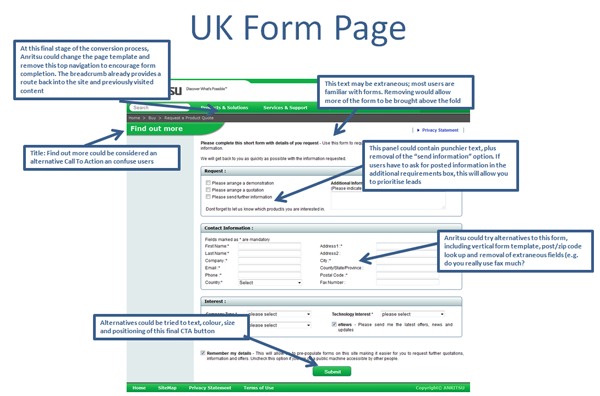
(Understanding how users interact with forms and measuring form completions and sign up is a big part of successful CRO for B2B.)
- Digital is different: It seems obvious to state, but the way that users consume your digital properties is different from a physical interaction with a sales person or a brochure. Many B2B websites have huge lists of products and treat their websites as a vast library of product specifications rather than a two-way business tool. If you have a large inventory of products, think about how these products are grouped together under category headings. The categories laid down by your corporate communications team may not actually contain the words or phrases used by customers in the real world. Even with Google's change to "not provided" you should still be able to get information on internal site search. So put your users in control and feature a prominent site search feature. Also, consider how the emergence of tablet and mobile impacts on a text heavy site - once again, internal site search is important.
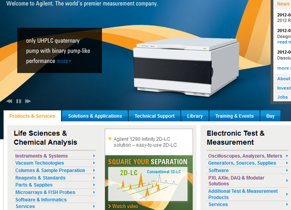
(Presenting a large inventory of products and services is a real challenge for B2B Web designers. Think about how you categorize products or families of products back to users. Make sure you have accelerators to get clients to sign up for information or a sales inquiry about your most popular or valuable products. Experiment with different versions of these accelerators with MVT or AB Testing.)
- Design: Your site should have a clear brand proposition and a clear logo within the masthead. Most visual journeys in Western websites start with the user scanning the logo in the top left so this is a good place for the logo to be positioned. If using a carousel or sliding banner, make sure it's user initiated and doesn't start automatically. Make sure the top navigation is divided into a small number of clear user options. Orientation is important in large sites, so always include a breadcrumb. Photographic assets should support the message you wish to get across. You don't necessarily need product photography, but inscrutable images from a photo library don't help much either. Above all, each page must lead to a clear user action, like a form inquiry, download or progression to another step.
- Content: Corporate copywriting is enjoying a renaissance with the explosion of content marketing. When writing copy remember it is quality not quantity that is important. Research by Jakob Nielsen suggests that only 20 percent of text is actually read (as opposed to skimmed). Make sure you include important sales features in the opening sentence, or even better use bullet points for emphasis. Also, a lot of technical detail or repetition of product codes does not make for a great user experience. Infographics and video create visual attention and encourage sharing, but only if they are clear and succinct with a strong message outlining business benefits.
- Culture: Users in different cultures respond to different types of design. So, if you are selling to an international audience you need to think about a local approach to design. Factors subject to cultural preferences include color (e.g. red means danger in the West, good luck in China), using subjects with local ethnicity in photographs, alignment on the left for alphabets like Hebrew and Arabic and even attitudes to time and time sensitive offers.
Joe Doveton, Head of Client Services, GlobalMaxer
Joe has 17 years industry experience, working alongside a number of high-profile brands including STA Travel, Manchester United, Vodafone, Sony and Panasonic. His area of expertise ranges from traffic driving disciplines (online advertising sales, ad planning and buying, ad networks, SEO & PPC) to site-side optimization (Web analytics, usability, conversion, AB and multivariate testing). Regularly speaking at conferences worldwide on all facets of multivariate testing and conversion, his ‘know-how' on how conversion patterns vary across cultures is second to none. Editorial credits include UX Magazine, Smart Insights and I Gaming Business Magazine to name but a few. Moreover, Joe recently wrote a chapter on cultural conversions for the renowned CRO industry bible ‘Landing Page Optimization' by Tim Ash (2012).

Subscribe to Our Newsletter!
Latest in Marketing


