Four Award-Winning Websites That Inspire Us


The Horizon Interactive Awards have announced the 2010 winners and, as usual, it's an impressive array of websites spanning many industries. This is one of the most interesting contests for Web designers and developers, as it showcases the best combinations of design, technology and function. You can see the full list here, and below are a few select winners we've chosen to show what some of your peers (and competitors) are up to.
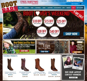
Ecommerce: BootBarn.com won for best in category for their new ecommerce site (with help from Acquity Group) and we can see why. The tone of the page is fitting, as the background shows a wide-open field with blue skies above and mountains in the background. The first thing you see is a sale, followed by a kids section, a "style" section ('more than just boots') and women's section. Just before the fold is a selection of "Featured Products" so the consumer can start shopping immediately. A sense of community is also present, with the photographs of recent content winners. Overall, the site covers all the bases - appealing to an  array of shoppers while encouraging purchases. Navigation is simple and product pages are clean and descriptive, some even include video showcasing the product.
Self Promotion/Portfolio: CooperGraphicDesign.com won gold for their site showcasing the company's capabilities and portfolio. We love the slider that at once demonstrates their knowledge of the industry and philosophy: good design succeeds - good design interacts - good design is contagious. The site simply states Cooper's mission, offers quick links to news and resources and displays a recent project, with a link to the entire portfolio underneath. The site looks professional and instills confidence while still showing enough flair that a design firm should present.
Integrated Marketing: Critical Mass handled a project for Nissan's all-electric Leaf car, and shows a very impressive campaign that hit several touch points; including social media, microsites, YouTube, email and more. What's most impressive about the campaign is that Nissan knew exactly what they needed to do - educate consumers about electric vehicles and the self-described "lifestyle change." A Twitter Q&A was set up. A map helps consumers plan their commute and offers knowledge about charging stations for electric cars. Another feature explains various government incentives for purchasing an electric car, and the site can even connect people with a local dealer to conduct a "home assessment" to determine where chargers can be placed and set up in the home. It's a campaign that knows the answer to the question on the consumer's mind: Is an electric car right for me? See the campaign in action.
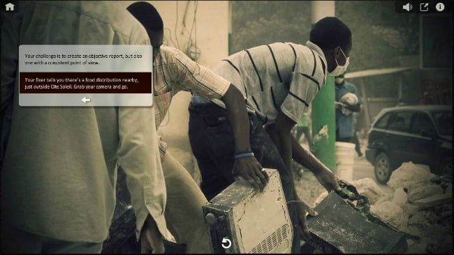
Best in Show: Inside the Haiti Earthquake reaches the zenith of Web design - it's compelling, beautiful, interactive and impossible to look away from. The site tells the story of the horrific Haiti earthquake of 2010 by putting you in the shoes of a survivor, journalist and aid worker. Clicks lead you through the interactive presentation of the challenges and sorrows faced by each, in a choose-your-own-adventure way. Stunning and haunting photography and video creates an engrossing and unforgettable experience. It's an amazing example of how to capture and communicate an important moment in time, and a triumph of the power of the Web - all made possible by some amazing design and development work.


Subscribe to Our Newsletter!
Latest in Marketing


