Decrease Cognitive and Memory Load to Increase Website Conversions

There's quite a bit of science behind how web visitors get to a page on your site.
- Search engine optimization helps determine the keywords that drive a user to the site
- Display and email marketing determine which campaigns send traffic to your pages
- Paid search determines which search terms are worth paying for to get eyeballs on your pages
But if, once the visitors get to your pages, you make them think too much, all that science isn't going to save you.
You need to carefully control how much users need to think to get what they need from your website. In online marketing, that means thinking about the memory load, and the cognitive load.
Short-Term Memory and Working Memory
The long-term memory we have access to is an impressive evolutionary feat. Once a piece of information gets stored there, we can recall that piece of information pretty much at will. We can do this even if there's a lot to recall, and even if we encountered something years back.
By contrast, the short-term memory is a dumping ground of information you need access to at the moment. Consider its limitations:
- Most people can only actively recall 7 items, plus or minus 2
- Short-term memory fades after 15 to 30 seconds pass
Now, think about how working memory is the task-oriented version of that. It's the buffer where the brain deposits only what's relevant for what you're trying to do right now.
For people who manage websites, there are a lot of mistakes you can make to tax the working memory of users without meaning to.
Even things that look harmless can tax the short-term memory:
- Displaying 10 or more product categories
- Showing instructions on the page before the user needs the text
- Forgetting to group similar options using visual elements
- Using the same color for links users have visited versus those they have not
Avoiding these pitfalls require actively thinking about what the user's mental model.
Cognitive Load
Cognitive load deals with how much information your brain needs to process to properly interpret something. This is what gets taxed when a user visits your site, and they have no clue which of your page elements can be interacted with.
Just like with memory load, it doesn't take a lot to unwittingly strain the user's cognitive load:
- Inconsistent use of different fonts
- Buttons that cannot be interacted with
- Clickable elements with no signifiers
Your interaction design needs to be top-notch to minimize cognitive load.
Managing Cognitive and Memory Load
If you carefully manage how little visitors need to think to get what they need from your site, more of your users will find what they need, and you'll have a better shot at converting visitors to customers.
1. Avoid making the user memorize anything
Since working memory is very limited, you'll want to keep the users from memorizing anything, if at all possible.
- Make comparison tables available. If you have even a basic web analytics package available, you can identify what products users are comparing. Here's the problem: comparing two products from different pages requires memorization. If you can provide comparison tables or tools to allow them to compare features and specifications on the same page, you'll save them the effort of memorizing.
- Have coupon codes carry over from email to page. Don't wait for users to insert coupon codes into your text box - directly transfer those over, so visitors don't need to type them in.
- Show instructions where they are needed, not before. Avoid telling users how to use elements of your site that they can't see on the page they are on. Display the information as users need it.
2. Display selections that users have already made
Visitors will take actions they're going to forget. It's up to you to add elements that remind them of the steps they've already taken:
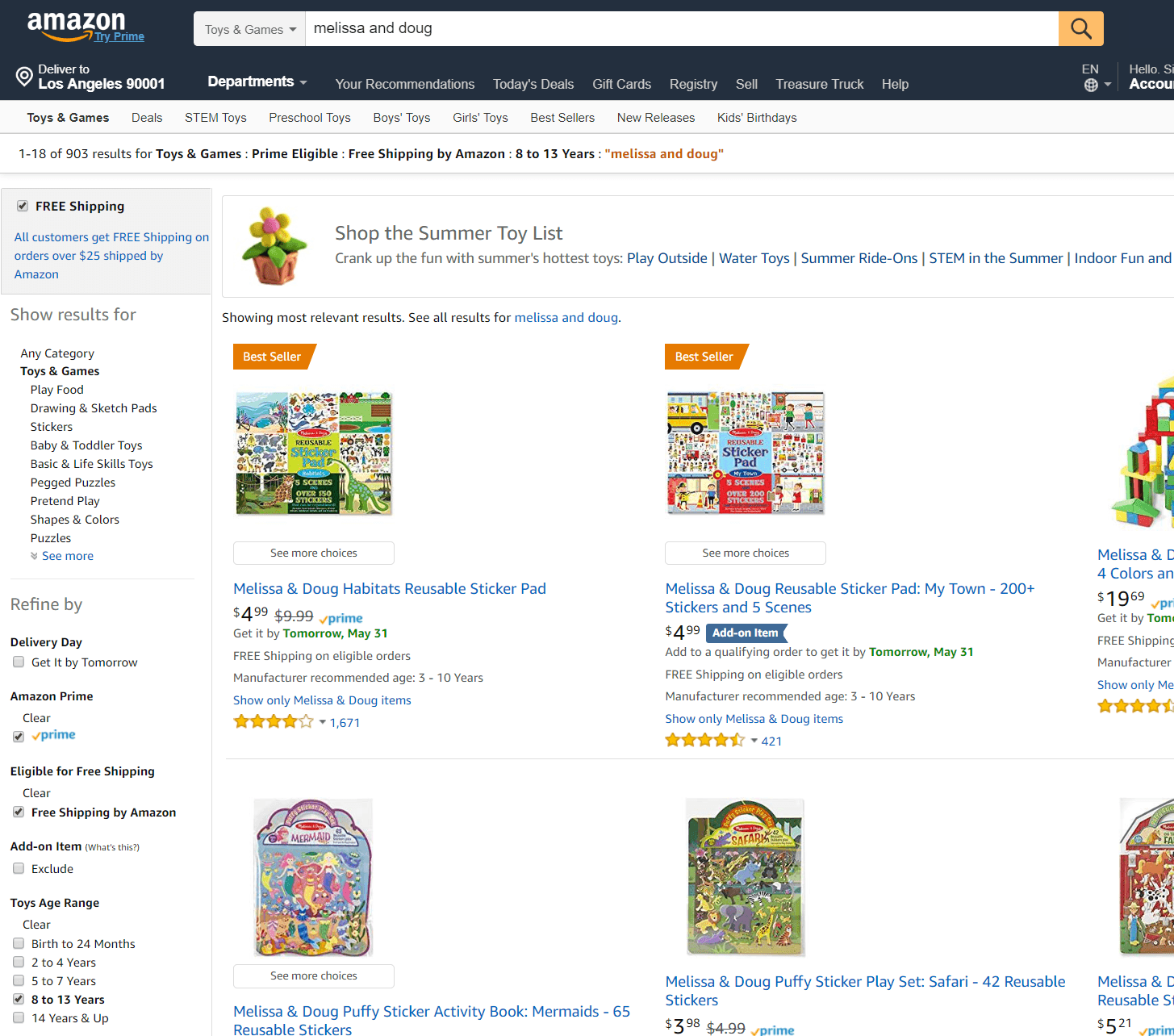
- Show filter selections users make. When you have facets on your site and people select the checkboxes, you need to show the selections on the checkbox themselves. For on-site search facets, you should also display the search terms and the filters at the top of the page.

Amazon displays filter options the user has checked, so they don't need to memorize the choices they've made. - Change the color of visited links. Help the users see which links they've visited by changing the color, so they don't need to recall that information.
3. Make the web pages load quickly
That short term memory limitation of 15 to 30 seconds becomes an issue when your pages take a while to load. Make sure the pages load before the user forgets what they're trying to do.
- Optimize images, and be deliberate about how you use them. Don't add images just for the sake of having them.
- Load different images on mobile. Don't just resize and trust technologies like Responsive Web Design to do the heavy lifting (that will load the same 1 MB image you used on the desktop).
- Chunk information properly. To keep page content manageable, each page should be the best answer to something, and no longer than that. Trying to make pages cater to 5 or more types of user intent can backfire. It can take a lot of cognitive power to sift through the content to find what the user needs.
4. Try to harness existing user mental models
If things are predictable for the users, they don't need to think as much. You should try and make this true for most of their visit.
- Follow web conventions. Place your logo at the upper-right, put navigation elements at the top for desktop, and generally don't stray from common online conventions.
- Use good signifiers to show which elements users can interact with. Make the buttons look like buttons, avoid overly flat design, and use blue links. That should help keep visitors from using time and energy figuring out which elements can be interacted with.
5. Group and limit options
Given that short-term memory has pretty extreme limitations, try to keep the number of choices you display down.
- Minimize top level options to 9 or below, even if it means needing more clicks to get to the page the user needs.
- Make options distinct. Ensure that the images and taxonomy communicate to users how the choices are different from each other.
6. Provide user feedback mechanisms
You can tax the user's cognitive load by sending them on a hunt about what changed on your page. Whenever you can avoid doing that, you should ...
- Have loaders to indicate you are still processing data. When users interact with something and it takes a while to load, notify them that you are still processing by displaying a loader. The signifier should convey that the page will change in a bit, saving cognitive load.
- Draw attention to the area you need the user to look at. When you have errors like fields needing to be filled in by users before they submit something, you can do better than the small red text next to the field. Over 90% of the page will be the same, so you need a stronger indicator to draw the user's eye to what's missing.

Asos.com draws attention to the field the user missed by giving it visual emphasis.
Putting It All Together
Short-term memory is ridiculously limited. You need to keep users from depleting that extremely limited resource as they go about their tasks. That's no small feat.
If you ...
- limit the options you display,
- load pages quickly,
- provide good feedback mechanisms,
- avoid making users memorize instructions, and
- latch onto models that web visitors already use
... you're more likely to make it effortless for users to convert.

Subscribe to Our Newsletter!
Latest in Marketing


