Compare Responsive Frameworks

With mobile becoming a central factor in most brands' digital strategies, responsive frameworks are proving more instrumental than ever for designers.
Bootstrap, for example, is currently among the most popular solutions for those looking to create responsive sites. The platform's newest version is even touted as "mobile first" from the ground up, which means that developers can think about the small screen before adding complexity to the traditional desktop experience. After all, it is easier to expand things on big screens than to condense them on small screens. Yet Bootstrap is far from the only responsive option. Compare some of the features from some of the Web's other top responsive web design frameworks below:
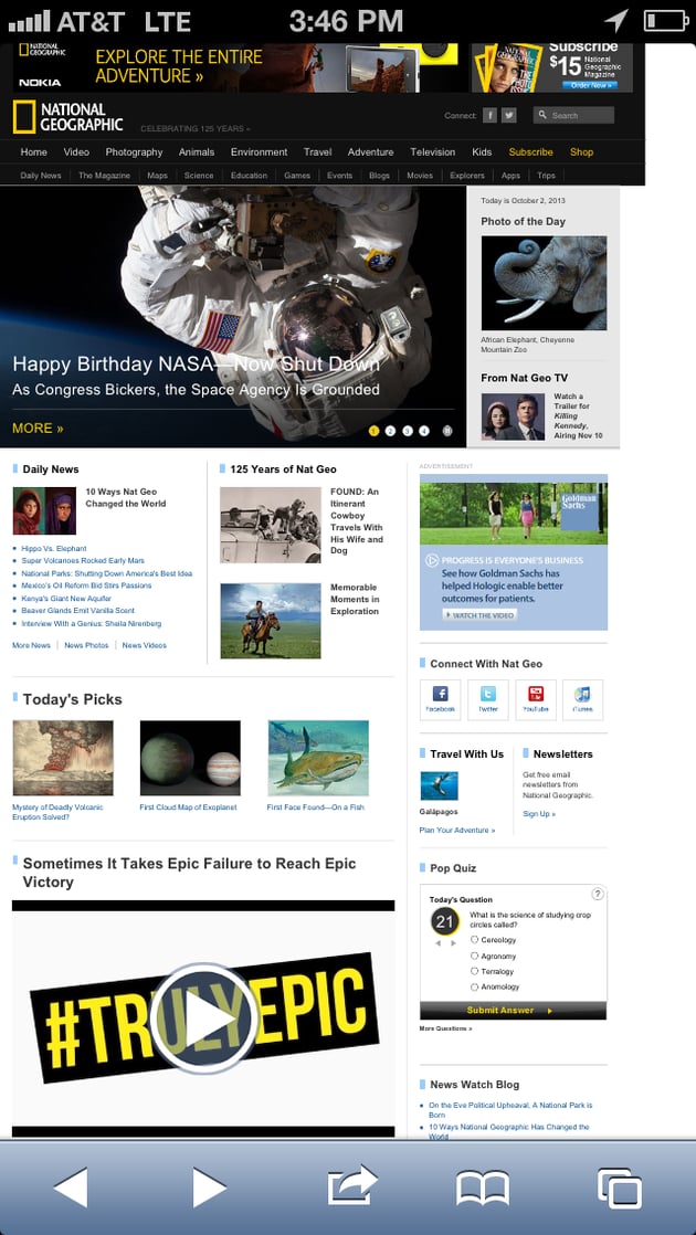
Foundation
Client Example: National Geographic
Zurb's Foundation offers a powerful grid system for developers to build on, which are flexible and adapt to any screen size - from smartphones to televisions. Plus, what's really cool is that Zurb has also included CSS styles that enable developers to hide and show elements depending on device type. Take that Bootstrap!

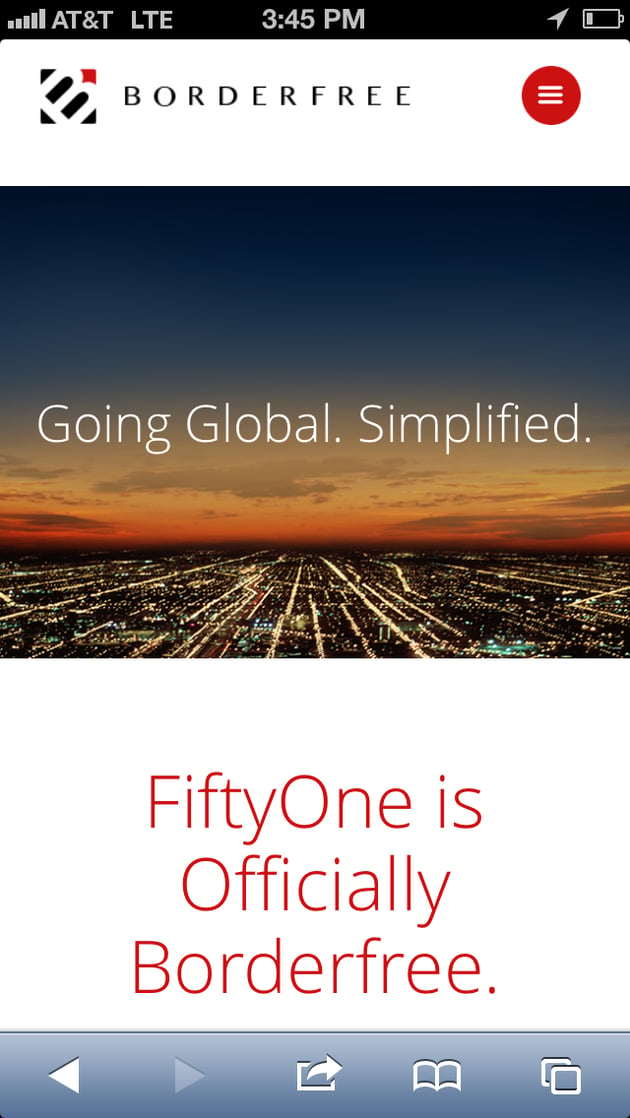
Gumby
Client Example: Borderfree
The Gumby Framework includes a variety of grid-based layouts for any number of different column variations. In addition, developers can customize the Gumby framework to choose which elements, UI modules, colors and fonts they would like in their Gumby packages.

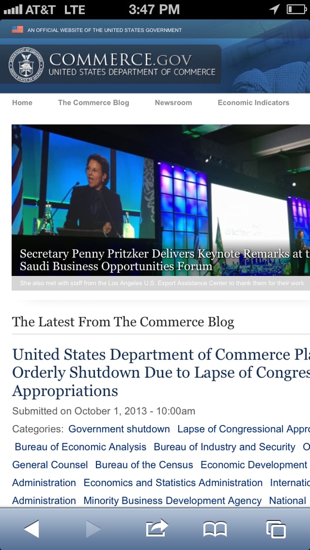
Blueprint CSS
Client Example: Commerce.Gov
This CSS framework helps developers eliminate discrepancies across browsers. The framework's grid can support complex layouts and developers have the ability to add many out of the box plugins for buttons, tabs, fancy type and more.

960.GS
Client Example: Sony Music
The 960 grid system provides commonly used dimensions, based on a width of 960 pixels, to help developers streamline Web development. The grid typically comes with both 12 and 16 columns, which can be used either separately or in tandem. However, designers can also choose a 24-column grid that consists of columns 30 pixels wide.

Responsive.GS
Client Example: Autism Awareness Centre
This responsive grid system also has a "mobile first" mentality. Developers can choose from 12, 16 or 24 columns, as well as optional gutters. In addition, the solution comes with box-sizing polyfill and respond.js polyfill. The former is a fallback for older browsers, while the latter enables responsive designs in browsers that don't support CSS3 media queries.


Subscribe to Our Newsletter!
Latest in Marketing


