9 Rules of Portfolio Site Creation

Designers don't just create résumés, they create portfolios that showcase their best works of art. More often than not, those portfolios are featured on the Web so that they can be easily accessed and shared at any time and from everywhere or used to supplement hard copy promotional materials.
Unlike their paper counterparts, digital portfolios must follow Web design and development best practices, not to mention tricky, and ever-changing, SEO tactics. After all, a site without functionality, and visitors, is ineffective (regardless of how cool it looks).
Discover 9 rules of portfolio site creation that will help make your digital showcase better than the rest:
1. Make a Statement with your Cover Page
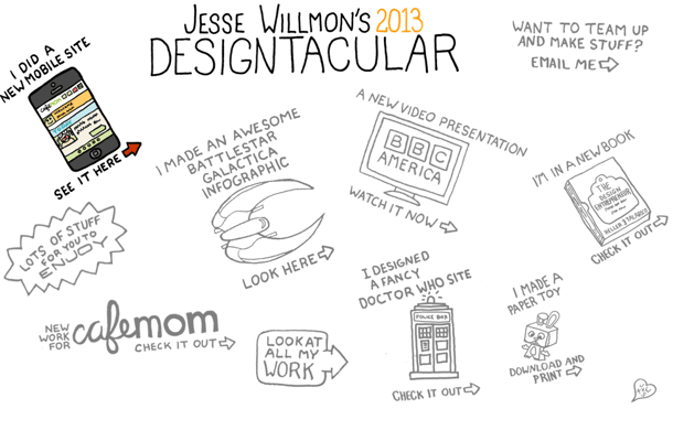
First impressions are everything, which is why it is very important to set the tone with your site's cover page. Whether you want to take a fun approach like Jesse Willmon (below), or a straightforward style like Frank Chimero, make sure that the portfolio's theme stays consistent throughout the entire site. Also, remember that the collection's layout and design elements shouldn't interfere with the site's overall usability.
2. Feature a Clear Menu Bar
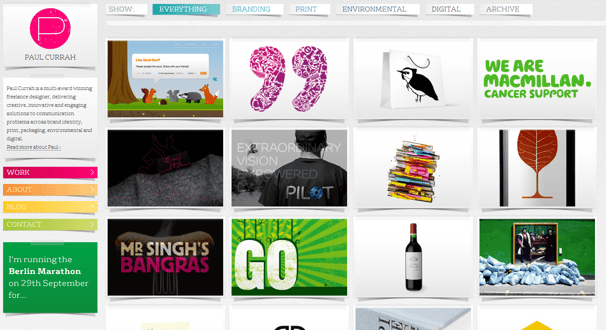
An online portfolio should have a variety of content, including assorted work samples, references, past experience and contact information. In order to get all of this important information seen, designers must feature a clear menu bar on their site, because no one is going to waste their time searching for information that should be readily available. Instead, possible employers will simply move on to the next candidate's portfolio. Paul Currah, for example, not only features a menu bar at the top of his site that makes it easy to navigate through his diverse collection of work, but also features a bright menu on the left side of the page to make it simple for visitors to learn more about him and his skills.
3. Be Selective with Work Examples
I had an art teacher who once told me that for every 100 paintings I create, I will only like one. While she may have been exaggerating a bit, the point is that art (design) is very subjective and more often than not, you will be more critical of your work than others will be. That said, use your critical eye to your advantage by carefully selecting the pieces of work that you want to feature. While it is a no brainer to feature your highest performing work and projects from your most prominent clients, use your best judgment to decide what other examples make it into your featured showcase.
4. Provide Descriptions
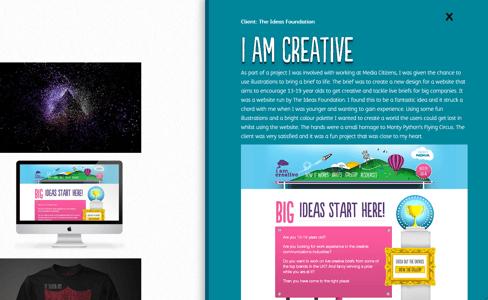
The images of the featured work on your site might make sense to you, but make sure they also make sense to your potential employers. The best way to do this is by accompanying your work examples with short, yet detailed, descriptions. These descriptions should state what the project goal was as well as detail your specific contributions to the project. Olly Gibbs' portfolio site, for instance, features a project title that drops down when visitors mouse over image examples. Then, when images are clicked on, a window slides across the right of the screen to provide visitors with a description about the project.
5. Add Testimonials
Just as user generated reviews are very influential to the decision making process for consumers shopping on ecommerce sites, testimonials can also sway an employer to choose to hire you over another candidate. Philip Bloom does a good job of featuring testimonials by displaying a "What clients have to say" section on the cover page of his portfolio. By doing this, potential employers who may not have been even looking for testimonials can tell that Bloom's work has been deemed a success by previous employers.

6. Be Accessible
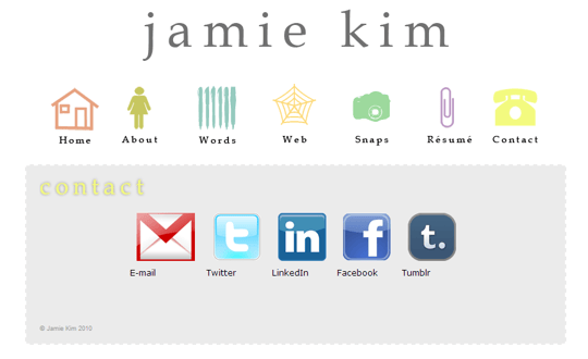
Your digital portfolio is worthless if potential employers can't figure out how to get a hold of you. While some designers choose to display their contact information on every page of their site, you should at least have an "about" and/or "contact" tab featured on your main menu. By doing this, visitors won't have to search for a way to contact you because regardless of wherever else you feature this information on your site, they can easily click the appropriate place in the menu bar to obtain access to this data. As an example, check out how easy Jamie Kim makes it to get in touch with her.
7. Update Frequently
Just as the rest of the professional world needs to keep their résumé up to date, a designer should do the same. This can show employers a few things, including that your work is in demand, that you stay current with new technologies and that you take pride in your creations.
8. Stay Creative
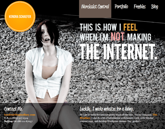
Some designers choose to take a simplistic approach to their portfolio design, while others, like Kendra Schaefer, decide on a more dramatic approach. Regardless of what technique is chosen, designers should make sure to add some personality into the site by including a few unique bells and whistles. So despite which design path you choose to go down, remember to stay creative - after all, you are a designer.
9. Sell Yourself
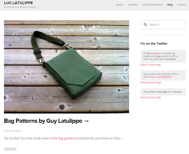
Last, but certainly not least, make sure to promote your portfolio whenever and wherever possible. As mentioned previously, a portfolio that is not seen is ineffective despite all the time and effort that is put into it. This is why designers should actively take steps to increase their site's visibility. This can be done by linking to the portfolio on social sites like LinkedIn, Facebook, Twitter and Google+, as well as featuring some of your work on design-centered community sites, like Behance and Dribble. Plus, designers should include their portfolio's URL on all of their business cards, so new contacts can easily access work samples. In addition, including a blog on your portfolio, like Luc Latulippe has done, can help drive traffic to your website. This is because the Google search engine loves timeliness and authority, and a regularly updated blog can help your portfolio site obtain both.

Subscribe to Our Newsletter!
Latest in Marketing


