7 Creative Ways to Use Short URLs

A traditional, direct URL can take up valuable real estate, which is why short URLs came into existence and became even more popular with the advent of Twitter, where messages, or Tweets, have to be 140 characters or less. Not convinced? Just look at this beauty, which causes this entire article to shift below the ad on the left: https://www.websitemagazine.com/blog/2013/07/31/sift-through-social-to-identify-leads.aspx. Do you really want that in your social media post, or anywhere else for that matter?
When a company needs to bridge the gap between the on- and offline worlds, they often use short URLs, or sometimes QR codes, to make it easy for consumers to access their products or services on the 'Net. Short URLs are also trackable. Let's take the former URL as an example, if I add a source code to the end (?source=urlarticle), I can take that long string of letters, numbers and symbols and make it easier to look at, remember and, more importantly, track (wsm.co/identifyleads13). If Website Magazine used that short URL in any of the following 7 creative ways, we'd easily be able to identify the source.
1. Infographics
There are infographics (visual representations of information) for almost everything these days, from Gold vs. Cats to Infographic on Infographics. Most infographics include a collection of data from outside sources. These resources have long URLs included under the graphic and are often illegible (excessively small font). Let's throw the original source a bone and give them a URL that a user may actually use.
Even better, infographics are often shared, which is a main reason for creating them in the first place, so graffiti your website's short URL all over that bad boy in case the poster doesn't follow proper infographic etiquette and fails to link to your site.
2. Print Ads
For branding reasons, it's better to use your website address in a print ad where the primary purpose is to gain credibility, target a specific audience or reach readers who are already spending money on products or services related to the topic at hand. However, if you have a specific event or announcement you are advertising (that has a long URL attached to it), use a short URL. For instance, Ektron and MethodFactory are offering a webinar about learning to create personalized Web experiences that increase engagement. In Website Magazine's print issue, we turned this url (https://event.webcasts.com/starthere.jsp?ei=1019610) into this (wsm.co/BoostYourDigitalImpact). One is definitely more memorable than the other. Furthermore, well, up until now, anyone visiting came from print.
3. Pinterest
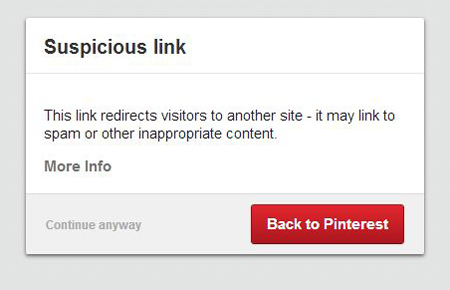
Pinterest is all about links and pictures, but the latter typically gets all the glory. Pinterest users are skimmers, so they are browsing images until one peaks their fancy. If the image you use in your pin doesn't have room for a full URL, include a short URL as a sort of watermark on your images and possibly build brand recognition and visits. It should be noted, that linking images or posts to short URLs in Pinterest, however, can cause this:

4. Promotional Items
When pressed for space on company swag (think Frisbees, T-Shirts, water bottles, et.c), include a short URL (obviously a vanity URL is better, like Website Magazine's wsm.co).
5. Presentations
Say you are presenting to a room full of people, whether it be colleagues or bosses, and you want to include stats and other data to back up what you are saying. It's easy (and doesn't take up too much room or take too much jotting down) to include short URLs in PowerPoint presentations or video.
6. Billboards
Since pictures say a thousand works, we'll let this one do the talking:

7. Forward to a Friend
When you are sharing links with friends or colleagues (either through a program like gchat or in a Facebook message) where hyperlinking text isn't an option, give them an easy URL to work with by shortening it. You can even be clever and do a Jedi-mind trick to persuade their decision (like when picking out an article image before deadline): wsm.co/peterwilllovethis1.

Subscribe to Our Newsletter!
Latest in Marketing


