6 Super Call-to-Actions (Plus Tips)

Whether it's completing a project or taking an action, people will take as long as you give them to do it. This is why in business, deadlines (enforceable ones) work and why, on the Web, call-to-actions (good ones) are integral to a website's success.
IaaS and Web hosting provider SingleHop recently released an infographic (click here) that details five tips for a more successful call-to-action (CTA). In it, the company details that, unsurprisingly, the click-through rates (CTRs) of above-the-fold CTAs are substantially higher (72 percent) than below-the-fold CTAs (47 percent). While that may be best practice number one, SingleHop provides interesting data on the fact that buttons, as opposed to text, provide upward of a 200 percent higher CTR. With SingleHop's tips in mind, Website Magazine has compiled six super CTAs.
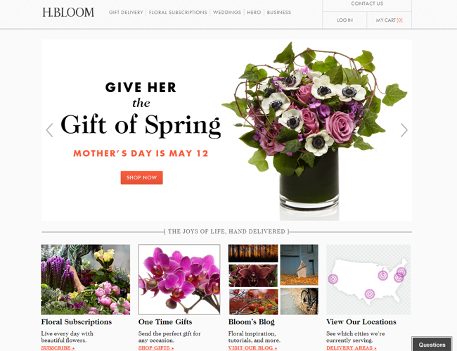
H.BLOOM
Super CTA: Nothing creates urgency (and a sense of value) more than mom does. By providing the date for Mother's Day, the copy leading into the CTA enhances the urgency and the words "Shop Now" are direct. Additionally, this floral subscription service's CTA uses high contrast to grab attention.
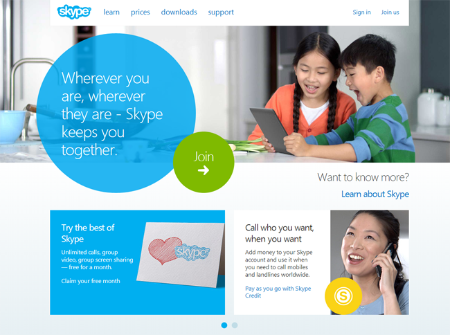
SKYPE
Super CTA: In SingleHop's infographic, it's suggested to play with shape, which Skype uses in a purposeful manner. It's clear to the user that the CTA is part of the product description and the best course of action is to "Join."
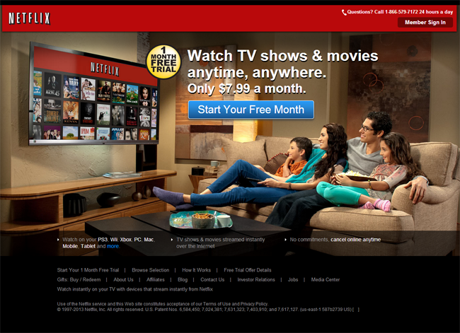
NETFLIX
Super CTA: After offering a one-month free trial and then conveying value (e.g. you can watch your programs wherever you want), Netflix directs users to "Start Your Free Month." Notice that Netflix uses its above-the-fold real estate to confirm and then reconfirm that a one-month free trial is available.
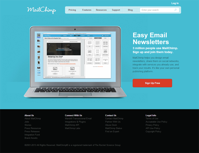
MailChimp
Super CTA: This beautiful, sleek homepage uses a calming color palate, but hits users with a sense of urgency with its "Sign Up Free" CTA.
Volusion
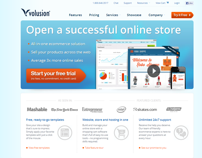
Super CTA: Volusion wants users to try their product for free. If you couldn't tell, the ecommerce software provider uses the same CTA in the center of the page (larger) and in the upper right-hand corner (smaller) to reinforce where they want users to go and what they'll do when they get there.
PagePart
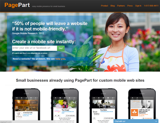
Super CTA: While PagePart's CTA differs from the rest on this list, it's appropriate for this mobile and social Web platform, because business owners want to create a mobile website, which is why they ventured to PagePart in the first place. The words "instantly" and then "Go" provide even more urgency.
Bonus: There are myriad factors to keep in mind when designing a website, but there are many seen repeatedly (like a missing call-to-action). Make sure your site isn't making these mistakes by checking out this article by Rafi Sweary, the co-founder of WalkMe.com.

Subscribe to Our Newsletter!
Latest in Marketing


