5 Ways to Show Off Your Brand Onsite (and Why You Need To)

Your brand is your company, concentrated to a viable and recognizable essence.
Your website is a medium for you to engage with your current and potential customers and earn more revenue from your existing relationships and by establishing new ones. It only makes sense that you should use your website to showcase your brand as much as possible. But why and how should you go about this?
The Importance of a Strong Brand
Your first job is to realize the importance of a strong, consistent brand:
- Reinforcing positive experiences. Having a brand associated with a positive experience, such as reading great information in an article or successfully purchasing an interesting product, will encourage users to come back for repeated experiences.
- Building familiarity. Having a consistent brand also helps users become more familiar with your company, which leads to increased trust and loyalty.
- Differentiating yourself. Branding also gives you the opportunity to differentiate yourself from your competitors.
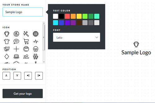
To achieve these three goals, you'll need to ensure your logo is visible and consistent - otherwise, your customers may not be aware of your brand, or won't have the chance to build a relationship with it. If you need help getting started, there are plenty of tools online that can help you build a logo (like Shopify's shown below). You could also seek the help of a professional designer or use a crowd-sourced marketplace like 99Designs.
Strategies to Make Your Brand More Prominent
Now that you know why your brand is important, you can start picking strategies to make it more prominent on your website.
1. Keep your logo visible at all times.
A brand is more than just a logo, but your logo is the most recognizable and easily transmittable piece of your brand, so display it prominently and often. Your logo should be visible on every page, and should have extra visibility in key areas of transaction, such as a product page or your blog. What's more, it should link back to your homepage, as Web users have come to expect this navigational element.
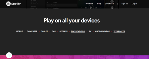
Keeping your logo visible at all times also works for sites that use parallax scrolling. Take Spotify for example, as users scroll down the page, the logo remains fixed in the upper left-hand corner.
2. Choose your colors, layout and fonts carefully.
These may seem like peripheral, superficial choices, but they can go a long way in supporting the voice and image of your brand. Branding doesn't have to be obvious or spelled out for users-it can be conveyed to them through subtle means that suggest a personality, or otherwise define the aesthetics of an experience. Every color of your site, and every element of your design should be scrutinized to fit your brand perfectly.
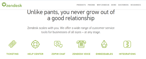
Zendesk, for instances, uses the green in its logo throughout the site - without overwhelming the visitor.
3. Have 404 pages and effects unique to your brand.
Add unique touches throughout your site that only your brand can claim. For example, you might create a tongue-in-cheek joke for your 404 error page, or add unique hover effects to your menus. These little twists on conventional design choices will stick out in your users' minds, and make your brand more familiar to them.
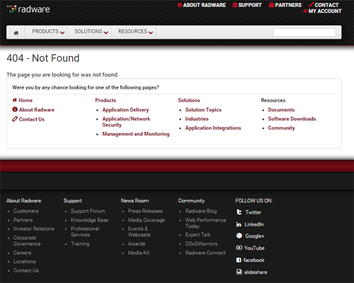
While there are some pretty clever 404 pages to choose from, Radware provides a good example because of a Web performance monitoring company, it stays on brand and provides links to other relevant content, as well as uses the maroon color associated with its brand.
4. Write in a tone unlike those of your competitors.
Your writing is a fantastic, yet underrated medium for demonstrating your brand. Think of your Web copy as being a megaphone for your brand's voice; who is your brand? What is your brand's character? Your tone, your word choices and your sentence structure can all lend themselves to demonstrating a cohesive character. And since you can write copy throughout your site, you'll have ample opportunities to demonstrate it.
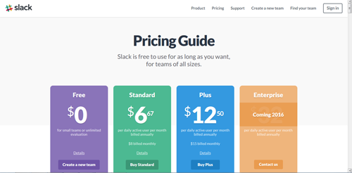
Slack, for example, tends to speak casually to its current and prospective audiences and its website reflects this no-fluff attitude.
5. Reward engagement with your brand.
This is key to building more positive experiences with your brand, which in turn builds memorability and familiarity. Whenever a Web visitor engages with your brand, you need to reward them with some signature brand response. For example, after a conversion, you might lead a user to a custom thank-you page with your brand prominently displayed, or you might include a brand-specific message that acknowledges people who leave comments on your blog.
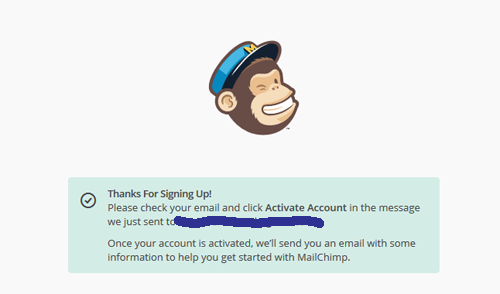
MailChimp provides a thank-page with the person's email address of where the confirmation will be sent. Additionally, it includes the MailChimp logo to show off its brand.
One of the most important elements to any branding strategy is consistency, so don't neglect it. Follow all of these principles for brand demonstration on your website, and try your best not to deviate from your chosen standards. The more your customers grow to learn and become familiar with your brand, the more loyal they'll be, and the more business you'll stand to gain.
Larry Alton is a professional blogger, writer and researcher who contributes to a number of reputable online media outlets and news sources. In addition to journalism, technical writing and in-depth research, he's also active in his community and spends weekends volunteering with a local non-profit literacy organization and rock climbing. Follow him on Twitter and connect with him on LinkedIn.

Subscribe to Our Newsletter!
Latest in Marketing


