3 Benefits to Turning up the Heat with Heatmaps

In today's digital age information is the key to success.
Luckily for businesses, there are many tools readily available that aim to deliver actionable data. From social media impressions to bounce rates, there are a veritable breadth of solutions available for businesses to leverage.
One of the more interesting available to businesses is heatmaps.
Creating a perfectly designed website is thing of fiction. There are nearly always changes that can be made to websites to improve both their overall functionality and their user satisfaction. Heatmaps allow designers to identify both successful and problem areas of their websites with the goal to improve the sites overall effectiveness.
There are multiple version of heatmaps (scroll and clicks are just two) and each can add something to the overall story. Below are three ways in which heatmaps help designers to increase the effectiveness of their websites.
Discover What's Really Clicking with Consumers and What's Not
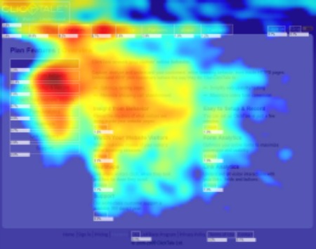
Part of the beauty with heatmaps is their simplicity. If an area of a website is heavy in user interaction it glows red (color depends on the service) and the darker, more intense, the red the heavier the user interaction. This allows designers to be able to gather information quickly on what is performing well instead of having to sift through pages of reports. Instead designers can see that one area is getting the most interaction and then they can decide "OK, what type of interaction are they getting?" and then proceed to a specific part of their reports.
Conversely, heatmaps also show designers what areas of their site are as cold as ice. With scarcely viewed areas being displayed in a cool blue color, developers will have no trouble differentiating between areas of great and little interest.

Identify Where to Place Features
Heatmaps not only let designers know which content on their website is the most popular but also what areas of the pages are receiving the most attention. This benefit can help designers to figure out where to put call-to-action's in order to increase their engagement chances.
For example, if your heatmap is showing that the sidebars on your site are barely receiving any engagement, whether it by mouse-overs or clicks, would that be a smart place to put a call-to-action feature? No. Instead, look at which areas are receiving the most engagement and try and identify a spot to insert your call-to-action there.
To help designers in their quest for correct content placement Nielsen Norman Group, a user experience consulting company, conducted a study back in 2006 in which they discovered that users read content on the web in an F-shaped pattern.
Identify and Eliminate Distractions
There are always burning questions when your website is not performing as it should be. While you may be asking "Is there something wrong with the code?" or "Did we link to the wrong page?" the answer may actually be much more simple, a distraction.
From pictures to calls-to-actions, there are a lot of features on websites that can distract its users from what the website was actually designed to achieve. In fact, Techwyse, an Internet marketing company, used heatmaps to find that contrasting colors draws users eyes and attention whether used in pictures, text or call-to-actions.
With the ability to definitively see which areas of a website are receiving the most attention, designers can discover what features are distracting users from the websites end-goal and ultimately eliminate them.
Heat Things Up
With no technical or coding skill necessary to operate heatmaps, they provide all designers and businesses with an excellent tool to help them review the performance of their website. While heatmaps will not give you all of the information that you need to know, when combined with other analytics resources they provide designers and businesses with a greater understanding of the consumers journey on their website.

Subscribe to Our Newsletter!
Latest in Marketing


