Why do people like a website? The answer lies in its design, the information it offers, its functionality, interactivity, and the list goes on. But if you were asked to point out to one defining feature/design element that has made you fall in love with a site, there is a very good chance you'll point out to the website imagery as a critical reason. Visuals have always been a powerful means of communication. In spite of the emergence of design minimalism as a popular design style of choice, images are still an important component of successful websites, like it or not.
If you are designer who believes you can get away with choosing just about any image and your visitors will give your design a free pass, you've got another thing coming. You are designing a website for highly mature internet audiences now who can identify a common stock image when they see one and who are put off with irrelevant, low quality imagery. A bad image choice has the potential to ruin your website in more ways than one. It negatively impacts UX and UI, the website conversion ratio and also its credibility.
Your core focus must be on choosing the right image. Here are 10 tips that tell you how:
1. Above Everything Else - Quality

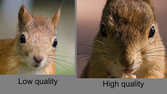
Large, pixel perfect, high resolution images always work best. Obviously, it is your design concept that determines the size of the image, but its size needs to be enough for it to make an impact. Such images look impressive and display a professional approach towards Web design.
2. Brand Relevance

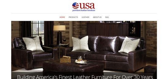
Your images must be relevant vis-à-vis your brand identity. If a brand's selling premium furniture, the images must exude the extremely classy nature of the furniture. USA Premium Leather Furniture is a brand that manufacturers premium leather furniture. Visitors are left in doubt as to the brand's purpose, purely because of its images. They do the talking for the brand.
3. Actionable
Actionable images are call-to-action images, the kind that persuade a visitor take action. What you are ensuring is that your images play a tangible role on your site and don't just improve its visual quotient. Brands in the food industry, like Burger King, do such images best. Tell me you don't want to place an order for a 'bacon cheeseburger deluxe' when you look at its image.
4. Powerful
National Geographic uses images that make you want to go through the stories on the site. The raw power of these images holds your attention, keeps you engaged and makes you want to know more about them. Such images strengthen the content on your site. Remember, you need some kick-ass content that isn't overwhelmed by the powerful imagery. One shouldn't overwhelm the other.
5. Unique
What if your brand's offering services in a saturated niche, and still wants to stand out? In such cases, you must get your images into the act to work in your favor and differentiate your brand from its competitors. Your images must tell your target audience that you are different and why you are different.
Amazee Labs is a firm offering Web consulting, Web development and Web hosting solutions and specializes in Drupal websites. There are plenty of such companies offering these services; the competition in this domain is tough. But you are tempted to take a look at the site and its services purely because of its images that have a degree of uniqueness about them.
6. Images to Replace Text - The Visual Hook
You must come across plenty of websites with text-heavy pages that do have images but they aren't the centerpiece of the page. The text is a good read but going through the pages isn't a very enjoyable experience. But what if the text was replaced with images? Such pages hook visitors like nothing else can.
Vity's Design specializes in the custom design of bikes and its landing page focuses on the contextual use of images rather than text, to make its point. The effect, to put it mildly, is absolutely brilliant. This is the kind of impact that you cannot achieve with text.
7. People
Photos of people have the potential to boost the conversion ratio of your website. But, avoid using stock photos of people. While this might be necessary sometimes, tragedy awaits your site if you've used common stock photos of people that your users will come across many other sites. In such cases, people photos can actually have an opposite effect due to their lack of credibility. What people are looking for are photos that look authentic. Visitors must believe that these are photos of real people that are in some way associated with your business.
Providence College Vantage Points is a text book example of how photos of real people get the website's message across with the necessary impact.
8. Emotions
Some images have emotions baked into them and these are perfect for notching up the conversion rate of your website. Cat Magnet is a premium brand selling fishing tackle and apparel for anglers. It wants to project catfishing not just as another activity but a way of life; and it does so through its images. They are fun images of people proudly displaying their catfish catch with satisfied expressions on their faces. That's what emotional images are all about.
9. Nothing Happens Without Effort
The eight tips that came before this one can only be accomplished with a great deal of effort. On most occasions, designers don't really have specific instructions from the client regarding the use of images and there is no budget set aside for them. This means designers are forced to use free images that might or might not be used elsewhere. In such cases, they must make it a point to go through free image sources to come up with perfect images aligned with their design concept and website objectives.
10. Give them the Importance it Deserves
Images shouldn't be used as a decorative element. They are way more than that. Think of an image as the key driver of your website's success and you'll be able to choose the right images. Make sure you identify the kind of images you will use at the conceptualization stage itself. Do not use images as an afterthought.
One of the cardinal mistakes that Web designers can make is thinking the efficacy of an image begins and ends with its visual appeal. They fail to consider the various other characteristics that go into the making of an ideal image for their site and pay the price for it. Hopefully, the tips given in this article will make sure this doesn't happen.
Author Bio: Jeff Davis is living in California and currently associated with Quick Laptop Cash - A place for selling a laptop online. He has been in this field for the last 6 years and is responsible for troubleshooting issues. Interact to discuss projects, technology solutions.
