Rethinking Marriott's Brand Identity -- One Email Design Element at a Time

As brands grow, merge and undergo inevitable business transitions, their image must evolve to reflect their changing identity. Even the most iconic and recognizable brands have reinvented their visual identities at one point or another (consider Coca-Cola, Apple and Shell to name a few).
When Marriott International decided to update the brand identity for its loyalty program, Marriott Rewards, we knew we needed to update the look of our digital brand communications, starting with a new email template. Our primary objective for this project was twofold: to effectively depict our updated brand positioning and to simplify the overall look and feel of the email template design -- all while complying with email best practices.
When designing an email template, it's critical to keep the subscriber in mind. Will they connect with the overall look of the email you are sending them? And how will they interact with its content and ultimately, the brand itself?
To create an eye-catching template that engages subscribers and reflects the brand image, start with these steps:
- Identify and implement key brand components
When redesigning an email template for a brand refresh, first determine what elements and characteristics define the essence of the brand.
In other words, if the logo is removed, what design elements (e.g. color palette, fonts, photo and illustration style, visual composition, etc.) make or break a brand's identity?
For Marriott Rewards, it was clear that our fonts and photographic style would constitute the pillars of the new brand -- and particularly, the way in which those fonts and photos play off each other to convey trust, hospitality and relaxation.
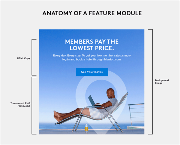
In practice, this had us placing headlines over large, experiential images - a look that is simple to execute in print, but tricky to execute in an email. This concept was what the style guide called for, which presented an issue we needed to solve. The solution we arrived at was using background images with clickable PNG overlays, as seen below.
- Choose fonts wisely
Before determining how to pull off the copy-over-image look in an email format, first marketers should take a look at what fonts should be used in the template update.
Choosing the right font should be central to any template redesign, as it is a pivotal element of your overall messaging and tone. Every font evokes its own unique mood and personality, and it's important to choose one that complements your brand messaging and supports your design goals. Fonts influence the look and feel of the entire template design and ultimately, represent the brand behind the email.
When deciding on a font, using Google Fonts in email is a safe and simple practice because fonts are natively hosted and easy to embed by simply adding a snippet of code to the of the HTML document. However, even though embedding Google fonts is a safe option, we needed to use the exact brand font -- which included hosting it on our servers and assigning fallbacks.

- Start with a blank slate
Starting fresh can be intimidating, but an email template rebrand is the perfect opportunity to optimize the design, create more robust content and declutter unnecessary elements. For email marketers, thinking about what resonates with your subscribers -- and what unneeded content doesn't -- can ultimately drive consumer engagement.
Rethinking Marriott's visual identity, we used this project as an opportunity to modernize the design.
A quick glance through your inbox will reveal an industry trend toward minimalism: less copy, larger images, more white space and less content. We achieved this look through a minimalistic "shell" that allows the content to steal the show.
The original Marriott Rewards email template opened with a header displaying specific loyalty member information. To declutter the overall look in the redesign, we moved these data points and the search bar into separate modules, which we can toggle on or off depending on the campaign.
Whether completely overhauling your brand, or simply looking for a fresh new look, an email template redesign is more or less inevitable. But while email presents a unique set of technical challenges, with wisely chosen design elements and coding know-how, brands can create templates that adhere to email best practices and resonate with the brand and subscribers both.
About the Author
Afton McCann leads the creative vision of the Marriott Rewards email program at Yes Lifecycle Marketing. A graduate of The School of the Art Institute of Chicago, she has over six years of design experience with major brands.

