Create a Custom Email Template to Boost Your Email Marketing

:; By Kim Robbins, AWeber ::
Savvy marketers need not to be convinced about the value of email marketing, and one of the best ways to boost email marketing this New Year is by enhancing the look and feel of outbound messages. To be more specific, invest in a custom branded email format and watch your email marketing go a long way.
Building a custom email template from scratch is no easy feat. Sure, it has a lot to do with creating an eye-catching design, but how does that design look when customers are reading your messages on-the-go? Does it appear distorted on their mobile or tablet device? To ensure it doesn't, here are some things to be on the lookout for in your custom email design.
Responsive code
Responsive emails are designed to scale down and rearrange content in smaller screen sizes. This is done by first setting CSS media queries based on the various devices that your clients or customers use. CSS media queries let you target CSS rules based on factors such as screen size and device-orientation; meaning you can use media queries to manipulate a CSS for a specific device (iPad, iphone, printer, etc.) or create a responsive website or email design. But be careful; all email clients aren't created equal so there are some limitations to CSS media queries and email design. The main issue is that some email clients don't fully support CSS and media queries. If you're looking to create a responsive email that works across all clients and across various devices, screen sizes and resolutions, check out AWeber's base code for responsive email that works everywhere. Once media queries are set for your custom email design, then apply the styles you want inside of each respective query.
Clunky columns
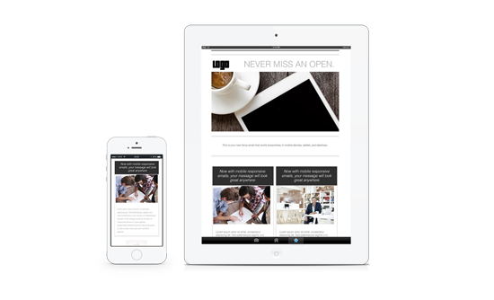
Columns may look great on desktop, but on mobile your messages will go from neat and orderly, to squished and overwhelming. Here's why. Columns resize themselves on smaller screen sizes, making your messages harder to read and prompting more work for your audience--think more scrolling. If you have multiple columns, try moving some of the information into a header or footer or adding a width of 100 percent to the column CSS once you get to a certain media query. This way, the columns will auto-adjust, span across the entire screen and stack on top of each other beautifully.
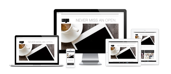
Image size
If you're following marketing best practices, your custom template should be image rich and not text heavy. That said, image sizes are another factor to consider for your email message output. Force images to scale no matter what size the device they appear on. Bind them with the following CSS inside of a media query and then your image will scale responsively without stretching, no matter what size your device is:
img {width:100%; height:auto;}
Marketing best practices
Custom templates can be created just for you to help reinforce your company's brand. Make sure the design includes your company's logo, tagline if you have one and buttons that link to your various social pages. A customized design that matches your brand and supports other marketing materials promotes consistency, which adds instant credibility and sophistication to your email marketing campaigns.
Once the template is complete, test it a few times to ensure that adding and replacing content is effortless and easy to navigate for ongoing use.
ESP compatibility
If you're doing a significant amount of email marketing, you're most likely using a popular email service provider to send marketing messages to your customer base. Be sure that your custom design speaks the template language of your ESP and is compatible on the platform. Have a consultation before you get started, or see if your ESP has a custom template offering to create a template for you.
A custom template can boost your email marketing efforts in 2015. By creating a custom template, you can help your email messages stand out in the ever-crowded inbox, save time and improve the overall experience for your customers.
Kim Robbins is a Custom Template Expert at AWeber where she creates tailor-made email designs for AWeber's customers.


