What Retailers Should Know About Infinite Scrolling

By Shaun Chatman, Copypress.com
The concept of infinite scrolling is best understood as a bottomless page. When a website visitor scrolls down on the page, another batch of articles is added. A popular site with thousands of articles could feasibly load hundreds of pieces of new content without a visitor ever having to click, "next." What's more, infinite scrolling works out-of-the-box for most WordPress themes.
Amazingly, many readers have no idea that this behavior is occurring. The only notification of infinite scrolling in action is a loading icon that displays very briefly while the page updates. When handled correctly, infinite scrolling provides seamless page integration for content-heavy sites, but is it right for retail sites?

(Image via Flickr by stefanosarta)
The Positives of Infinite Scrolling
The pros and cons of infinite scrolling are a hot-button topic on the Internet. The biggest pro is the organic one for which it was created. It loads content continuously in the background, providing the user all the topics or products they could want in real-time. It has the ancillary benefit of being an efficient way for readers to consume information, an important need in the realm of social media. Similarly, online consumers who are doing more browsing than goal-based shopping, get to see hundreds of products they may never have come across if they were using on-site search, clicking "next," or filtering results in some other way.
The other positive aspect of infinite scrolling from the user perspective is that it delivers more content than an ordinary page without the need for a click-through by the reader, which is a plus for shoppers who are using smaller screens to access a retail site. What's more, smartphone users are already familiar with infinite scrolling within their social media apps - Facebook never ends, Twitter doesn't either and Pinterest is also bottomless.
The Negatives of Infinite Scrolling
In the early days of the Internet, the premise was that a search for a term would deliver a specific result. Infinite scrolling can and usually will subvert those results. A highly active page could have added dozens of results since the time the search engine spider captured the result.
While more intuitive site designers account for this by providing exact Web addresses when appropriate, algorithms are still inefficient at this point. Ultimately, a user who visits a website expecting certain information may be left wanting. Even worse, if the site in question is image-intensive, a smart device user will experience a great deal of aggravation before giving up because the content may take too long to load. In the wrong hands, infinite scrolling is one of the worst designs on the Web.
How to Use Infinite Scrolling Correctly
Sites with low engagement should consider implementing infinite scrolling. Think about visits to Twitter or Facebook. Users want quick access to a streaming flow of information. A lot of it is white noise, but there is useful information as well. As long as user interaction is minimal, the design works.
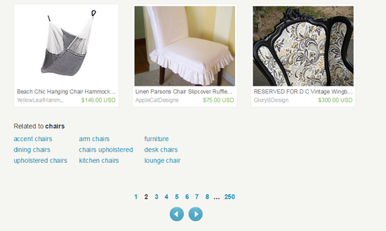
Compare that philosophy to a site such as Etsy, which had a notoriously bad experience with infinite scrolling. What the company learned is that a flood of content wreaks havoc with the attempt to purchase a single item. This blog post provides some assumptions on why infinite scrolling on Etsy failed, one of which is the fact that many shoppers, when browsing product result pages, will click on a product, view the product page and then return to the product result pages. The problem with that user habit and infinite scrolling is that infinite scrolling does not hold the shopper's "place." A look at Etsy.com now, shows it has reverted back to 48 results per page.

Infinite scrolling is not going away, so it is imperative that you understood how it works and when it works well.
Author Bio
Shaun Chatman is a seasoned writer featured on many authority blogs. Writing is his passion, and he spends most of his waking hours writing about everything from Tech to Education. He lives in Dunedin, Fl. He contributes regularly to many websites and is a featured contributor at Copypress.com.


