Trick or Treat: Tips for Retailers to Improve the Online Shopping Experience

By Rory Dennis, Amplience
With Halloween just days away, haunted houses and trick-or-treating are top of mind for many. While these activities may be fun, there's a time and a place for both, and the last place we want to encounter either is during an online shopping experience. Depending on the channel and device, online shopping can either be a treat, or be quite tricky. Luckily, by focusing on a few key components of website design, retailers can help customers avoid any sneaky surprises and ensure a sweet user experience, no matter if they're shopping from a smartphone, tablet, laptop or desktop.
Don't Get Lost In a Maze of Content
For consumers, if a website isn't easy to navigate, it can feel like they're wandering through a corn maze. Users can find themselves searching aimlessly through tabs of unorganized products, unsure of where to look and unaware of what they'll find on the next page. To prevent customers from feeling lost, incorporate a list page that allows them to quickly browse a selection of products that fall into a specific category. List pages enhance the shopping experience by providing multiple merchandising options. For example, the use of roundels draws the shopper's eye to new items or a special offer and helps them zero in on the products they want to investigate further.
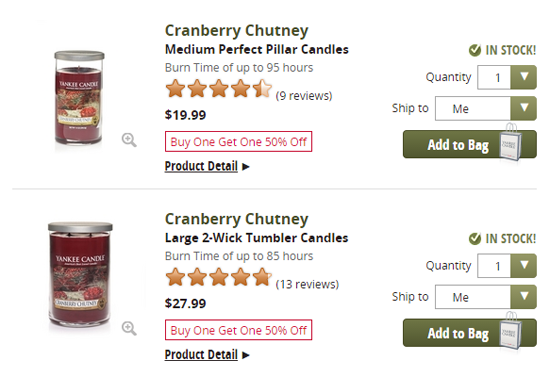
Yankee Candle uses roundels to indicate which items are part of its "Buy One Get One 50% Off" promotion.
Or, by showing alternative views upon mouse-over, retailers can provide interactivity that engages browsers, while simultaneously delivering more content to view. This opens up new buying avenues for customers and improves sales for the retailer.
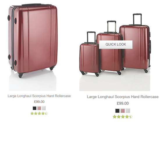
On its product listing pages, Marks & Spencer give website visitors the ability to hover over a product image to see alternative views.
Boo! Product Pages that Pop
There's nothing scarier than two-dimensional product pictures and an unsightly product description. Providing great imagery and interaction capabilities is key for retailers looking to convert customers to sale. The incorporation of rich media does the trick-think zoom, 3D imaging, product views from various angles, movement, etc. The online shopper doesn't have the luxury of touching, trying on or physically interacting with products as she would in-store, but the goal of enhanced product pages is to provide the next best thing. Customers should feel like they have an in-depth understanding of the product before they buy to avoid surprises when the package arrives on their doorstep.
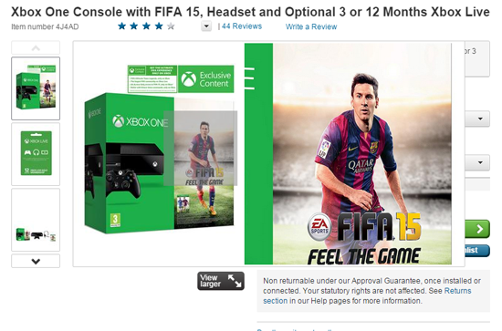
Woolworths.co.uk provides zoom-in capability for all its product images.
A Real Treat: Bring Commerce to Content Pages
Having the ability to purchase directly from the content pages can be an unexpected treat for customers. By providing the ability to buy right at the point of inspiration, retailers remove the hassle of the traditional check-out page. Plus, providing buying power at this point capitalizes on interest and excitement about a product instantly and reduces the risk of losing customers due to a time-consuming or complicated check-out process. This means a smoother, goosebump-free purchasing experience for the user, and higher conversion rates and increased revenue for the retailer.
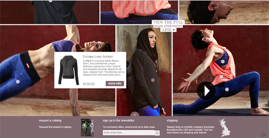
On Sweaty Betty's website, shoppers can buy right from the point of inspiration by simply clicking the little plus on the item.
Mastering the Multichannel Monster
We live in an always-connected, device-saturated world, and consumers are utilizing all avenues and digital touch points to research and purchase products. For the consumer, this provides greater flexibility and versatility. But what does this mean for retailers? Frighteningly enough, it means increased challenges with managing content delivery across multiple devices.
Luckily, retailers don't have to fear the multichannel monster. Today's adaptive design solutions, using dynamic imaging technology, help retailers effectively address these challenges by resizing content on the fly. The best part: the resizing process is fully automated and streamlined. This helps designers ensure that a site performs well across all devices.
There's no arguing that online shopping can be a frightening experience. However, the goal for retailers, no matter how scary the monster, is to ensure the fast delivery of high-quality content so that users enjoy a positive shopping experience, not an online fright-fest. By designing a website that features elements like zoom and product rotation and optimizing engagement across device types and platforms, retailers can ease customer fears and make ecommerce horror stories a thing of the past.
Rory Dennis co-founded Amplience and is GM of Amplience in the United States, developing Amplience's presence in North America. Rory previously worked as Business Development Manager for O2 Ireland's Interactive Media Team.


