Top 10 Split Tests for Merchants to Try

When it comes to split testing - send Group A this email and Group B that one and the best-performing email goes out to everyone else - many companies fail to think beyond testing subject lines. This is a mistake, according to the president (well, kind of). During the 2012 election, President Barack Obama's camp tested as many as 18 variations before choosing one to send out to the masses. Since he won, after all, ecommerce merchants should follow suit.
In fact, President Obama's team tested nearly every aspect of their emails, from subject lines, to content, to formatting. Although there may be some obvious differences in running for president and operating an online business, there is one glaring similarity - each lobby for email subscribers to open and engage with their messages. Of course, there are also similar sleepless nights, gray hairs...but that's a conversation for another time.
Here are the top-10 split tests for merchants to try (remember: only change one variable at a time). Note: If you need to know how to actually perform the tests, consult with your email service providers, most provide step-by-step instructions on their websites (like MailChimp does here).
1. From Names
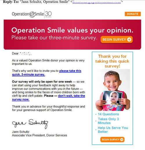
This previously unopened email (shame on me) included the Associate Vice President, Donor Service's name as the sender, as opposed to purely "Operation Smile." The only way to know if one works better than the other is to test (warning: that will be a prevailing theme here), but using a person's name, instead of an organization's, seems like a surefire way to peek interest (and get opens).
2. Offers
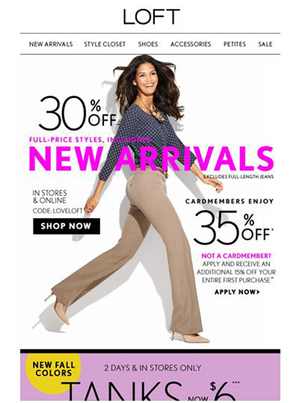
An additional 20 percent off of clearance items, may not get the same result as 30 percent off new arrivals, but who's to say without, you guessed it, testing. The latter promotion may interest consumers more, because new products are typically fresh, on-trend and season appropriate, whereas clearance items are often last-season items (many shoppers are willing to shop out of season to save a buck though).
3. Images
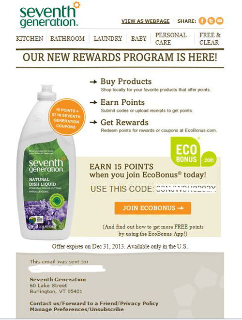
Not all emails can have cuddling babies and cute kittens, but images do tell a thousand words. Merchants want in-email pictures to convey the optimal messages to consumers, so see which image(s) work best for a fraction of your email list before sending the message out to everyone. For example, this editor often chooses Seventh Generation products to avoid bringing unnecessary chemicals into the home. Washing my son's sippy cups with non-toxic dish soap appeals to my emotions as a mom and my purse strings as a consumer. That said, an image of a mom or child would probably resonate with me more than a product shot. Seventh Generation - or any other brand - wouldn't know until they tried (a.k.a. tested), however.
4. Calls-to-Action
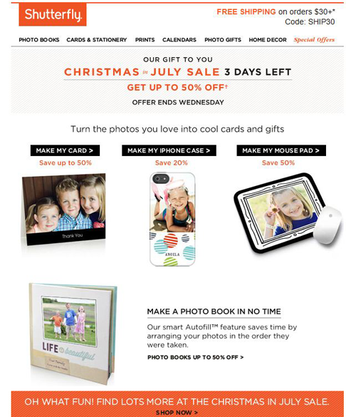
There isn't a clear-cut rule as to how many calls-to-action to include in an email, but the appropriate next step (or action) should be obvious. In the example below, Shutterfly clearly wants me to personalize a card or gift. Perhaps (and only perhaps), this email could have performed better, if instead of five small CTAs, it featured one large one. Even better, if Shutterfly pulled data from my saved photo albums, such as (let's pretend) Chad's Birthday, the email could be further personalized with a "MAKE CHAD A PHOTO BOOK" call-to-action.
5. Personalization
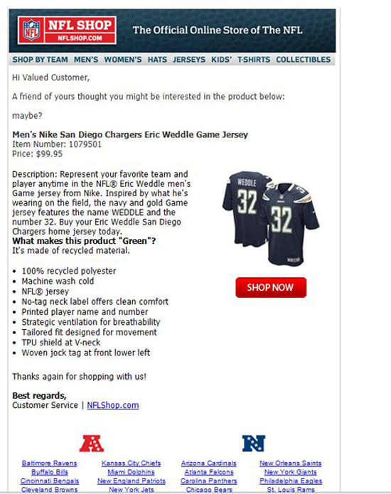
Not every consumer is going to open an email because their name is in the subject line nor are shoppers sure to spend time in emails because their names are in the greeting, but it's definitely an element to test. Below is what, this editor thinks, is a missed opportunity for personalization. To share a product from NFLShop.com, there are only two requirements: your email address and your friend's email address. Possibly, if NFL Shop also required the sender and recipient's first name, the open and conversion rates could increase. For example, my husband's name in the subject line (instead of, "Your friend wants you to see this item") and my name in the greeting (instead of, "Hi Valued Customer") could increase the likeliness of conversion. While this example isn't necessarily a split test, merchants can send one group an email with their names in the subject line (or greeting) and one with more generic options.
6. Email Design
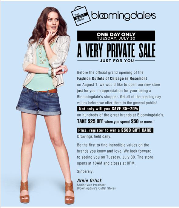
From colors and layout to font size and style, design plays an integral role in email performance. Even something as simple as switching the location of "ONE DAY ONLY" and "A VERY PRIVATE SALE", in the email below, could have an impact on performance.
7. Content
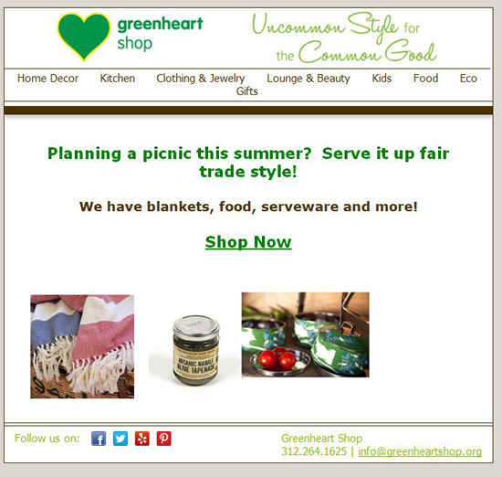
You've just crafted the most clever copy and you are ready to hit send, but your email subscribers may not find it clever. In fact, they could find it confusing (been there as both a writer and consumer). Challenge yourself to create two sets of content to see which one resonates with your audience. For example, the email below could contain this copy for Group B: From what you sit on to what you eat, Greenheart Shop has your summer picnic covered with fair-trade items you can feel good about using (or eating). SHOP NOW!
8. User-Generated Content
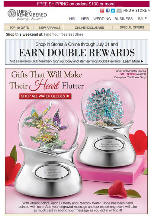
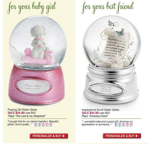
Content that users create, like ratings and reviews, can influence a customer's purchasing decisions, leading to increased engagement and conversions. Merchants should test whether their customers respond to in-email reviews by including them in one test and not in the other. Things Remembered uses reviews under the different types of water globes a consumer can personalize and purchase.
9. Subject Line
This article started out minimizing subject-line test, simply because of its overuse, but it's important nonetheless. For example, the email subject line for a Groupon message was "Movie with Popcorn", perhaps it could have performed better with a specific community, "Movie with Popcorn in River North." Another idea is to add emoticons to an email subject line (see below). For a more in-depth at symbols in the subject line, check out Website Magazine's May 2013 issue.
![]()
10. Landing Pages
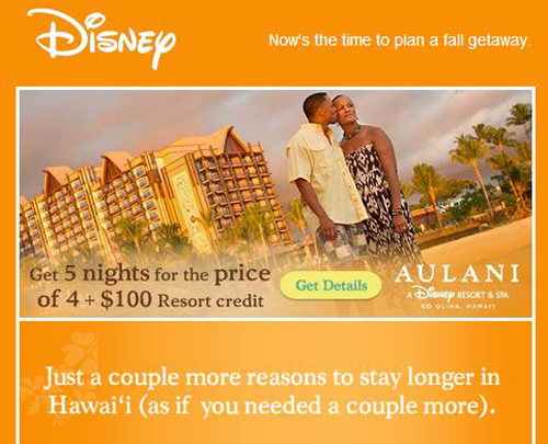
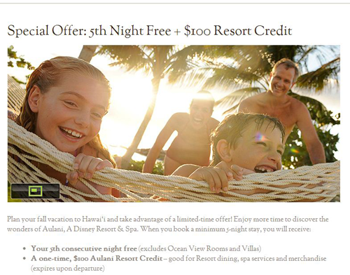
Where does a consumer go when they follow an in-email link? Change the path for one group and not for another and see who responds best to what. For instance, the email from Disney below shows a man and a woman in a romantic setting, but the landing page features a large image of a family. If I, as the consumer, clicked through because of the in-email image, it might be better to feature a similar photo on the landing page, but even Disney won't know until they test it.
