Top 10 Converting Retailers, What We Can Learn

by Michael Phillips
18 Mar, 2009
Nielsen Online and Marketing Charts have released a report of the top 10 converting online retailers (minimum of 500K unique visitors during the month). Of course, they are very large websites, but we can learn something from them. They are: Schwan's, ProFlowers, Quixtar, vitacost.com, Woman Within, L.L. Bean, Office Depot, Tickets.com, 1800Flowers.com and QVC.
Let's look at the home pages of four of them and get some insight as to what might entice browsers to become purchasers. In a later blog post, we will examine some of these sites' checkout pages for more clues to success.
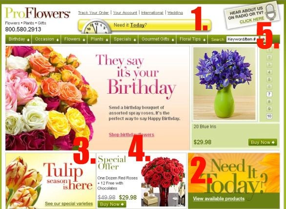
- The top banner asks, "Need it Today?" They know their clientele - many flower shoppers are looking for last minute gifts. It also serves as a prompt to start shopping now, taking advantage of immediate gratification.
- In fact, this call to action is so important to this website, it's listed again on the bottom right of the page. This time, there is a link with available products to ship today, pushing the consumer into further action.
- Calling out tulip season gives the site a timely feel. Consumers immediately know that ProFlowers is up-to-date. It also sparks a product browsing session.
- Special offers are great ways to entice a browser to dig deeper in the site, and give them a sense of saving significant money. Notice the standard price is crossed out, next to the sale price.
- Hear About Us on Radio or TV - this is an excellent use of cross-channel marketing, tying three mediums into one. The radio and television spots offer discount codes to be entered on the website.
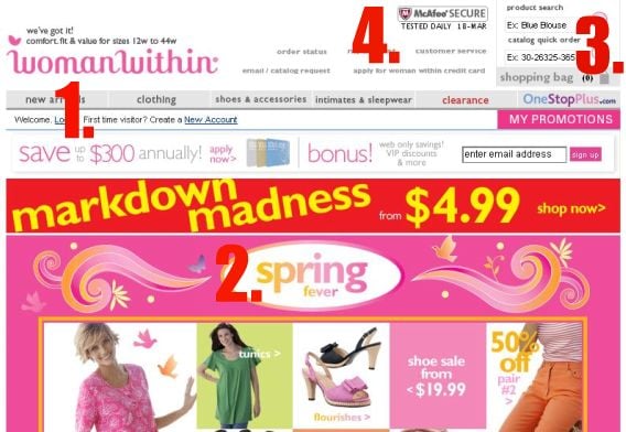
- Immediately, this site conveys several important messages. The logo is decidedly feminine and modern, and "Save $300," "bonus," and "markdown madness" tells the visitor to expect big discounts here. This triggers clicks and shopping.
- Like ProFlowers, this site is timely and fresh with "spring fever."
- An interesting concept. The product search field is already filled in. This might not only get the user to search for that particular item (blue blouse) but also shows what to do, prompting a search for a product.
- The McAfee SECURE badge gives the browser immediate confidence that the transaction they are about to make is secure. Also important is the mention that it is "tested daily."
- No real secrets here. The promise of a $10 gift card is the main selling point. It's prominently displayed twice on top and again as the first pane of the slider. Also note the use of an expiration date, prompting a quick purchase. The next two images are people wearing parkas during spring rains and the $10 offer again.
- The search bar is given prime real estate, enticing a user to enter deeper into the site. Also, right below and across the top are several key categories of products, saving the user time and encouraging browsing.
- "Guaranteed. You Have Our Word," is another tactic to make browsers feel at ease. Clicking that spot sends users to L.L. Bean's warranty policy.
- (not pictured) At the bottom left of the page, below the fold, is an offer of free shipping and free return shipping.

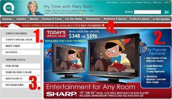
- "Today's Special Value" grabs attention and tells the consumer they should be visiting this site often. It also delivers a sense of urgency - that great deal might not be there tomorrow. Also listed are the retail and sale prices.
- "By Popular Demand" gives the site a bit of a community presence. Consumers always want what other consumers have. It's not necessarily a product for which the browser came to the site, but now that it's known to be popular, it looks attractive.
- The "Shopping Tools" section ties the QVC business to the website. As a television network, it's essential to provide a place for users to bridge the experiences. It also urges users to stay connected to the brand, even when they close the browsing session.
- Again we see timely promotions in the red bar. Also note the "3 Easy Payments" plug. In fact payments are mentioned in three prominent places on the site; this top bar, under "Today's Special Value," and in "By Popular Demand." QVC understands their consumers and is well aware they want and may need payment options.

Michael Phillips
Masson specializes in helping brands articulate their purpose and communicate their value—through naming, campaigns, pitch decks, copy, video, and multi-platform, targeted content series.


