The Perfect Pricing Page

Traditional B2C ecommerce retailers know that the product page is where purchasing decisions happen, but the service industry has a different page to worry about - the pricing page.
The pricing page is where service providers list all of the bells and whistles that come with their offered services. It is also, obviously, where the price points of those services are listed - which means that it is a vital aspect of the customer's path to purchase. All of these reasons are why it is important for service providers to spend a lot of time testing and optimizing the design of their pricing page for the best return on investment (ROI) possible.
For those just embarking on the design journey for this important page (and for those whose pricing page could use a refresher), consider the following best practices:
1. Make it scannable.
Although there is typically a lot of information that needs to be featured on the pricing page, it is important that companies make this information easy to read. After all, consumers who are in the research phase are likely looking to quickly discover important information like prices and the major difference between packages.
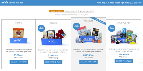
Take Petbox's pricing page as an example. The subscription company offers four different plans and highlights the price of each plan by using larger, blue font than the rest of the page's copy. What's more, the company makes it easy for page visitors to identify the difference of each plan by featuring a small blue circle that informs consumers how many items are shipped with each plan.
2. Know your customers, target their needs.
One way to make your plans stand out is to target your most popular customer segments by labeling plans accordingly. In doing so, your most qualified leads will be drawn to the label that they identify with.
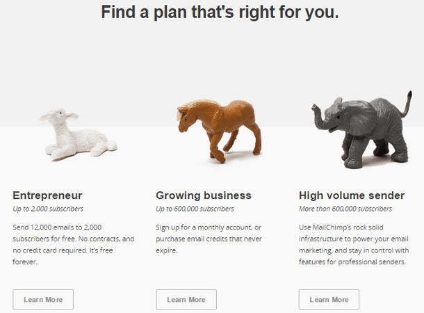
MailChimp, for example, offers three different plans, and labels each one with the customer segment it is best suited for, including "Entrepreneur," "Growing Business" and "High Volume Sender." What's more, the company adds a brief line of copy under each label that provides customers with the information they need to know for making their decision, such as "Up to 2,000 subscribers" (see image).
3. Answer their questions.
While it is great if all the information provided on your pricing page can answer all of a customer's potential questions, this is rarely the case. This is why it is important to provide options, such as live chat functionality, FAQ sections or customer service phone numbers to customers who may need more information before making a purchasing decision.
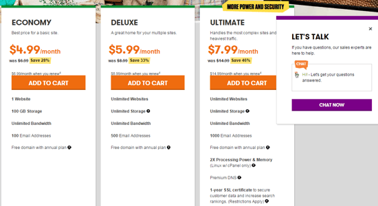
For instance, GoDaddy not only offers live chat functionality to its customers (see image below), but also a variety of other customer service tools as visitors scroll down the company's Web hosting pricing page. In fact, GoDaddy offers more charts where users can further compare service offerings, as well as a "Review" section that is similar to the reviews left on traditional ecommerce product pages. Lastly, the company includes a FAQ section toward the bottom of the page, as well as a customer service number.
4. Display clear CTAs.
Just like an ecommerce product page would never leave off the "Add to Cart" call-to-action (CTA), pricing pages should always feature clear CTAs that enable consumers to easily take the next step in their path to purchase.
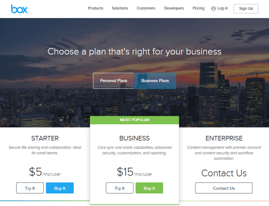
Cloud content management service Box provides an excellent example of clear CTAs on its pricing page. The company features "Try It" icons on its starter and business plans, as well as "Buy It" icons that are highlighted in blue and green. This enables users to quickly choose their path, whether it be just trying the service for free for 14 days, or committing to it with the "Buy" CTA. In addition, Enterprise clients are presented with the "Contact Us" CTA, as they typically need to speak to a customer service representative for more customized plans.
5. Try "anchoring."
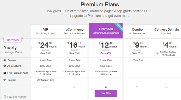
Some companies user "anchoring" on their pricing pages to make their offerings seem more affordable, or like a "better deal." Anchoring is defined as showing a higher price first, followed by a more affordable price. By doing this, consumers are "anchored" by the first price that they see, so all subsequent prices seem like a great deal.
Wix, for instance, starts its pricing page with its highest-end plan, priced at $24.92. The succeeding plans are all cheaper, making them appear as a better value. What's more, Wix (at the time of this writing) features discounts on each of its plans (aside from its basic offering). This also makes customers feel as if they are receiving a great deal.
6. Use peer pressure.
In nearly every aforementioned example, the companies include a variation of "most popular option" on their pricing page. By highlighting this information, companies are providing an element of trust, which makes consumers looking at the "popular" option feel more confident in their decision.
7. Show off your success.
Another way companies can add an element of trust to their pricing page is by showing off their clients who have already leveraged their services - especially if the client list includes notable names.
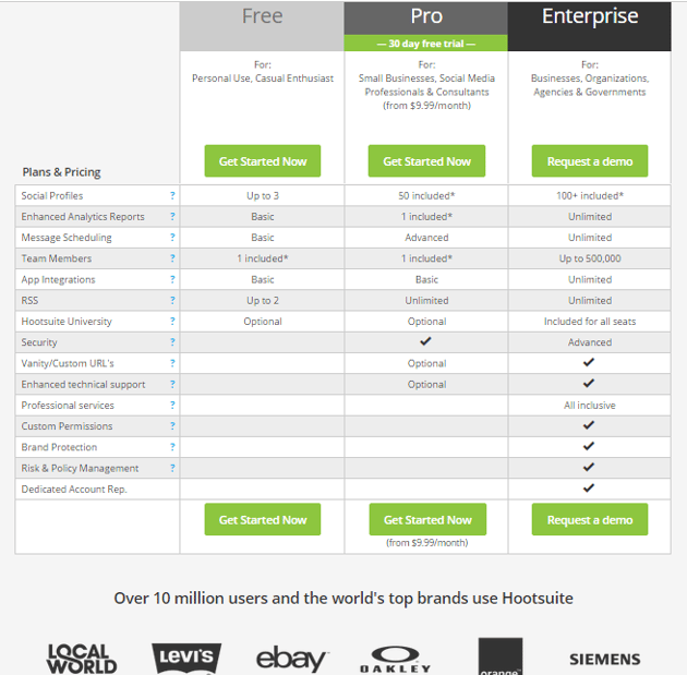
For example, Hootsuite includes the line of text "Over 10 million users and the world's tio brands use Hootsuite" on its pricing page. As if that is not enough to help potential customers be more confident in their purchasing decision, the social management company also displays the logos of six of its well-known clients, including Levi's, ebay and Oakley.
8. Test.
The most important pricing page best practice is testing. After all, every company is different and so are the customers, so what may work for once may not work for the other. In fact, companies should test everything from their prices ($1.99 vs. $2) to the color of their CTAs, and even the copy on their pages. Doing so will help companies continuously optimize this very important Web page, and, of course, lead to an increase in conversions.


