Lesser-Known Retailers Offering Great Online Experiences for Shoppers

It's common to talk about the top players in any field, while lesser-known players are usually ignored. The truth is there are many things one can learn from the not-so-popular names in a particular business domain, but who are doing well for themselves.
On the same token, a lot has been said about the leading ecommerce players, but there are many lesser-known retailers offering great online shopping experiences to their visitors.
Let's take a look at their sites and what they are doing right:
1. T.I.L Darling
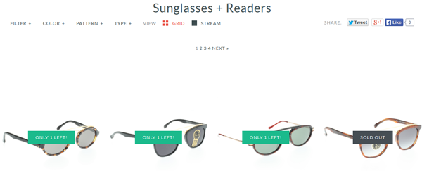
T.I.L (This is London) Darling provides the ultimate boutique experience to its visitors. The clean design of this site pumps up the "oomph factor" to enhance the shopping experience of visitors.
When you select a particular category, all products of that category are displayed in grid style. It also provides the option to view products list in 'stream' style. While displaying product images in grid, it provides no other information of the product apart from the stock inventory, thereby reducing the clutter on the page. When you click on a particular product, it gives a brief overview of the product on the same page. If you want more information, just click on the 'more details' link, which will take you to the comprehensive product information page.
Moreover, it has a well-designed checkout page that contains only a few steps to make it simple and convenient for shoppers to buy products.
2. Metta Skincare
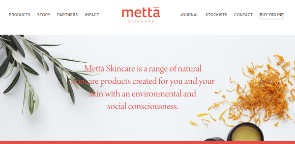
Metta Skincare works on the principle 'Simple is Beautiful!' The designers of this site have adopted a minimalistic approach to keep the site fresh and clean. The photography on the website is stunning and entices visitors to stay on the site longer. There is fine use of white space on the site to ensure visitors can easily find the important content on it.
Sections on this site are allowed to stand alone, making the whole site more pleasant to look at. This provides visitors with a pleasant browsing experience.
3. Hard Graft
First impressions rule.
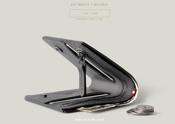
Hard Graft designers have used high-quality product images to make an awesome first impression on visitors.
What's more, individual product pages on this site are designed differently than the product pages of any traditional ecommerce store. Clicking on any product will open the product page that displays large high resolution images of that product all over the page. These images capture the essence of the attractive product design and present the product beautifully to visitors; this entices them to make a purchase.
Certain products are also presented with short high-quality 'How To' videos to help visitors understand the hidden features of the products. High-quality images and product videos make purchase decisions easier for shoppers.
4. CheapAir
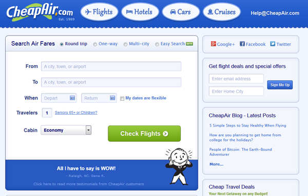
An ecommerce site should have excellent search, filter and sorting options to provide a positive shopping experience to visitors and help them make informed decisions. CheapAir does a brilliant job of providing customizable and interactive search and filter options to its visitors.
Visitors can select from the list of airlines to view all flights available from that particular airline. They are even provided with a 'Mix & Match' option to select flights from different carriers. Visitors can sort the results based on departure timings, arrival timings, stops and fare.
Moreover, it lets customer pay with Bitcoin (a form of digital currency) for their flight, making it easy for flyers to book flights. This year it even started to take Litecoin and Dogecoin.
5. BabyEarth
BabyEarth is a well-designed site which provides excellent user experience. Just like Amazon, the product pages on this site have all the relevant features like ratings and reviews of the product, option to add the item to wishlist or registry, detailed product description, display of related products and more.
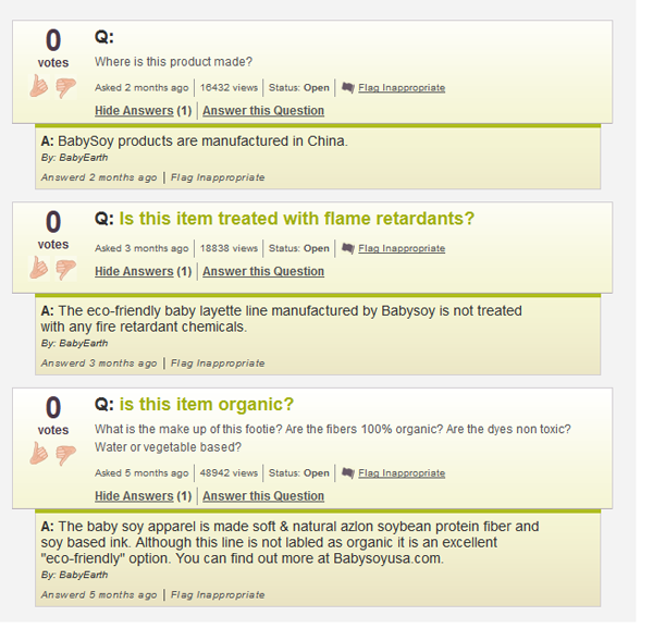
The one main characteristic that sets BabyEarth apart from other online stores is its use of a questions-and-answers feature. This feature is located on every product page in a prominent position. This is a really helpful feature for prospective customers as it can help overcome any doubts they have about purchasing the product.
6. Monogram Art
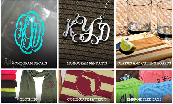
Monogram Art is an online boutique that offers selectively chosen unique customizable monogrammed gifts.
The individual product pages offer the option of selecting the font style that one wants to get embossed on the product.
It also has a very well-designed checkout process. It offers a guest checkout option to shoppers, which means they are not required to enter a truckload of information and spend time creating an account on the site. This has been proven to increase conversions. Even with guest checkout, Monogram Art smartly asks for a consumer's email address, so they are able to follow up with post-transaction emails.
7. FramesDirect.com
FramesDirect.com is a great example of how to craft an easy-to-navigate site. A large list of manufacturers and frames are presented in an easy-to-locate manner for visitors giving them a bundle of options to select from. This wide variety makes it impossible for a visitor not to find a frame of their choice. It offers filtering options like lens type, style, size (eye, bridge and temple), frame material, frame color, face shape, facial features, price and many more.
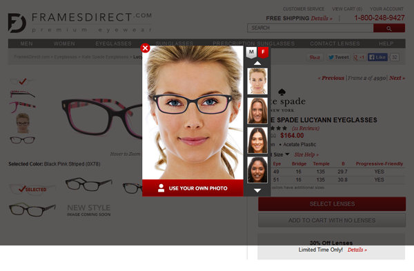
The biggest problem faced by online shoppers is the inability to try the product before purchasing it. To get around this issue, FramesDirect.com has created the try-on program, which lets visitors try glasses virtually on photos of different models or upload their own photos. This feature lets them provide better online shopping experience to users.
Summary
Though the above-mentioned ecommerce sites are not as popular as Amazon, Walmart or eBay, they come with their own unique attributes. These online stores clearly show that you can provide good shopping experience to your visitors, even if you are not a big player on the ecommerce market.
Take a cue from all of them to set up your ecommerce website in such a way that visitors are convinced buying products from your site will be the best decision they will ever make; this will increase your profits in the long run.


