How to Use the 4 Buyer Modalities to Improve Landing Page Targeting

Have you ever wondered why companies create those super long landing pages even though you never even read half of it?
Or why they included elements on them that only make you raise your eyebrows?
And yet you still buy their product...
That's most likely because their copy targets not just you. In fact, they create it to attract all four buyer modalities to the sale.
And the elements you skipped were the ones targeting other personality types than yours.
Intrigued?
You should be. Buyer modalities isn't a new concept. It is however one that can have a profound impact on your online marketing.
I first read about buyer modalities in Bryan and Jeffrey Eisenberg's "Waiting for your cat to bark" (and I think they are the ones who coined the term anyway). The premise of this concept is simple, there are four distinct characteristics of customers: Competitive, Spontaneous, Methodical and Humanistic. And each contains different traits and responds to various different messages:
Competitive shoppers, one of the smallest customer groups in the society, can be easily described as the ones who focus on "keeping up with the Jones.'" They focus on how the product can make them the best. Sports market, given its competitive nature, attracts a lot of competitive shoppers (and thus you see many "the best" claims in sports advertising - run longer, train harder and so on). Moreover, these shoppers aren't afraid to take risks when buying but will only settle what they think is the best product.
Spontaneous customers on the other hand look for immediate satisfaction. They are often the people who know what they want and will find any reason to get it, regardless of how logical or illogical the purchase might be. They are willing to take risks as well but buy often on impulse. These are the people who pick candy beside the checkout at a grocery store.
Methodical buyers, the most prevailing group in the society (approximately 40-45 percent) are the most comparative by nature. They know very well what their problem is and are willing to spend money to solve it. But they need convincing to know your product is the best. They will thoroughly research it before making a purchase and compare a product with competition before making a decision.
Lastly, humanistic shoppers are the ones who put personal growth (theirs and others) first. They care about others' opinion, reviews. They are less likely to take risks, and will take their time to make a decision. They are focused on family values.
How modalities affect your landing page visitors behavior
Each type of these buyers will react to your copy differently. Moreover, different elements on your landing pages will attract their attention.
When creating any kind of landing pages - from long form to simple ecommerce product pages, it is imperative that you know what elements to include to target each buyer segment.
Competitive
Buyers with competitive characteristics enjoy being the first to own a product. They respond very well to any copy that convinces them they are the leaders in the field (or the best in any other way).
They don't spend much time digging for information though, preferring summaries and digested facts. They respond very well to bullet points and generally prefer to scan the copy rather than immerse themselves in it.
Their decisions are fast and very logical. They want the best product and won't satisfy on the second best. They also want to know straight away if they are selecting the right product.
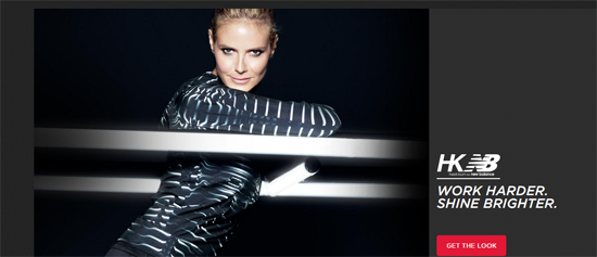
(A snippet of a New Balance landing page, the company appeals to competitive buyers who want to work harder and shine brighter.)
Spontaneous
Here's the thing about spontaneous buyers - they often don't know what they want until they see it. Therefore an important aspect of targeting these customers is making the product to stand out for them. You can achieve this by using large banners, bold text and other typographic elements that make the product more visible.
This group also responds very well to messages about savings, free or fast shipping, discounts, sales or urgency inducing elements like limited stock or time limited offers. Another element this group might respond very well to are product recommendations, such as "others who purchased this also bought" copy as well as upsells and cross-sells.
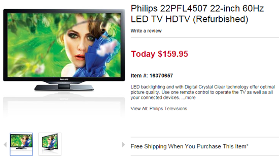
(Overstock appeals to spontaneous shoppers who gravitate toward free shipping offers.)
Methodical
Methodical customers prefer to thoroughly research an item before making a purchase. They will examine its details, compare them with those of other products, read reviews and will seek confirmation that an item will do what they expect it to.
In most cases, the majority of your landing page copy will be directed at these buyers, partially because they form the largest segment but also, because they expect a wealth of information.
Information they typically look for on a landing page include what makes your solution better than your competitors. It could be the lowest price, extended warranty or anything else that will speak to a rational customer. They want to see a detailed information on how your product works and what exactly does it do.
They will also need a form of reassurance, in a form of user ratings, comparison charts, reviews but also customer stories. If you can include information how your product has helped others, even better.

(Sears looks to put methodical shoppers at ease with tips to purchasing a washer and dryer set.)
Humanistic
Buyers representing the last group are very family oriented. They care about personal growth for themselves and others.
Painting an image of family, success or well-being through your copy is bound to attract their attention. They respond well to messages of value, trust, strength. Since they make an emotional decision, presenting your product from human perspective works well for them.
These buyers need to find answers to several questions, who you are, whom you've helped and what's a big picture of using your product.
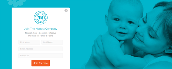
(From color and image choice to copy, The Honest Company wants moms to know they provide products that are natural and safe for their families.)
Targeting landing pages to all groups
It may seem impossible to create a landing page targeting all of those buyer personality types. However, you can build in elements that will bait each group into a product.
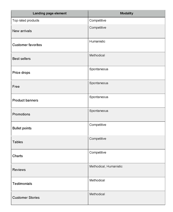
Here are few examples of landing page elements that bait different buyer modalities (note: click to zoom in):
Seeing this in Practice
Let's look at four companies that create landing pages for all four buyer modalities:
Amazon
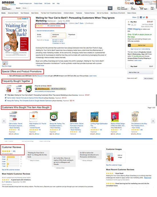
If you look at Amazon, they include many of those elements on their product pages. These elements might be scattered all over the page but depending on your modality, you are bound to notice the ones that are going to attract you.
Best Buy
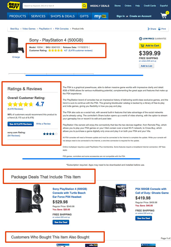
Best Buy is another online retailer targeting different modalities with various landing page elements: ratings, recommendations, reviews and more.
Pelican Water
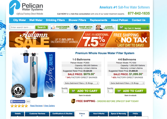
Even though Pelican Water's product page seems busy and long, if you look closely at it, you'll notice the reason why. It uses a lot of elements to target each modality individually! From sales, product overviews, in-depth information, pricing options to reviews, tutorials and more, it's all here. User with any modality will find something that should speak to them when viewing this page.
Relevancy for All
Most landing pages are long by design. Their creators however don't create them this way to overwhelm you with copy, distracting you from the product itself. Quite often their goal is somewhat different - to target all four various buyer modalities and make the page relevant to all buyers. Only by doing so they can assure that regardless of who lands on their page, they will find elements that might convince them to buy.


