A Merchant's Guide to the New Gmail

Putting users in control of how they receive email messages is not a new concept. Consumers not only dictate which companies they get messages from, but can also manage what information they are sent and when. Gmail, however, took user control to a new level with its new, tabbed-style inbox, which automatically classifies messages into categories. Primary, Social and Promotions are default tabs that appear for users, whereas Updates and Forums sections can be included when users edit their preferences.
Like all changes that directly impact a company's ability to attain and retain customers (think Google's Penguin 2.0), there was much hype surrounding the recent update, from sheer panic to some announcing email marketing gone forever. The primary concerns for businesses are that their email open rates and overall engagement on that channel will suffer, as email recipients can easily ignore the Promotions tab.
Now that the dust is starting to settle, the savviest of brands are being proactive in getting users to move their emails from their "Promotions" tab (where most marketing messages end up) to their "primary" tab (essentially where, for example, an email from a friend would appear). They are also learning how to stand out in a crowded Promotions tab.
Here are practical and, more importantly, effective ways for merchants to navigate the new, tabbed-style Gmail.
1. Inform Subscribers
As Web merchants, marketers and the like, it's easy to believe all Internet users have the same 'Net behaviors and preferences as us. It turns out, however, there are major differences between marketers and consumers, such as 93 percent of marketers have made a purchase after receiving an email from a company, whereas only 49 percent of consumers have. This goes to show that those who are actively involved in their company's Web success look at the 'Net differently, meaning that despite all the excitement over Gmail's new, tabbed-style inbox, most of your consumers may not even be aware of the change (especially if they use mobile to access email - a topic discussed in more detail below). This is where you come in.
If you haven't already, your company should send out an email to its Gmail subscribers letting them know they need to take action. Here are two good use-cases.
(1)
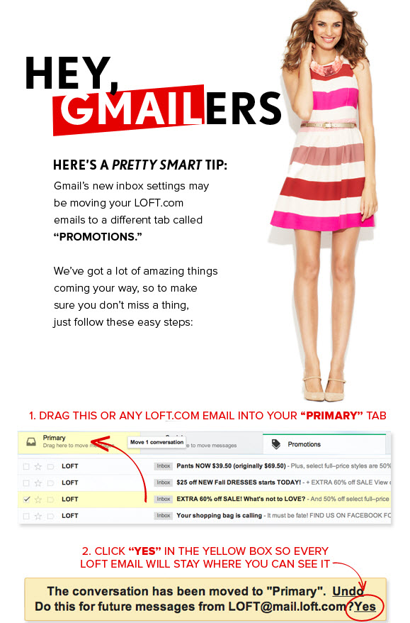
Loft sent its subscribers a step-by-step tutorial on how to permanently move its promotional emails into the primary tab.
(2)
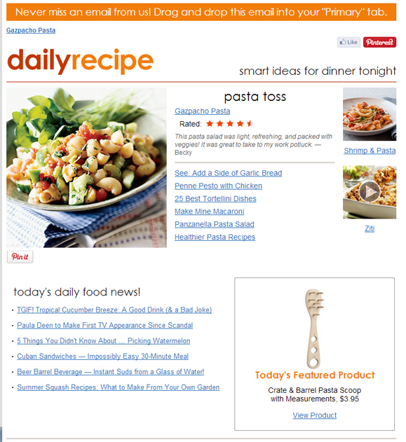
Recipe.com added a banner ad to the top of its daily recipe email to alert users that they need to take action to see Recipe.com emails in the future.
2. Keep Doing What You're Doing
With Gmail's new layout, engaged subscribers are actually more engaged. Return Path found that Gmail users who are routinely engaged with marketing email are reading emails at a slightly higher percentage with the update (roughly 60 percent, a 2.11 percent increase - see image below). Among moderately engaged recipients, the bulk of the Gmail audience, read rates dipped slightly to around 10 percent. Some industries are actually fairing much, much better. In the first week of the Tab's release, the airline industry doubled their read rates to 34 percent.

3. Get with the Mobile Program
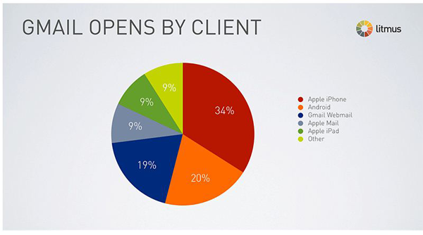
Most users that open emails on their smartphones are not affected by Gmail Tabs as all emails are delivered in one inbox (e.g. for iPhone Mail, which is the number one email client for Gmail users). There are exceptions, however, for those subscribers using Gmail's official mobile apps on Android 4.0+ devices as well as the iPhone and iPad. The same categories available for desktop Gmail users are accessible with the app. That said, nearly half of all emails are opened on mobile devices and 66 percent of Gmail opens occur on mobile devices, which may be why Tabs hasn't had the great impact many predicted. After all, according to litmus, Gmail opens only account for about 4 percent of total email opens, and only 41 percent of those opens are occurring in email clients that support Gmail tabs.
It should be reiterated that merchants need to serve mobile-friendly emails to their customers, with Campaigner finding that 41 percent of consumers are frustrated with poor mobile design and user experience. (See "Holiday Prep: Mobile Email - Infographic")
4. Change Your Name(?)
With Gmails new tabbed-style format, it appears that a sender's name carries more weight with subscribers than the email subject line, at least when a tab is not expanded. In the image below, you can see that the inactive "Promotions" tab has two new messages - one from Google Offers and the other Zagat. Merchants will want to keep their names short and clear without jeopardizing brand integrity. For example, although it would be nice if Website Magazine was recognizable by to test.

5. Be Personal, Consistent
Regardless of the effects of Gmail's Tabs update, the fact remains that merchants must actively seek ways to activate passive users by leveraging best practices. One way to produce more opens is through sending segmented email campaigns. Retailers may see as high as 30 percent more opens using this technique rather than sending undifferentiated messages. Another email best practice that is often forgotten is ensuring consistency between emails and landing pages. It's important to remember what will happen "after the click." Monetate suggests maintaining a "scent trail," where retailers use similar creative and messaging on landing pages and throughout the user experience (see example below) to increase relevance, conversions and future email engagement. A user who has a good first experience with a retailer's email will likely want future messages from that merchant and even move their emails to his or her primary inbox.

6. Extend Offers
With merchant offers being sent to the Promotions tab, users may in fact check that folder less often, but there is also a flip side. Shoppers may actively look for deals in their Promotions folder when they are in a purchasing mindset, which means retailers may want to consider extending their promotional offers. While it's not reasonable to ask merchants to offer 25 percent off jeans for a back-to-school sale forever, they could include a caveat like "Kids already in school? From Sept. 13 - Oct. 1 get 10 percent off denim products to pick up those items you missed." This makes a retailer's message relevant longer.


