Check Out These Add-To-Cart Buttons

 Riddle me this: We all do the same thing; however, some of us do it better than others - this could be due to our attractiveness, efficiency or placement. But whatever it is, the aspects that make us successful also make us desirable amongst Internet shoppers. What are we?
If you guessed "add to cart" buttons, you are correct. These buttons are among the most important design elements on an ecommerce site. A successful button impacts conversion rate, but also reinforces brand identity.
Testing different add-to-cart options is the only way to know for sure what button/icon style works the best for your site. However, taking some pointers from some of the biggest and most successful ecommerce companies on the Web can prove to be very valuable.
Here are some examples of successful brand's add-to-cart buttons:
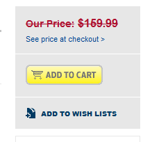
Best Buy
This add-to-cart button is featured in the middle of the right side of the checkout page. Although the button could be larger, it is highlighted by a Best Buy-yellow rectangle. The button features a clean and simple design of a gray cart, with the common verbiage "Add To Cart" within it. In the space around the cart, Best Buy provides the price, discounted price, and "add to wish list" option. Additionally, for qualified products, Best Buy provides a "protect your product" option as well as promotional free shipping if available. Although it is not the flashiest checkout button, it provides unification across the site by simply being the same color as the brand's famous logo.
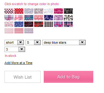
Victoria's Secret
Instead of a cart icon, Victoria's Secret uses a pink shopping bag, which is similar in design to the bags used in the retailer's brick-and-mortar stores. This call-to-action button is featured in the lower right corner of the page and is directly under options such as size and colors of the item to be purchased, and directly beside a wish list button. The button is simple in design, which meshes well with the rest of the site and the brand. The text on the button simply says "Add to Bag", and the button's larger size makes it difficult to miss - which is ideal for merchants.
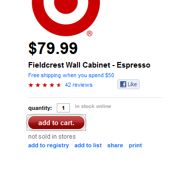
Target
Target also keeps its call-to-action button simple. However, because of its red and white color, it still strongly reinforces the brand's identity. Unlike the other buttons mentioned, it is featured in the middle-left side of the page. The text inside the button says, "add to cart", and although the button is only medium in size, the space around it is appropriately utilized by providing reviews, the ability to like the item on Facebook, add the item to a registry, add the item to a list, share it or print out an image of the item.
Bloomingdales
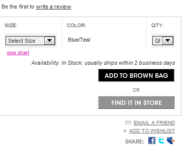
Similar to Victoria's Secret, Bloomingdales uses its signature "Little Brown Bag" as its call-to-action button, which is displayed in the lower-right corner of the page. The text on the button says "Add to Brown Bag." Similar to Target, Bloomingdales makes good use of the space around the button by providing an option to find the selected item in stores, email the item to a friend, add it to a wish list or share it through social media. After a consumer chooses an item, text appears that tells the consumer how long the item will take to ship. One criticism is that the color doesn't pop out on the page, especially since the rest of the website is also primarily black and gray.
OfficeMax
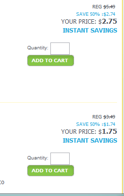
This button is brighter than the others mentioned above. The design consists of a bright green rectangular box with white text in the middle that, again, simply says "add to cart." Once an item is chosen, a big yellow box appears in the upper right-hand corner that shows how many items are in the cart, how much the total of the purchase is, and how much needs to be added for free shipping. Although this button definitely stands out, it is small and doesn't do anything to reinforce the brand's identity. Things that could be improved upon include the addition of more social options, increasing the size of the button and its overall cohesiveness with the rest of the site.
Checkout Time
As previously stated, call-to-action buttons are very important, yet what makes for an effective button will always be an ongoing debate. The previous examples show us that buttons should be simple and contain simple verbiage. The right side of a Web page is the usual spot for add-to-cart buttons, yet making sure the button is unified with the site and brand is key. Another important strategy is to provide social options next to the checkout button, such as for user reviews or the ability to share an item via email or social media.
While size, color, text and shapes of these buttons will vary, they are all aspects that every merchant should consider (and test) when choosing the most effective add-to-cart button.


