Bigger Commerce Capabilities in Retail Redesign

Providing a streamlined navigation experience and superior filtering can help customers find relevant products faster across all devices, which is a critical component of the ecommerce experience and why Groove, a full-service ecommerce agency, ultimately made many of the design decisions it did when using BigCommerce Enterprise to fully redesign Natori.com.
Customers can now experience and shop from a diverse collection of lifestyle products on a fully responsive Natori.com. Website Magazine caught up with Engel Baldwin, director of client strategy at Groove (a BigCommerce certified partner) to discuss highlights of the redesign, which, like any design project, had unique requirements.
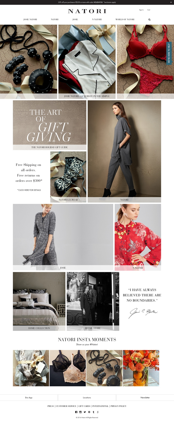
"With every brand, the goal is to allow its unique proposition to emanate in every element of the website," said Baldwin. "For a luxury retailer, especially in the fashion vertical, there's a layer of visual artistry that must also shine through. We had to make sure that the composition of their photography and overall brand aesthetic was not compromised, but elevated, in the digital space. All the while, weaving in the essentials of a converting Web experience."

Let's look at some of those essentials:
Homepage Navigation

Whether they were learned through Web conventions or by trial and error, website visitors bring their browsing habits with them to each site they visit. A retailer's job is to ensure their site not only meets conventions but also expectations because any misstep will send shoppers to competitors.
Getting the homepage navigation right is a big part of the user experience. When redesigning Natori.com, Groove ultimately chose to highlight five "sections" based on branding and ease-of-use needs.
"Natori was challenged with creating/building awareness for all of the brands inside of the House of Natori. The previous user experience was not successful in bringing them forward or showing their connection to one another," said Baldwin. "Our ecommerce experience led us to focus on a solution that was simple and organized to seamlessly direct users toward products. By categorizing each sub-brand into the main navigation we could accomplish this while still providing context within the entire brand family. Each dropdown menu would then give us the opportunity to individualize the sub-brands through unique descriptions and imagery."
Mobile users receive the same five options but as a collapsed menu with the much-debated "hamburger menu" helping users recognize which action they should take.

"Though many continue to debate the effectiveness of the hamburger menu, we still see it as the best overall solution for responsive sites with deep navigation," said Baldwin. "Users have come to recognize them and their function when viewing sites on small screens. But it does vary from site to site based on the depth and type of content, type of user, and development strategy. In Natori's case, it was important to minimize clutter and keep the small screen experience clean and intuitive."
Product Description Pages (PDPs)
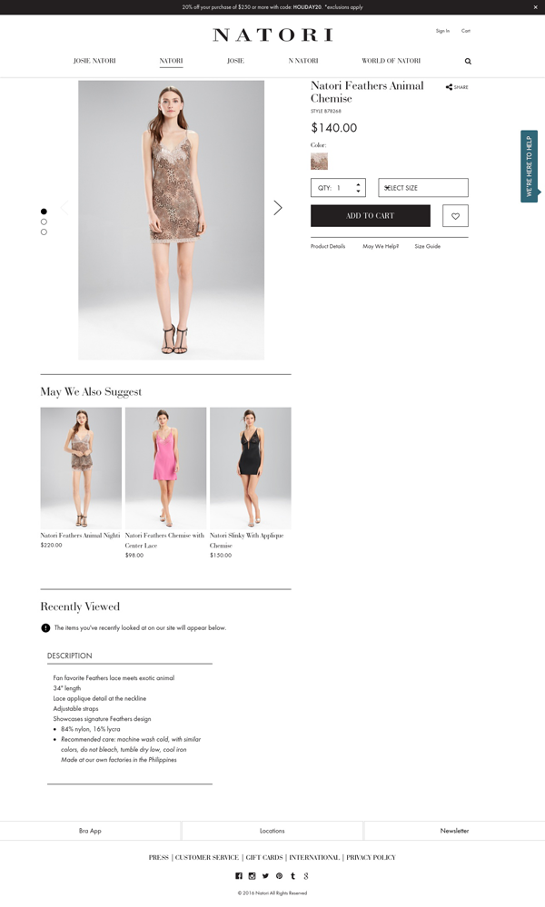
From the descriptions themselves to image viewing options, shoppers turn to product pages to gather more information about an item. Knowing what to include to move shoppers toward purchase and what to leave off in order to keep the pages streamlined, can be difficult.

"Knowing there is a greater level of purchase intent on the PDPs--our approach is to make the most relevant and engaging aspects of the product available, while ensuring that the opportunity to buy is clearly available," said Baldwin. "That is what drives the inclusion/exclusion of page elements. For Natori, the design quality and craftsmanship is what makes their products so unique. So seeing larger imagery with multiple views/angles was imperative. It was also important that we merchandise companion and compatible products given the nature of their entire collection, and seize the potential point of sale with the add to cart (ATC) button at the ready to move forward to the cart."
Like any digital project, time will tell how users respond and what they'll demand next. What do you think of the site? Let us know in the comments below.


