Best of 2011 - Ecommerce Landing Pages

 You only get one first impression, and a landing page is the first impression of every successful website. Therefore, it is imperative to create a good one.
Successful ecommerce landing pages include aspects such as bold titles, eye-grabbing call-to-action buttons, easy navigational links and prominently featured promotions.
As the end of 2011 draws near, let's view some of the best examples of ecommerce landing pages from the past 12 months:
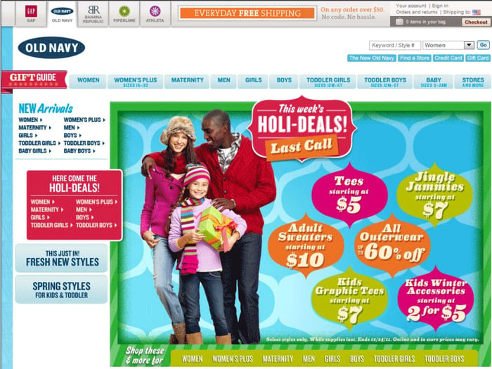
The best part of this landing page is the brightly and prominently displayed prices, which are perfect for consumers shopping for a good deal (who isn't?). Additionally, the gift guide and "Holi-deals" are highlighted in red for easy visibility. And conveniently, consumers have the option to visit sister stores by clicking on tabs at the top of the landing page.
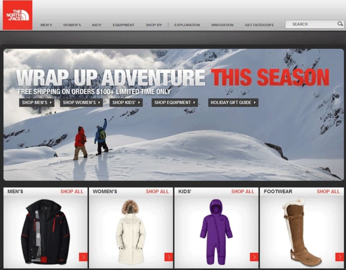
No matter who or what a consumer is shopping for (men, women, kids, equipment or holiday gifts), this landing page features multiple eye-catching links on which to click. Not only does the main photo at the top of the page include links for different departments, but the departments are also featured directly underneath the image in a row of individual smaller photos. The landing page is direct, simple and sleek for easy end-user navigation.
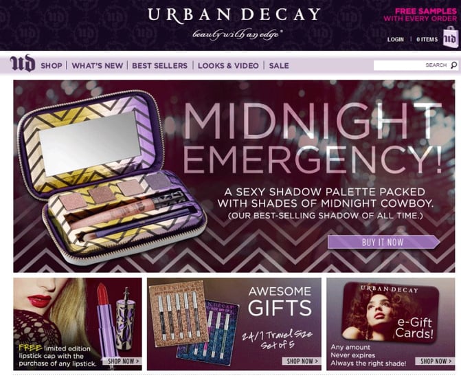
This landing page includes many best practices, such as the large title of the brand and inclusion of the brand's slogan. Other best practices include a large call-to-action button that says "Buy It Now," as well as the word "FREE" in the upper right-hand corner and bottom left-hand corner - which, without a doubt, grabs the attention of consumers. Furthermore, the featured picture box changes about every 10 seconds, and the second featured box features a call-to-action button that enables consumers to view videos from the brand.
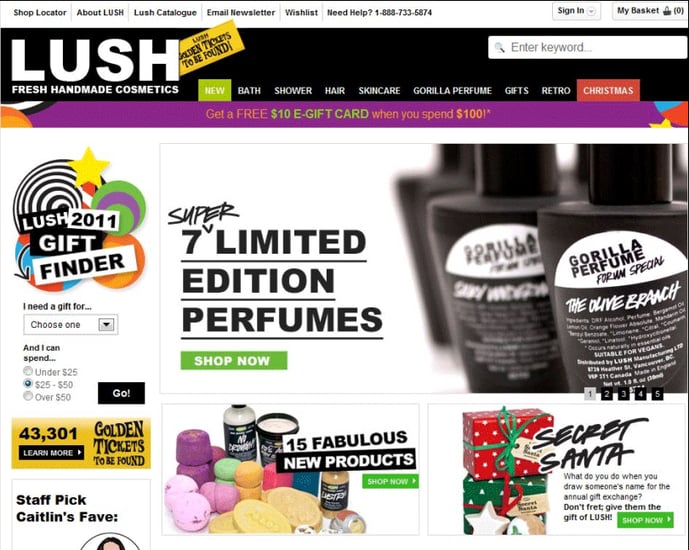
Although a bit busier than the previous examples, one of the best aspects of this page is the gift-finder, which is featured with bright colors on the left-hand side of the page. Not only does it allow consumers to choose who the gift is for, but it also allows them to choose a price range. Other best practices of this landing page include the golden ticket promotion that is featured next to the company's name, as well as the "New" and "Christmas" tabs at the top of the page, which are highlighted in Green and Yellow.
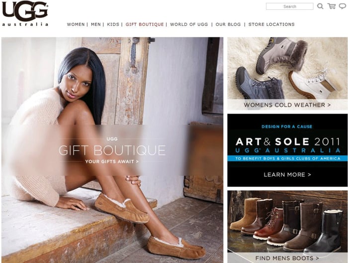
This landing page notably features the Ugg's Gift Boutique, which is an effective tactic during the holidays. Furthermore, on the right-hand side of the page, boots for both men and women are featured with call-to-action buttons. Lastly, the upper right corner prominently features the company's shipping and return policy (free), which is an important factor for consumers.
