7 Features Every Modern Ecommerce Site Needs

Practically any business can set up an ecommerce site, or an ecommerce section of their main website. The name makes it sound fancy, but realistically, it's just a place where consumers can log in and make a purchase-that purchase could literally be anything.
Unfortunately, while the concept of an ecommerce site is simple, the execution is somewhat more complex. Depending on how a small business owner chooses to develop a site, the setup is straightforward, but in order to be successful, they'll need to pay careful attention to its design and structure.
These seven features are bare-minimum essentials for any modern ecommerce site:
1. Apparent branding
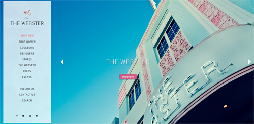
Branding should be a business owner's first goal, making sure it's obvious and everywhere. Every page on their site, from the homepage to their individual product pages, should highlight their brand. A retailer's logo should be in the header, the brand's colors should be obvious and even the tone of Web copy should speak to the company's identity. Presenting that identity consistently will help users remember and value their experience, and will build customer loyalty (so long as the rest of their experience is seamless). The Webster, for example, prominently and consistently shows its branding for Miami-type living.

2. Special offers and deals
When people get to a homepage, they need something exciting or unique to keep them interested. A flat list of ordinary products at ordinary prices isn't going to cut it. Site owners need to promote and emphasize special offers and deals that users will value.
3. Search functionality
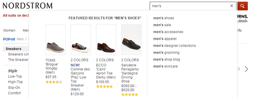
Integrated search functionality was once a luxury for online stores, but today, users have come to expect it. Simple search integration won't set shop owners back much. In fact, most template ecommerce sites already have one built in. But if they want to go the extra mile, it's worth their while to make some upgrades. Include multiple filters so users can quickly and easily browse through different categories. For those who really want to go all-out, develop a predictive search element for the site. It will make intuitive recommendations to users and streamline the entire shopping process. In the example below, Nordstrom not only offers predictive search (triggers queries as a person types), but also features results for its predictive search results, including product photos, reviews and price, making the results more compelling and click-worthy.

4. User accounts
Most ecommerce sites are developed around user accounts, but some still offer guest checkout functionality. Retailers who want to generate more revenue on their platform should opt for user accounts exclusively, and reward users for logging in. The goal is to make it worth their while to come back, and make them feel like they belong to that community to encourage repeat business. The benefits of guest checkout, however, is that some retailers report an uptick on conversions since buyers don't have to enter account details.
5. Mobile optimization
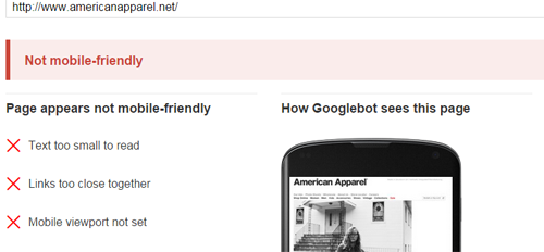
These days, mobile optimization is a minimum requirement for all websites. Too many people are relying on smartphones and mobile devices to do the majority of their online work, so if a site is not optimized for those experiences, it risks losing a majority of its audience. If that weren't enough, retailers should keep in mind that Google recently released an update that puts a greater emphasis on mobile-friendliness, so in addition to losing immediate customers, retailers may see a drop in traffic due to reduced visibility on the search engine result pages (SERPs).

6. Social integrations
An ecommerce site should tie into social media in some way. Most site owners include icons with links to their individual profiles on the main site, but they may want to go a step further when it comes to influencing their users to share their experiences. For example, on individual product pages, site owners could have links that suggest that users share the item on their social profiles. Or, upon checkout, they could give customers the option to post about the order they just placed. In other words, small business owners will want to make it easy for customers to share products, content, and experiences.
7. Immediate communication options
If a user comes to a site and has a question or a concern about one of the products, he or she is going to instinctively look for help. If that help isn't there, or if it takes more than a minute to find, the customer is going to leave and go somewhere else. Ecommerce sites need to have some kind of readily visible, immediately available help for wandering users. For example, live chat, detailed help articles, reviews, FAQs, comparison to similar items, or customer questions and answers (like in the Amazon example below).


