6 Ecommerce Strategies to Boost AOV

For most B2C ecommerce websites, the repurchase rate is low and repeat business remains elusive. According to a study conducted by RJMetrics, only 32 percent of customers place another order in their first year. In other words, two thirds of your customers are unlikely to buy from you again. That means that a high average order value (AOV) of that initial purchase is crucial to the success of your business.
In this article, we will look at six different approaches you can implement quickly to improve your AOV. Fundamentally, there are two broad levers to pull: cross-selling and upselling. Since these terms are often used interchangeably, it's worth defining them before we jump in.
Cross-selling refers to the strategy of getting a consumer to buy complementary products in addition to what's already in their shopping cart. Upselling is a technique of encouraging a consumer to buy a premium, more expensive version of the product already in their cart.
With the definitions out of the way, let's jump into the six ecommerce strategies to boost your AOV next year.
1. Offer a discount immediately after purchase
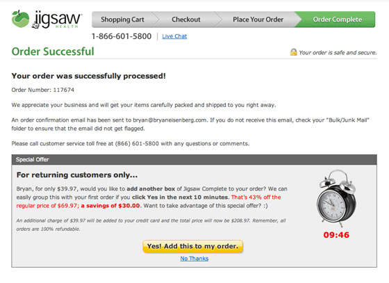
One of the best times to ask a consumer to buy something is when they have just purchased from you and might still be holding their credit card. Perhaps it's a small accessory to complete the look or a must-have add-on to their new product. Whatever it may be, making it easy and compelling for your brand-new customer to add those items on the order confirmation screen is a great way to boost your ecommerce AOV.
Here is a great example from Jigsaw Health (via Unbounce):

This company decided to focus on returning customers, but there is no reason not to capture extra value by making an offer to new customers as well. Test cross-selling as an add-on, accessory or another complementary product. Alternatively, upsell with an opportunity to upgrade the product they have just purchased. The order has already been placed so there is nothing to lose!
2. Add an extra cross-sell step to your checkout flow
Making your checkout flow longer might sound like something that would hurt sales. However, there are a number of principles that make the multi-step checkout perform as well if not better than a single page layout. First, breaking a task up into smaller pieces makes it less daunting. Second, if done right, extra steps declutter the flow and make it less confusing. Lastly, those consumers who start the checkout flow are more likely to complete it.
With that in mind, there is an opportunity to unclutter your cross-selling efforts in cart or via an interstitial and put them into a separate step in the process.
Here is an example from an electric bike brand EVELO:

In the above example, the cross-sell step itself is presented as customization. The layout is very clean and simple to follow. Accessory packages can be viewed and added on the same screen with just one click.
3. Incentivize upgrades
For most businesses, upgrades are highly profitable since the margin is typically higher than on the base product. If your products lend themselves to upgrades, you need to think carefully about how to incentivize those upgrades.
Discounts are an obvious choice. A more powerful evergreen solution is the right pricing strategy. Think about the popcorn pricing at the movie theater. They might sell you a small bucket for $5, a medium for $6 and a large one for $7. Subconsciously, you will try to calculate the value of each and quickly realize that doubling or even tripling the size of your popcorn for two dollars is a steal! Of course, the popcorn pricing strategy is designed precisely for you to come to that conclusion and upgrade to a large bucket.
Of course, this approach can be adopted to various products and services. Below is a perfect example from Norton antivirus:

 Norton is using both the discount and the clever pricing strategy to get you to upgrade. For $10/year more consumers can upgrade from one device to five devices. The discount appears to go up with every upgrade level so the more you buy, the more you save. This is the classic "popcorn" pricing strategy.
4. Make it easy to buy combos/bundles
Ecommerce recommendation engines have been getting better over the last couple of years but even companies like Amazon often miss the mark. For now, nothing beats curated product combos, bundles or looks.
While Amazon's recommendations are not always great, they do a very good job with their bundles and it is very easy to add the whole thing with just one click.

Test offering bundles with a few of your best-selling products to introduce consumers to your new products or to move inventory of products that might not be selling as well on their own. There are several locations that could work. Amazon deploys this bundles module on their product pages. Try using an interstitial once the product has been added to cart. Alternatively, you can test adding an extra checkout step or use the bundles approach on your order confirmation page, as discussed above.
5. Use visual cues for progress toward rewards
Virtually all ecommerce websites have some sort of minimum order amount to get free shipping. Most simply state it somewhere above the fold. Why not make the experience more visual and make your visitors feel like they are progressing toward a specific goal as they add items to cart?
Below is an example from Jet.com. They show a progress bar to indicate how close someone is to getting free shipping.

Here is another excellent example from Mack Weldon:

Their progress bar combines a free shipping threshold with additional discounts based on the cart size. This is a perfect way to boost AOV.
6. Add a little friction to removing items from cart
Many ecommerce platforms do a poor job of laying out their shopping carts. For example, take a look at this fairly typical shopping cart layout from Shopify:


For starters, there is no call-to-action hierarchy. Updating one's cart appears to be an equally important action as continuing with checkout. In addition, there is an entire column dedicated to removing items from cart, laid out with the same visual importance as price and quantity.
The above example has more screen real estate dedicated to removing items from cart than proceeding with checkout! You should absolutely give your website visitors an ability to easily remove products from cart. That said, if you are practically begging for things to be removed, you will get exactly what you're asking for and your AOV will suffer as the result.
Conclusion
The shopping experience on many ecommerce websites is broken. Some ecommerce categories, like retail, rely too heavily on discounts to attract customers. The end result is a low repurchase rate and shrinking margins. Fortunately, there are ways of bucking the trend by boosting your AOV and recapturing some of that lost value. The above strategies and accompanying examples should give you plenty of tests to run well into next year.
About the Author
Andrey Milyan is a veteran of the digital marketing industry with over 12 years of experience helping some of the most iconic brands develop their marketing strategy online. Over the years, his roster of clients included P&G, Verizon, LG, CHANEL and many others. Today, Andrey runs an independent consulting practice at AndreyMilyan.com, helping early stage clients grow their online sales.


