5 Image-Rich Ecommerce Sites

Retailers only have a few seconds (if that) to make a good impression once a visitor arrives at their site.
One sure-fire way to grab the attention of site visitors and create a lasting impression is by prominently featuring visual content on the landing page. Not only can the right image attract attention, but it can also serve as a good representation of the brand for new customers.
Before scrapping your virtual store's current design in favor of a more visually rich layout, however, it is important to gain some inspiration into how other brands on the 'Net are creating image-rich landing pages, such as the five merchants featured below:
Nicole Miller
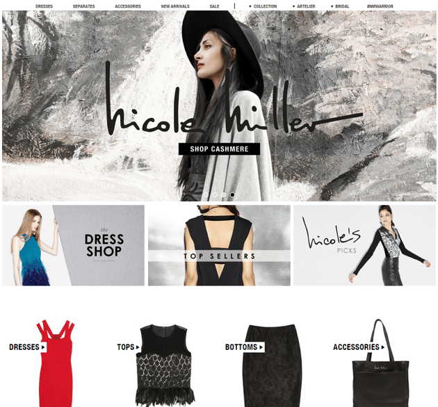
The Nicole Miller website uses a carousel to feature multiple hero images on its landing page. Each hero image is visually unique and high-quality, as well as accompanied with a bold call-to-action, such as "Shop Holiday," "Shop New Arrivals" or "Shop Cashmere." It is also important to note that in addition to offering a traditional navigation menu, the Nicole Miller website features a visual menu below the fold by using images to represent popular categories like "Dresses," "Tops," "Bottoms" and "Accessories."
Greats
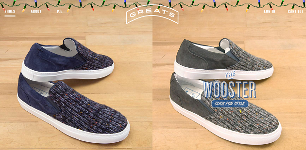
The Greats website is a stellar example for the old adage, "less is more." The simple site puts an emphasis on product images and leaves the majority of its copy for its product pages. Similar to the Ada Blackjack site, shoppers can view every product that Greats sells by simply scrolling down the retailer's landing page, which features consistent product images for each type of shoe the retailer has in inventory. Also worth noting is the Christmas lights that are featured on the top of the site, which helps the retailer add some holiday spirit to its site without having to change the site's overall design.
Hanna Anderson
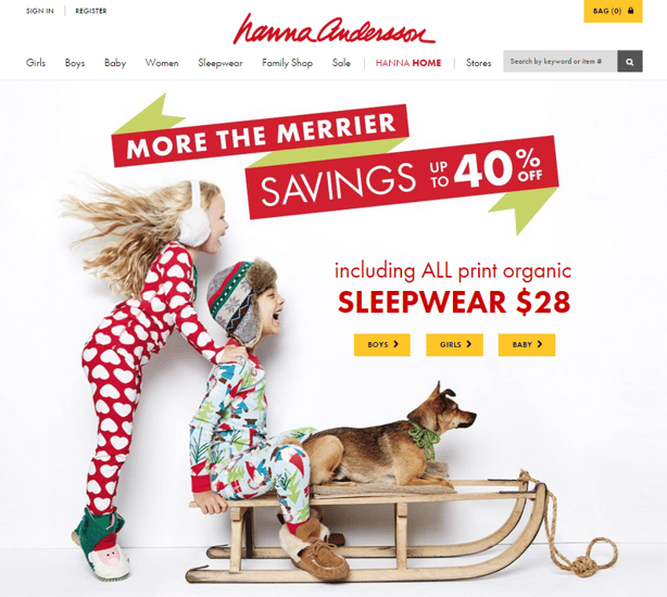
Hanna Anderson is an example of retailer who not only uses visual content to capture site visitor's attention, but also plans ahead for the holidays. This is apparent by the high-quality, holiday-themed images that are prominently featured on the retailer's landing page. To drive conversions, Hanna Anderson displays calls-to-action next to its hero image, which direct shoppers to the section of the site where they can find the products that are featured in the image.
Ada Blackjack
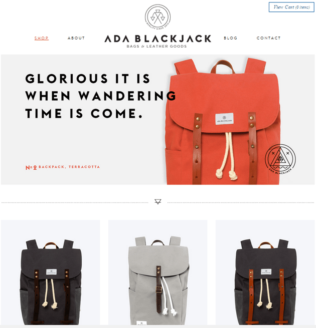
The simplistic, primarily white-and-black design of the Ada Blackjack website makes the retailer's hero image really stand out. In fact, upon arrival to the site there is no question as to what type of products Ada Blackjack sells - handmade bags and leather goods. Moreover, shoppers can find all of the retailer's products by simply scrolling down, as every item is featured on a clean, white background as shoppers scroll below the fold of the landing page.
Room & Board
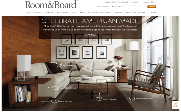
It can be overwhelming for consumers to shop online with retailers who have large inventories, as there are many product categories and pages to be sorted through. To combat this challenge, furniture retailer Room & Board features a carousel of hero images very prominently on its landing page. These hero images are clearly designed to convert visitors because each image tells visitors exactly where the featured inventory is made (in various U.S. cities). Plus, when a shopper clicks on one of the hero images, they are immediately directed to a page that displays each product (and its price) that is showcased in the hero image.
