3 Perfect Product Pages

Product pages are worthy comrades in the battle for conversions.
When done well, they do their part in convincing consumers to follow calls-to-action like, "add to cart" or "checkout now." The alternative is prospective buyers leaving because there wasn't enough information to make a purchasing decision.
In an effort to help online merchants decide the must-have elements of their product pages, Website Magazine has named the top five crucial product page elements and provided three perfect product page examples (and one near-perfect example). To be included, the product pages must include high-quality photos, shipping and return fees/policies, unique product descriptions, customer review options and, of course, must be mobile-friendly (at least).
Nordstrom - Perfect
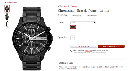
Nordstrom nearly always presents itself as the perfect ecommerce example and its product pages are no different. Not only does Nordstrom have differently angled product shots and the ability to zoom in, but it also has product reviews and is mobile friendly.
Additionally, Nordstrom offers unique product descriptions that are not identical to that of the manufacturers', which provides more details to move consumers toward purchase and some SEO benefits as well. Lastly, another added benefit of Nordstrom's product pages is including social sharing options.
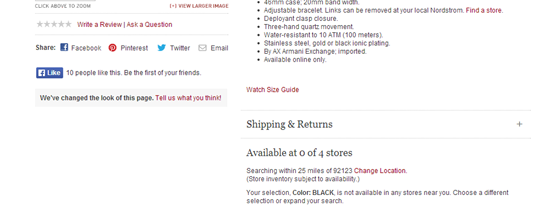
Nordstrom can obtain some qualitative feedback from what customers are saying when they share the products and prospective buyers can get their friends' opinions or show a loved one what they want without creating a wishlist.
ModCloth - Perfect
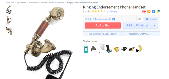
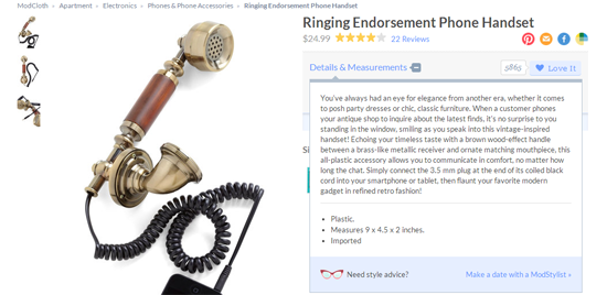
Perhaps the most inspirational item on the ModCloth's product pages is its prominent display of its shipping and return policy. It's extremely frustrating for consumers when they get to the final steps of the checkout process only to find out shipping costs more than they are willing to spend.
Retailers should test the placement of these items, but placing shipping policies (especially if it's free shipping or free shipping with purchases over a certain amount) can increase conversion. ModCloth also offers social sharing buttons, customer reviews, unique product descriptions (which users can expand to read), multiple high-quality images, mobile-friendly pages and even live chat (a bonus for sure).
Steve Madden - Perfect
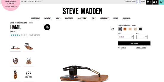
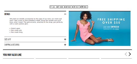
Did you know Steve Madden is offering a promo code for free shipping for orders over $50? Well, now you know because the product pages display this very important (conversion-friendly) message in two separate places (above the fold in the pink bubble and below the fold in a large blue box with a beautiful image). What's particularly perfect about this product page is the various product shots and even a 360-degree view of the shoes. (Check out Shopify's video tutorial on this topic). Steve Madden is also, of course, mobile friendly and offers social sharing features, unique product descriptions and customer reviews.
Bonus - World Market - Near Perfect
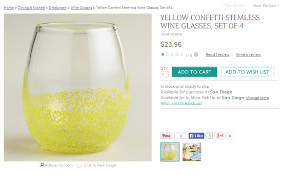
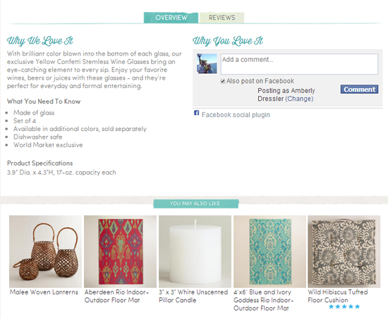
World Market takes care of four of the must-have product page elements. It has two great photos - a product shot and a lifestyle shot; it has social sharing, customer reviews, unique product descriptions and is mobile friendly.
While it's a great product page, World Market does not include shipping and return fees/policies on the page itself. So despite the fact that World Market offers the coveted pick-up in-store feature, the page is only near-perfect. Perhaps it could be improved by simply adding "Free Store Pick Up" to entice users to select the local option and not bounce once they find out about the near-seven dollar shipping costs on the next page.


