3 Elements of the Millennial Male Shopping Experience

Millennials often get a bad rap.
Either we're too young, too inexperienced or we lack the strong conviction that our elders have. Any way you look at it, there a multiple reasons people can list for not liking our generation.
What many may not realize is that our generation is arguably the most important generation alive today. At 27 percent of the worldwide population, not only are we more numerous than the Baby Boomers but our current buying power is already $1.3 trillion and is expected to continue to grow.
With the rise of the millennials, the stereotype that only women like to shop has been pushed back. Millennial men love to shop, I know this first hand (23-year-old male). In fact, 38 percent of millennial men reported shopping for clothing more than twice a month as opposed to just 10 percent of non-milllennial men.
Considering men shop more often in our generation it is important to understand what we like and what we simply do not.
Clean and Minimalist Design
The first thing I judge a website by is its homepage design. While this is like judging a book by its cover (sorry Mom, that is one lesson I didn't learn too well), if the homepage does not look good it's almost a sure thing that I'm exiting the site within thirty seconds.
Web designers should take their professors' lessons about whitespace (the absence of text or graphics) to heart because that is the second thing I look for on a website. I understand that there is a lot of information that businesses want to cram onto their websites but at a certain point it is just too much. If more information is needed then add another page and link to it. By overloading the already limited space of a webpage with content, whether it's text or graphics, the visual flow is ruined knocking the user off their rhythm and creating an overall unpleasant experience.
Arngren
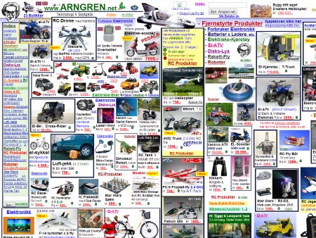
This is a popular ecommerce website to pick on but quite frankly it deserves it. The Norwegian website looks like someone threw up all over the page. There is barely any whitespace, the page dimensions are completely wrong, there is no visual hierarchy and to top it off graphics and text are overlapping each other (Move Santa! You're blocking the bike!).
Urban Outfitters
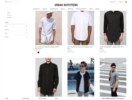
While the store may not be everyone's cup of tea, Urban Outfitter's website is clean and simple with high quality images and a clear visual hierarchy. Urban clearly stresses their products by using large high quality images with a small descriptive caption beneath without overloading the consumer at the same time. They accomplish this by only having three pictures per row and a lot of whitespace.
The More Deals the Better
Do not, I repeat, do not make me pay for shipping. It just adds to my overall total. To me, free shipping is one of the most influential deals companies can offer. If I'm about to check out and I see a shipping fee, I immediately open up a new window and search what local store I can buy the product at instead as well as what other websites I can purchase the product from.
Deals and sales are how we shop. Until we have been able to completely pay off our student loans many of us will be penny pinching with every paycheck. One of the best ways to get me to buy something from your site is through a sale. I understand that not every sale price is a good deal but there is something psychologically that makes me more comfortable with paying a higher price for an item that's on sale.
Amazon Prime
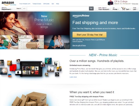
I admit the yearly fee is not enticing, there are a lot of other ways I could use that $99. What makes paying that yearly fee acceptable is not their video streaming service or their e-book borrowing service, it's the free shipping. Getting to the end of the checkout process and seeing that $0 next to shipping is like getting a snow day when you're in elementary school, it's magical.
Tiger Direct
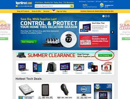
While I am not a particular fan of Tiger Direct's website overall (honestly, the mustard yellow kills it for me), I applaud them on two things in particular. The first is clearly displaying their special deals. Don't hide them or make me click to another page to find them, proudly display them on your home page so I know what to look at. The second is how they make it easy to browse only the items that are on sale. Once I click on the "Start Shopping" link on the home page I'm taken to a page that only has items which are on sale. This not only allows me to view sale items that I'm interested, it also allows me to see other items that I might not have known were on sale or even existed.
Remember Who You Are
Studying a more successful company and seeing what they are doing differently is always a good idea. However, you must remember that just because it's working for them does not mean it's going to work for you (looking at you JC Penny). It's important to know your competition and understand what is making them successful but don't lose your businesses identity in the process. Diving into different markets is extremely hard and it doesn't work out for everybody.
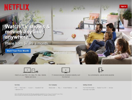
Netflix
While Netflix certainly has its pluses and minuses (the TV shows are typically much better than the movies) the streaming juggernaut nearly lost their dedicated following when they tried to change who they were fundamentally in order to make a little extra money. Netflix subscribers quickly cried foul when they learned that they were going to split their streaming and mail-delivery services. What Netflix apparently forgot is that people use them primarily because they're inexpensive. As someone who has elected to use Netflix over cable, I rely on Netflix to keep their prices down.
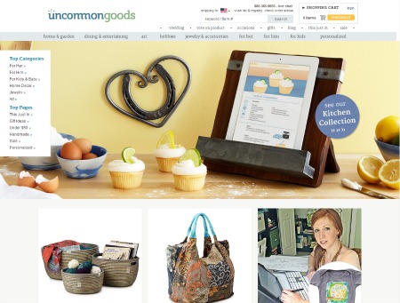
UncommonGoods
Quirky, unique and unconventional are all applicable terms that can used when describing this online marketplace. With a stressor on individuality and creativity, UncommonGoods is one of the first places I go when looking for a present for anyone. Not everything on the site is my particular cup of tea but it provides a unique marketplace for consumers to find out-of-the-box gifts for those they care about.
What does it all mean?
Appeasing all millennials is nearly impossible. There are so many varying opinions within our generation it makes it hard for even me to keep up sometimes. However, with 40 percent of millennial males saying they would buy everything online if they could, it is imperative that companies continue to give it their best shot.
With great confidence I can say that millennial men really do love to shop. Whether we're looking for the latest Derrick Rose shoes or a few button downs from H&M, we're always thinking of what to buy next.


