Analytics Get a Makeover with Visual.ly

For some Web workers, sorting through analytics can be a dull, yet necessary, task. But a new tool from Visual.ly aims to change that.
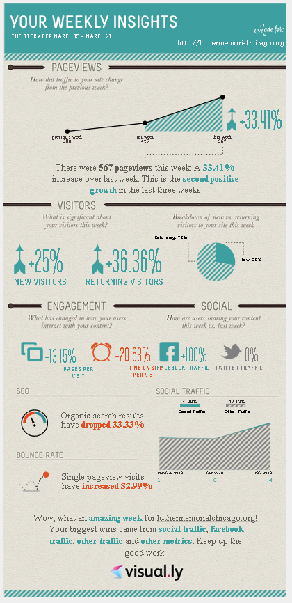
The data visualization and infographic platform has launched a tool that provides users with a free visual traffic summary of their site's performance. The tool leverages data from a user's Google Analytics account to automatically create a custom infographic based on a site's weekly performance. This infographic displays basic site analytics, such as pageviews, new and returning visitor data, social engagement, SEO stats and bounce rate.
The provided metrics are certainly not enough information for analytics professionals who need to dive deep into a site's performance, however, the tool can be used to send a site snapshot around to other team members. By doing this, all colleagues within an organization can stay up-to-date with their site's performance, and be aware of what metrics can be improved upon.


