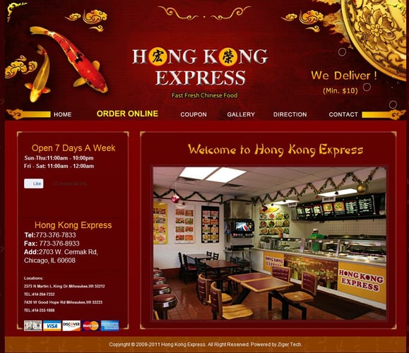
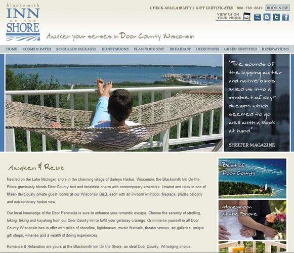
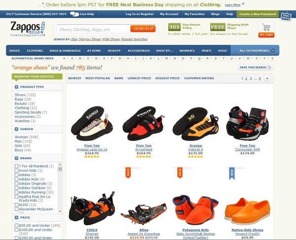
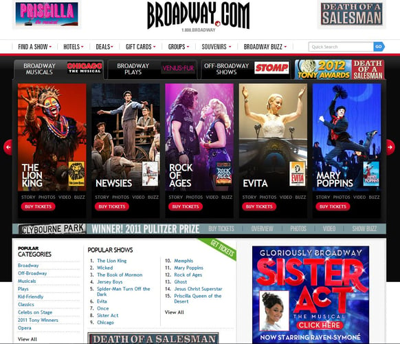
Top PPC Landing Pages by Industry

by Michael Garrity
15 May, 2012
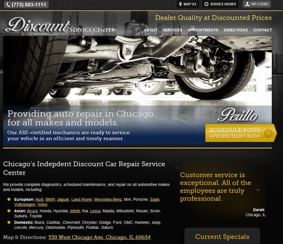
 When you're paying good money for clicks from a search engine to drive traffic to your site, it only makes sense that you would want the landing page that users arrive at to be engaging and informative, right?
What seems obvious to some of us may go unnoticed by others. The importance of first impressions on converting visitors has been talked about at length, but it's one of those old adages that is seriously important. That is, if you want your PPC campaign to be worth anything.

Michael Garrity
Michael Garrity, Director of Marketing for Francis Lofts & Bunks, is an accomplished writer with a rich background in marketing, communications, and community engagement. With expertise in content creation and management, marketing strategy, digital advertising, SEO, social media management, and proficiency in various tools including Microsoft Office, Adobe InDesign, and Adobe Photoshop, he is well equipped to deliver outstanding results. Holding a BA in English Literature from St. Joseph's College (IN), Michael graduated Summa Cum Laude with a 3.92 GPA, honing his strong communication skills. His diverse experience makes him a valuable asset to any team.


