4 Click-Worthy Native Ads

Native ads have been a hot topic over the last couple of years, and for good reason.
These ads aim to bridge the gap between content marketing and traditional advertising, because advertisers use content they created (e.g. articles, infographics, videos and even earned media, like reviews) and design it and promote it in a way that resembles the platform on which the content appears, providing a seamless transition between editorial and advertisement. This can also be cause for concern as the lines between editorial and advertising blur, causing the Interactive Advertising Bureau to step in, producing the Native Advertising Playbook (read the PDF) to provide greater clarity in the market.
The industry's watchdog, IAB has also named six native advertising units. These units include in-feed and paid search units, recommendation widgets, promoted listings, IAB standard ads with "native" elements and custom units. These units are easily found throughout the Web, if users know what to look for. Not all of these ads, however, are click-worthy.
Find out what makes a native ad compelling and worthy of a click by checking out four examples of these units below:
Native Ad Unit: Promoted Listing
Brand: LovableDoggie
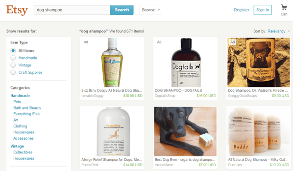
Why it's Click-Worthy: When searching for "dog shampoo" on Etsy, the ecommerce site turns up more than 600 results. The top three results, however, are all native advertisements. Each one of these ads, including the one from LovableDoggie, are click-worthy not only because they are displayed for a targeted and relevant search, but also because they are the top search results served, which typically results in more clicks for advertisers.

Native Ad Unit: Paid Search
Brand: JustFab
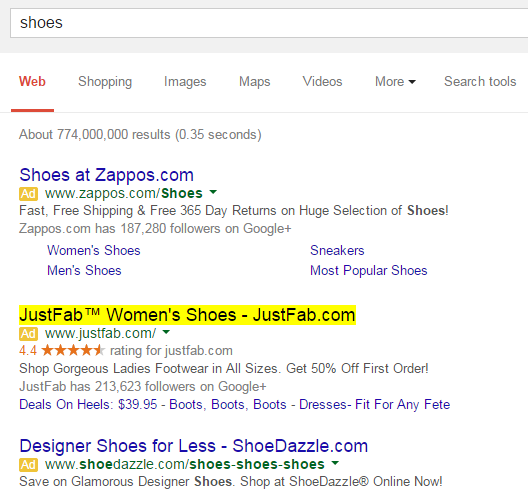
Why it's Click-Worthy: Unlike Zappos and ShoeDazzle, JustFab's paid search advertisement (see image below) features a rating. Ratings are typically seen as a trust symbol by consumers and could be the difference maker when consumers are choosing a search result to click.

Native Ad Unit: Custom
Brand: White Castle
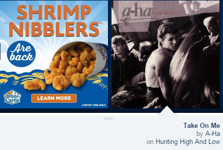
Why it's Click-Worthy: White Castle's ad is click-worthy because it is featured within a Pandora user's rotating music carousel. By being neatly positioned next to the song that is currently playing the user experience isn't interrupted, yet users still have the ability to click on the ad to learn more. Moreover, the ad makes its presence known to users who have Pandora playing in the background because it is accompanied by a brief audio advertisement between songs.

Native Ad Unit: In-Feed
Brand: GrubHub
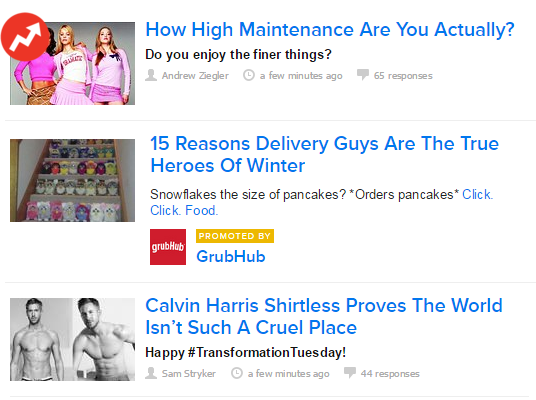
Why it's Click-Worthy: GrubHub's ad is click-worthy because it actually doesn't look like an ad at all. The ad is essentially content being promoted by GrubHub that is positioned within Buzzfeed's main content stream on the publisher's website. Even with the "promoted by" label, users are more compelled to click on this content because it resembles the other content, in both the look (thumbnail image, text size, etc.) and feel (using an editorial-like title) of the other Buzzfeed articles.


